Line Chart Widget for Elementor
The XPro Line Chart Widget for Elementor is a powerful tool that allows you to transform complex data into clear, interactive, and visually appealing line graphs. With extensive customization options for orientations, animations, and styling, you can showcase trends and statistics that perfectly match your website’s design.
What is a Line Chart Widget?
A Line Chart is ideal for displaying information as a series of data points connected by straight or curved line segments. The Free XPro widget stands out by offering both Horizontal and Vertical orientations, and advanced features like Stacked Area Charts and Stepped Lines.
Requirement
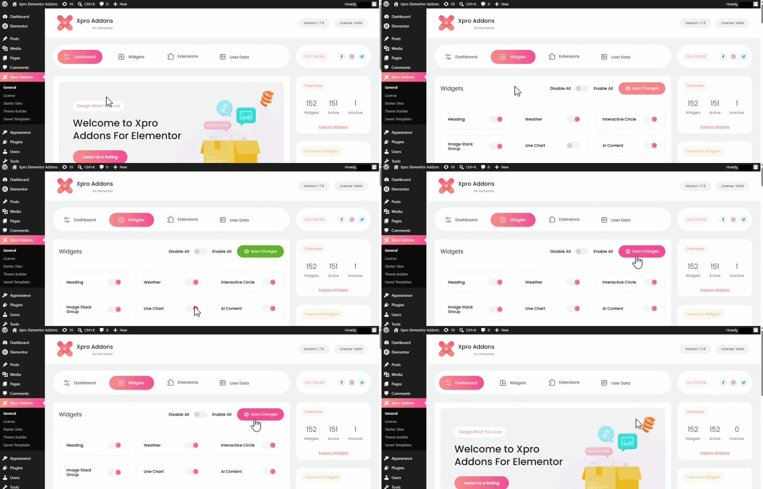
You need to install and activate the Free version of Xpro Elementor Addons. To ensure the widget is visible in the Elementor editor, follow these steps:
- Click on the Xpro Addons option in your WordPress Dashboard menu.
- Navigate to the Widgets Tab, find the Line Chart widget, toggle the button ON to enable it, and save changes.
How to Use the XPro Line Chart Widget
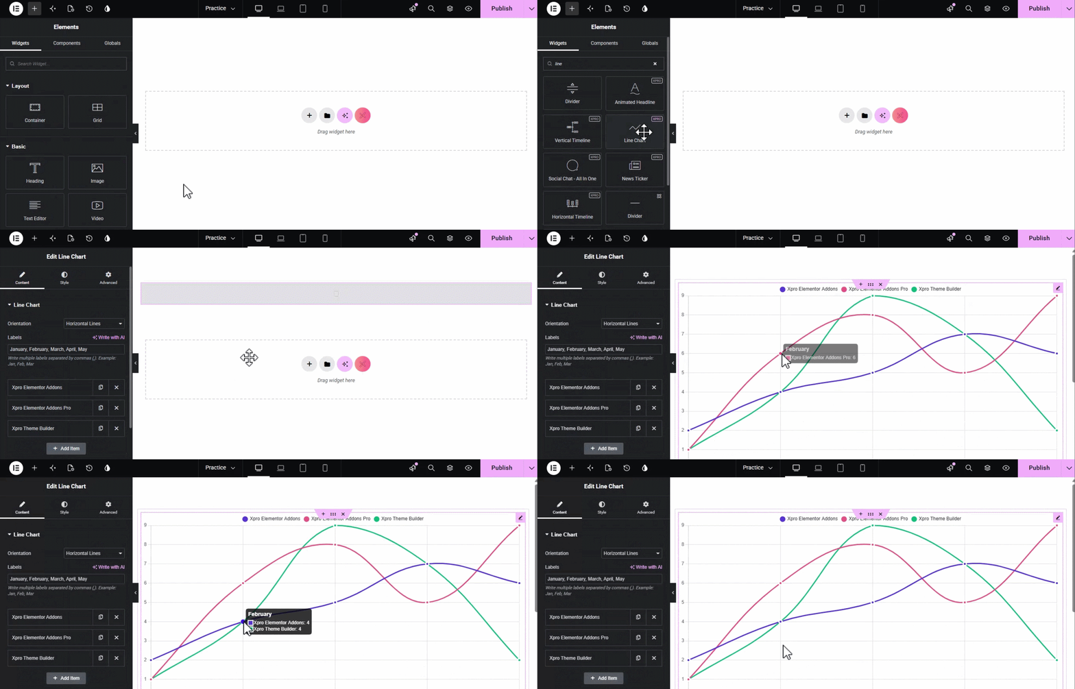
Ensure you have XPro Elementor Addons installed and activated.
- Open your Elementor editor and search for “Line Chart” in the widget panel.
- Drag and drop the widget into your desired section.
- Start adding your data in the Content Tab and customize the look in the Style Tab.
Content Tab Settings
The Content Tab is where you manage your data sets and the fundamental behavior of the chart.
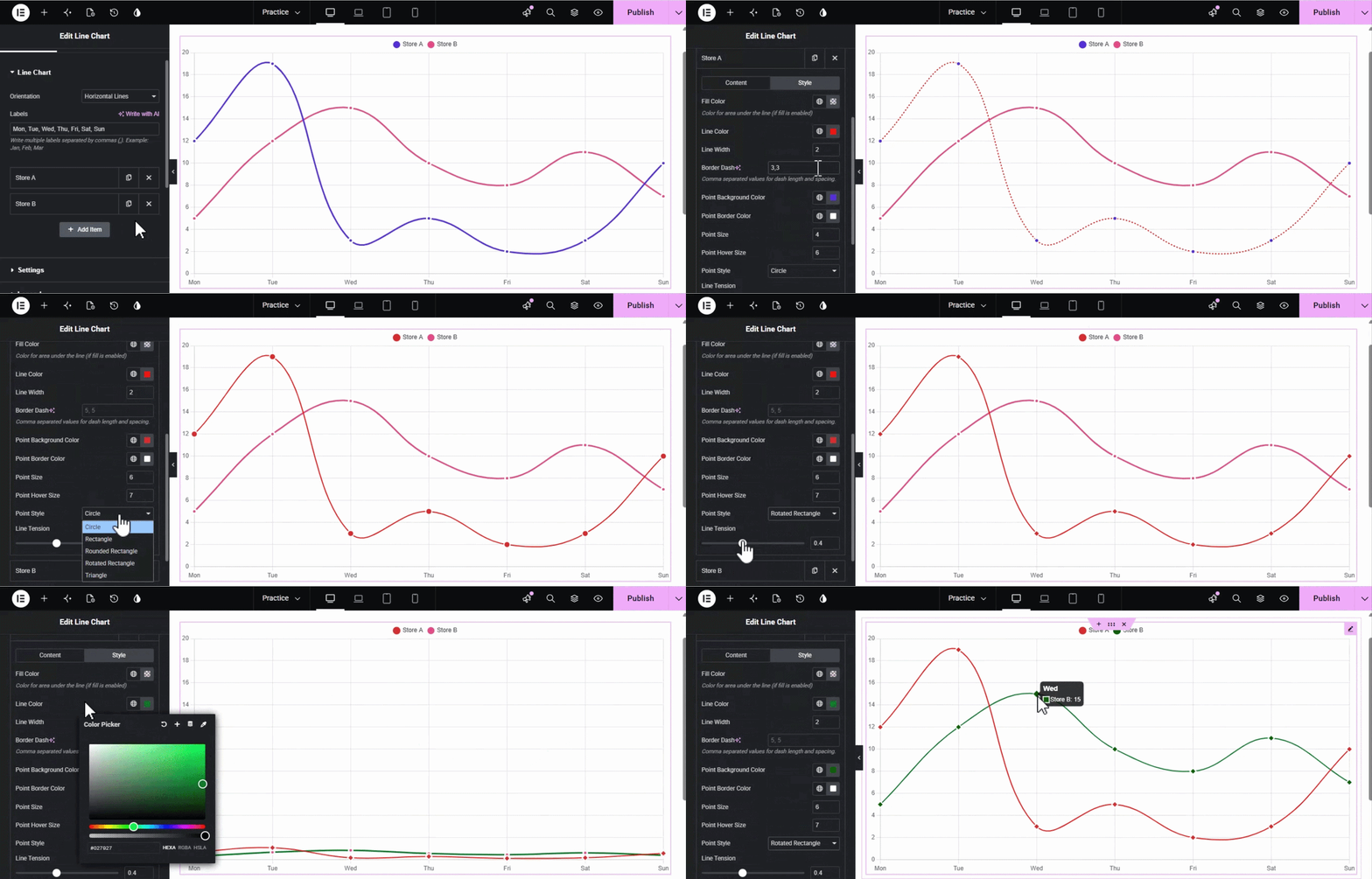
Line Chart Section
- Orientation: Choose between Horizontal Lines or Vertical Lines for your chart layout.
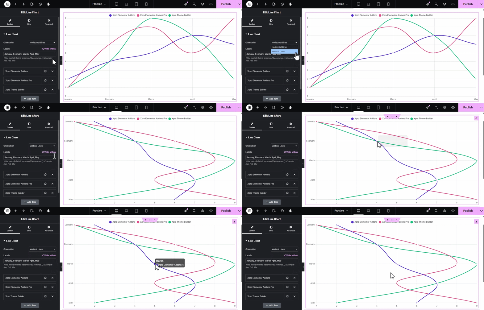
- Labels: Enter the labels for your axis (e.g., months or years) separated by commas.
- Items (Repeater): Add multiple datasets to a single chart.
- Content: Set the Label, input your Data values (comma-separated), and define the Drawing Order (higher numbers appear on top).
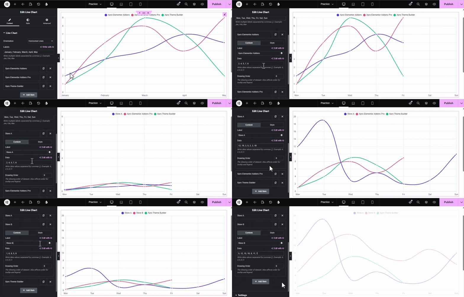
- Style (Item-level): Customize specific settings for this dataset, including Fill Color, Line Color/Width, Border Dash (for dashed lines), Point Style/Size, and Line Tension to control curve smoothness.
Settings Section
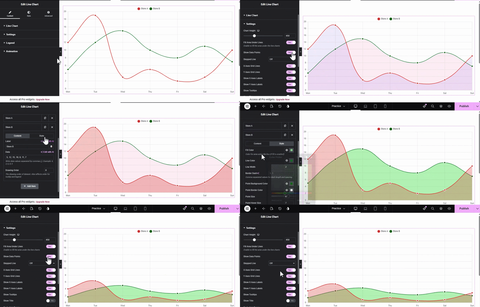
- Chart Height: Adjust the height of the chart for Desktop, Tablet, and Mobile.
- Fill Area Under Lines: Toggle to turn your line chart into an area chart.
- Show Data Points: Enable or disable the markers on the data lines.
- Stepped Line: Choose between Off, Before, After, or Middle to create stepped transitions.
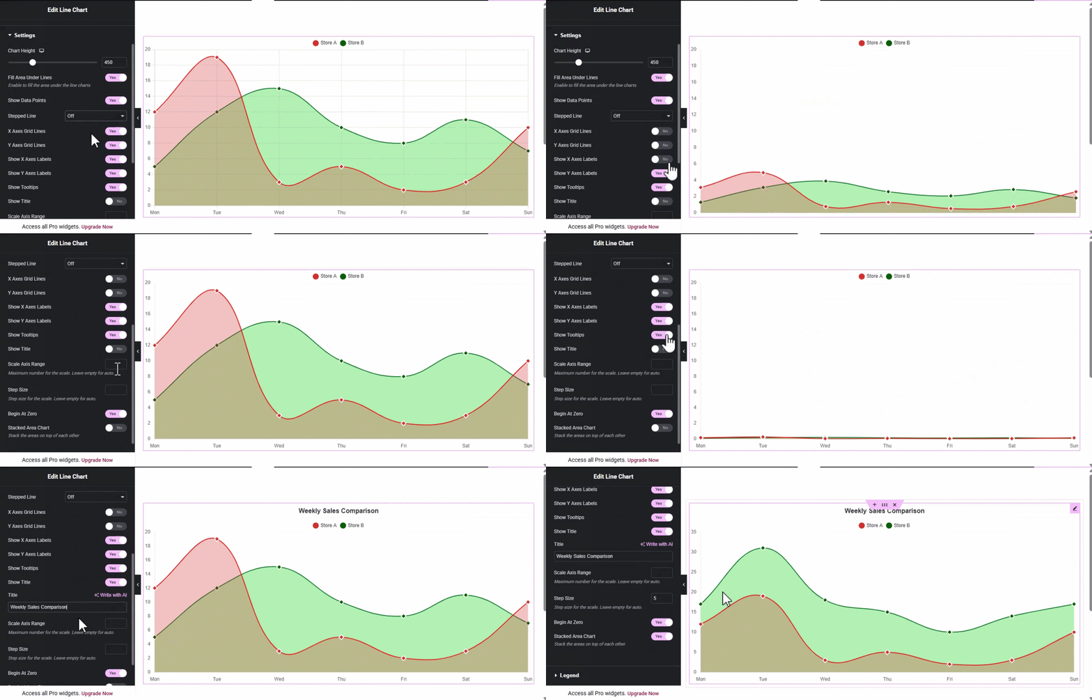
- Grid Lines & Labels: Individual toggles to show/hide X and Y axis grid lines and labels.
- Scale Axis Range & Step Size: Manually define the maximum scale and increments, or leave empty for automatic calculation.
- Begin At Zero: Force the Y-axis to start from zero.
- Stacked Area Chart: Enable this to stack datasets on top of each other.
Legend Section
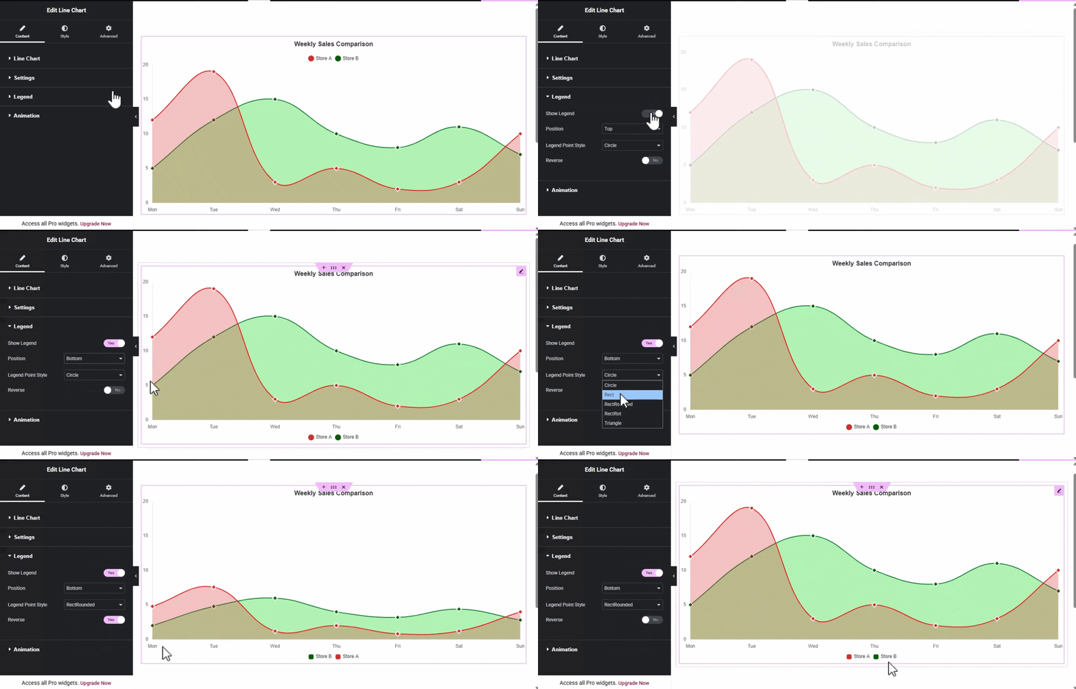
- Show Legend: Enable to display a key for your datasets.
- Position: Place the legend at the Top, Bottom, Left, or Right.
- Legend Point Style: Choose shapes like Circle, Cross, Dash, Rect, etc..
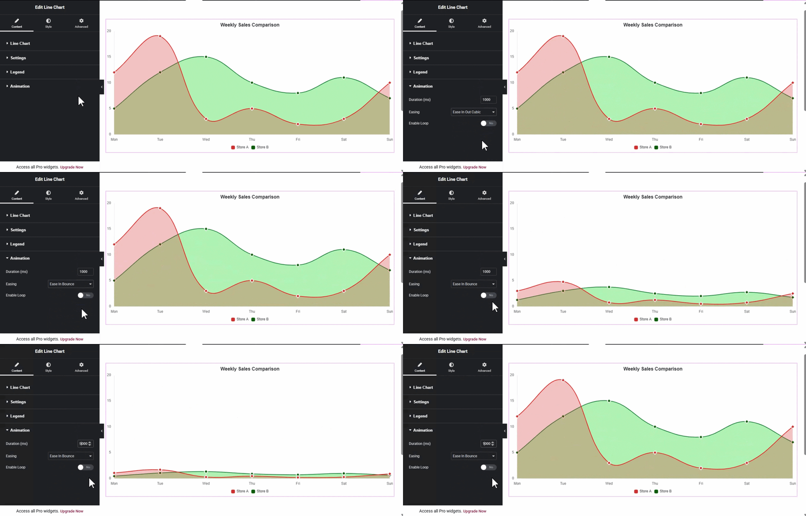
Animation Section
- Duration (ms): Control how long the entry animation lasts.
- Easing: Select the animation style (e.g., Linear, EaseInQuad, EaseOutBounce).
- Enable Loop: Keep the animation running in a continuous cycle.
Style Tab Settings
The Style Tab allows you to refine the aesthetics of your chart elements.
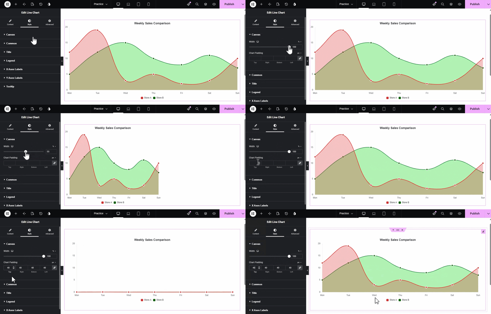
Canvas Section
- Width: Set the responsive width of the chart container.
- Chart Padding: Adjust the internal spacing around the chart area.
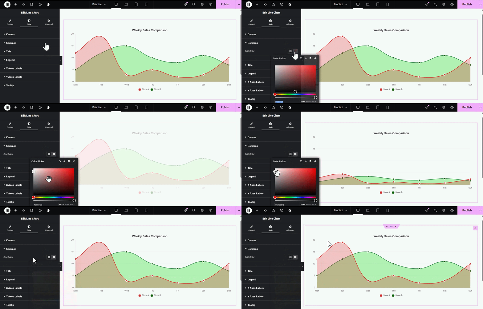
Common Section
- Grid Color: Customize the color of the background grid lines.
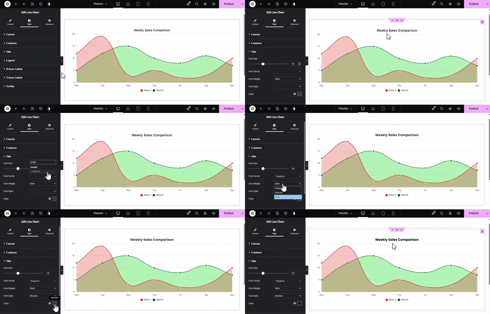
Title
Adjust Font size, font family, font weight, and style
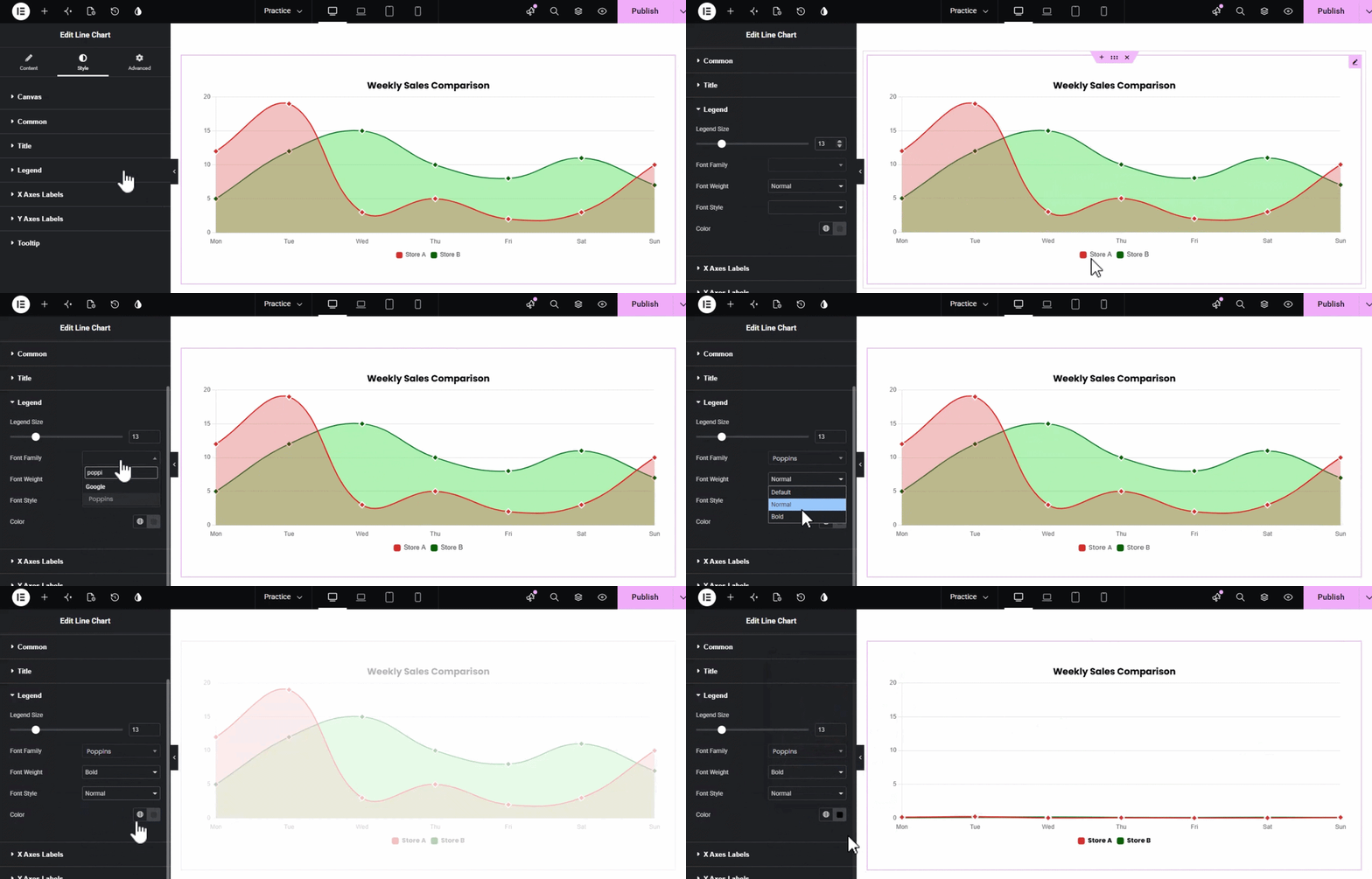
Legend Section
- Legend Size & Typography: Adjust the font size, weight, and family for legend text.
- Color: Set the text color for the legend.
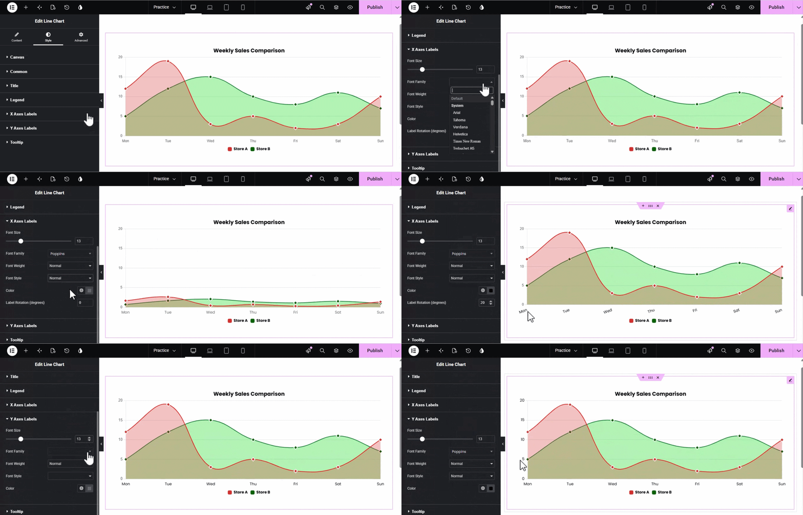
X & Y Axes Labels Section
- Typography: Full control over the font settings for axis labels.
- Color: Change the label text color.
- Label Rotation (X-Axis only): Rotate labels by degrees to prevent overlapping on crowded charts.
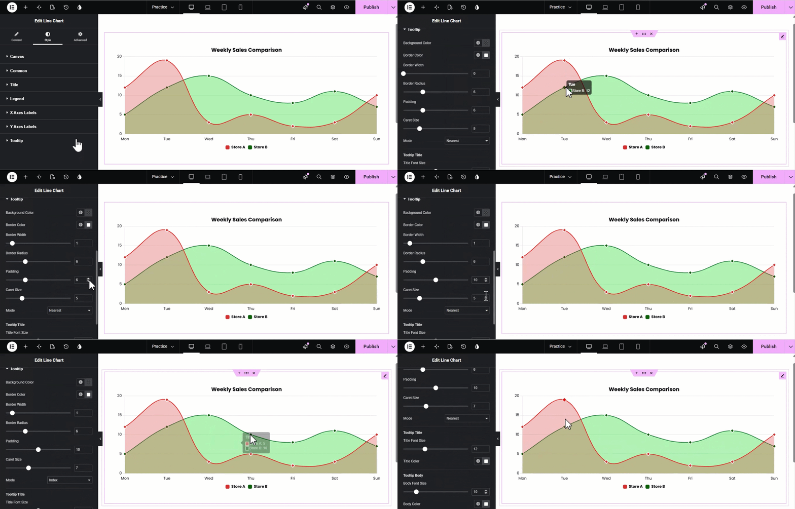
Tooltip Section
- Background & Border: Customize the tooltip box’s color, radius, and border width.
- Mode: Choose how tooltips are triggered (e.g., Nearest or Index).
- Typography: Set unique font styles and colors for both the Tooltip Title and the Body text.
Unlock the full power of data storytelling with the XPro Line Chart widget. By following this guide, you now have the tools to transform raw numbers into professional, high-impact visualizations—from simple performance trackers to complex, stacked area charts. With deep granular control over orientations, smooth animations, and interactive tooltips, your data can now be presented in a way that is both functional and aesthetically stunning.
We hope this documentation helps you elevate your website’s data presentation. If you have any remaining questions, need technical assistance, or want to explore more advanced tips, please visit our XPro Help Center or reach out to our Dedicated Support Team. Start visualizing your success with XPro today!