




Pro Widget
Elementor Image Accordion Widget
An image accordion turns a row of pictures into a story: inactive images sit as narrow strips, and the one your visitor hovers or clicks expands to reveal its title, description, and call to action. The Xpro Image Accordion widget does it in horizontal or vertical layouts, with per-item media, entrance animations, overlay colors for both states, and a linked button in every panel — showcase a portfolio, a process, or a product line in the space of a single banner.
The Most Exciting Way To Show Off Your Favorite Images
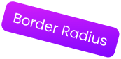
Inactive panels compress into slim strips and the active one expands by a ratio you control — so the layout always shows a hint of what's next. Set item height, strip spacing, border radius, and an overlay color for both the resting and active image, then let the row expand under the cursor or on click.
Personal Shoot
Golden hour, one photographer, no crew — portraits that feel unplanned.
View PortfolioPersonal Shoot
Golden hour, one photographer, no crew — portraits that feel unplanned.
View PortfolioPersonal Shoot
Golden hour, one photographer, no crew — portraits that feel unplanned.
View PortfolioPersonal Shoot
Golden hour, one photographer, no crew — portraits that feel unplanned.
View PortfolioStyle Your Images In Unique Horizontal Layout
The classic side-by-side strip layout — perfect for portfolios, destinations, and product lines that read left to right.
Showcase Your Images In Exciting Vertical Layout
The same expanding behavior stacked top to bottom — ideal for process steps, timelines, and tall imagery on narrow columns.
Exciting Image Accordion Triggers For Instant Action
Choose the trigger that fits the audience: hover for exploratory desktop visitors, click for deliberate interactions and touch-friendly behavior. One setting, no shortcodes.
Make Your Image Accordion Active On Click
Click-to-expand keeps content stable — visitors choose exactly when a panel opens, and one panel can be set active by default so the accordion never starts empty.
Make Your Image Accordion Active On Hover
Hover-to-expand adds motion your visitors can feel — paired with a content entrance animation and position you pick, so the revealed copy arrives with style.
Get More User Interaction by Adding Compelling CTA Buttons
Every panel can carry its own button — text, link, typography, and classic or gradient colors with separate hover states and border controls. The accordion doesn't just show your work; it routes visitors to it.
Unique Customization Options to Personalize Your Image Accordion
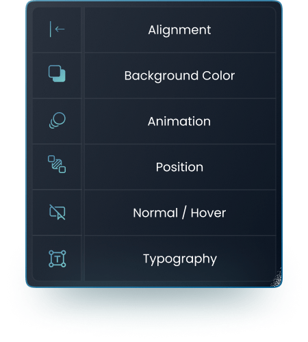
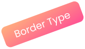
Content alignment, background, and position float anywhere on the active image; title and description get full typography control; and content boxes take five border styles — solid, dashed, grooved, dotted, or double — with color, width, and radius dialed in.
Cities Of Lights
After-dark cityscapes — neon, rain, and long exposures.
See the GalleryCities Of Lights
After-dark cityscapes — neon, rain, and long exposures.
See the GalleryCities Of Lights
After-dark cityscapes — neon, rain, and long exposures.
See the Gallery
Customize Button In The Way You Want
Button text typography (font, size, weight, letter and word spacing), normal and hover colors, classic or gradient fills, and the same five border types — so the CTA matches your brand buttons instead of the widget's defaults.
New Project
View MoreNew Project
View More
Our Blogs
Discover The Latest From Xpro Elementor Blogs
7 Best Image Scroll Widget For Elementor – [Tested & Compared]
If you are looking for the best image scroll widget for elementor to showcase stunning landscapes, designs, templates, portfolios, product images, or long web...
Read MoreGet Help From Our General Knowledge Base
What is the Image Accordion widget?
A Pro widget in Xpro Elementor Addons that displays images as expandable panels — inactive images stay as slim strips while the hovered or clicked one expands to reveal its title, description, and button.
Can the accordion expand on hover instead of click?
Yes — the trigger is a one-switch choice between hover and click, and you can set one panel to be active by default so the widget always shows content.
Can each panel link somewhere?
Yes — every item has its own button with text, link, and full styling (colors, gradients, hover states, borders), turning the accordion into a traffic router.
Horizontal or vertical — which is better?
Both layouts support every feature. Horizontal suits portfolios and product lines; vertical fits process steps and narrow columns. Switch layouts from one dropdown.