


Pro Widget
Elementor Line Chart Widget
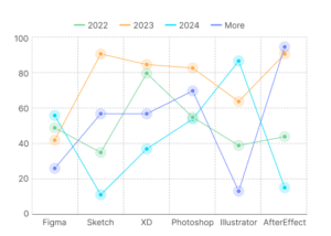
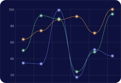
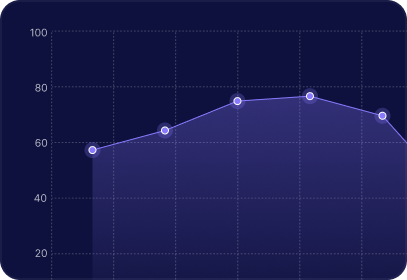
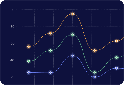
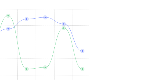
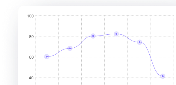
A Line Chart is ideal for displaying information as a series of data points connected by straight or curved line segments. This widget offers both Horizontal and Vertical orientations and advanced features like Stacked Area Charts and Stepped Lines.
Build Fully Custom, Interactive Graphs in Minutes.
Sized for Every Screen
Canvas width and chart padding are set independently for desktop, tablet, and mobile — not one fixed size squeezed everywhere.
Horizontal or Vertical Orientation
Flip the chart's direction to fit the layout, not the other way around.
Line and Point Styling
Line tension for smoothing, border dash for custom stroke patterns, point size/style/hover size — all adjustable per dataset.
Tooltips & Legends
Nearest-point tooltip mode, adjustable border radius/padding/caret size, and a legend with position, point style, and reverse-order controls.
Everything You Need to Visualize Data in One Widget
Visual Customization
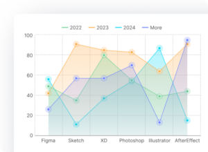
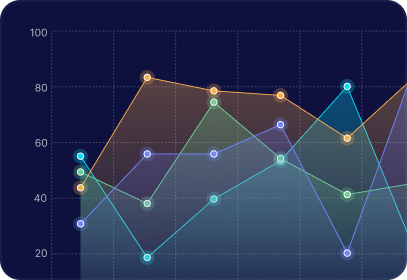
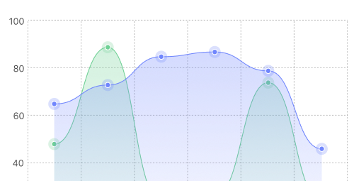
Toggle "Fill Area" for an area chart or enable "Stacked Area" for cumulative totals. Combine these independent options or use either alone, then customize lines, colors, and hover sizes.
Scaling & Precision
Adjust the Axis Range, Step Size, and Begin at Zero settings for precise chart scaling. Enable Stepped Line to show values as fixed jumps instead of smooth, continuous transitions.
Animation
Set the entry animation's duration and easing style, and enable looping if you want continuous motion rather than a one-time reveal.
Layout & Typography Control
Set canvas size and padding per device. Style X and Y labels individually using font, size, weight, etc. Style independent grid lines and title visibility.
Drop it in
Search for the Line Chart widget in your Elementor panel and add it to your section.
Add your data
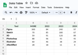
Use the repeater to add datasets: type labels and values separated by commas, or generate them with AI. Set each dataset's drawing order to control layering and legend sequence.
Style it
Switch to the Style tab to set line/point styling per dataset, then canvas, grid, legend, axis-label, and tooltip styling globally.
-
Drop it in
Search for the Line Chart widget in your Elementor panel and add it to your section.
-
Boosted Brand Trust
Clean, professional-grade charts instantly elevate the credibility of your case studies, annual reviews, and business metrics
-
Lower Bounce Rates
Smooth entry animations draw attention immediately, lowering on-page bounce rates. here
Why Visual Data Storytelling Works Better
-
Faster Comprehension
The human brain processes visual graphs up to 60,000 times faster than raw text or tables.on here
-
Boosted Brand Trust
Clean, professional-grade charts instantly elevate the credibility of your case studies, annual reviews, and business metrics
-
Lower Bounce Rates
Smooth entry animations draw attention immediately, lowering on-page bounce rates. here

-
Flawless Mobile Rendering
Fully responsive controls let you adjust canvas width and chart padding specifically for mobile users.
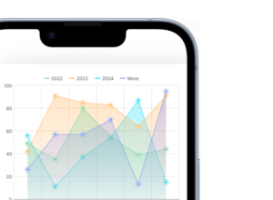
Seen a chart style you like elsewhere? Build it here.
Dashed Multi-Series Comparisons
Set a comma-separated dash length and spacing per dataset to break up a busy multi-line chart.
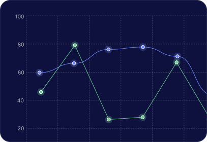
Smooth-and-filled vs. sharp-and-outlined
The same dataset reads completely differently with Fill Area off and Line Tension at zero — no separate widget needed.
Layered gradient areas
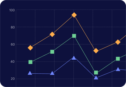
Crossing trend lines with diamond points
Swap Point Style to diamond, square, or triangle when circle markers get lost in overlapping series.
Minimal, card-style chart
Turn off axis grid lines and labels for a quiet, editorial chart that sits inside a small card or widget.
Ribbon-style band comparison
Three filled datasets with distinct colors and moderate transparency read as flowing bands instead of stacked blocks.
Have Any Doubt?
Frequently Asked Questions
Can I show multiple datasets on one chart?
Yes — add as many dataset items as you need, each with its own color, line style, and drawing order.
Do I need to know code?
No. Every setting is a visual control in the Elementor panel — no custom CSS or JS required.
Can I control how the chart looks on mobile vs. desktop?
Yes — canvas width and padding can be set per breakpoint.