Introduction
The Xpro Bar Chart widget for Elementor allows you to transform complex data into visually appealing, interactive charts. Whether you are showcasing sales figures, growth metrics, or comparative statistics, this widget provides a lightweight and fully customizable way to present information clearly to your visitors without the need for complex coding.
How to Install the Bar Chart Widget
Requirement
To use this widget, you must install and activate the Pro version of Xpro Elementor Addons.
Enabling the Widget
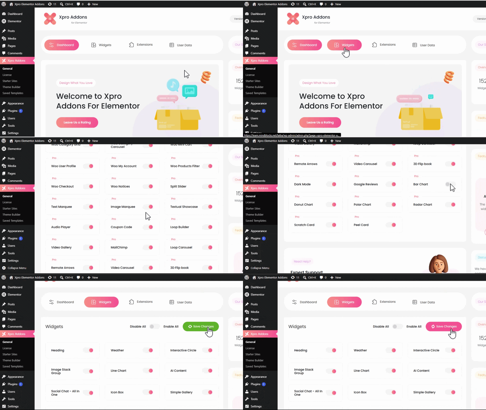
- Navigate to the Xpro Addons menu on your WordPress Dashboard.
- Click on the Widgets tab.
- Locate the Bar Chart widget and toggle the button ON to enable it for the Elementor editor.
How to Use the Bar Chart Widget
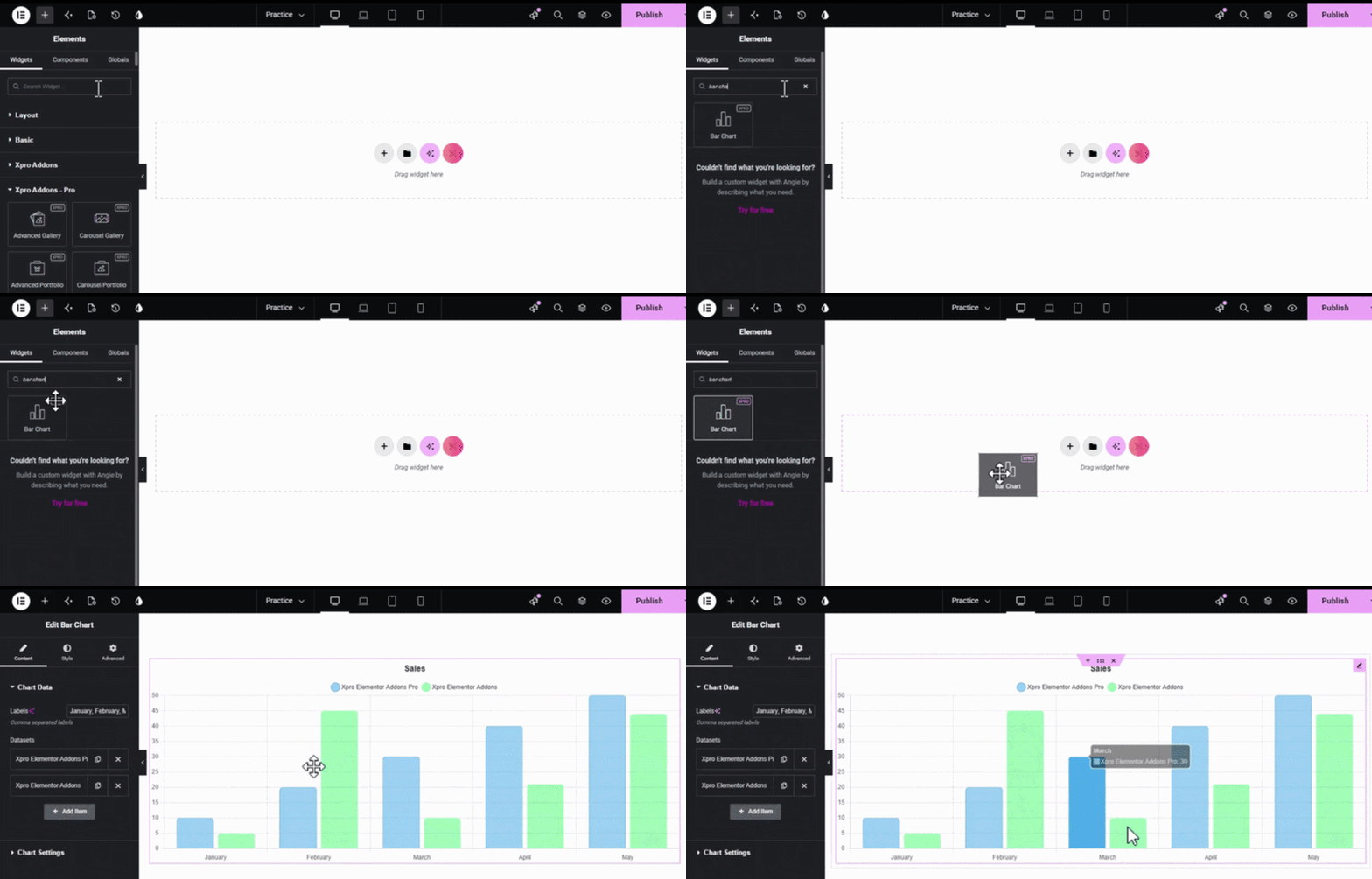
Once enabled, open your page in the Elementor Editor, find the Bar Chart widget in the Xpro Addons – Pro section, and drag and drop it onto your page.
1. Configuring Chart Data
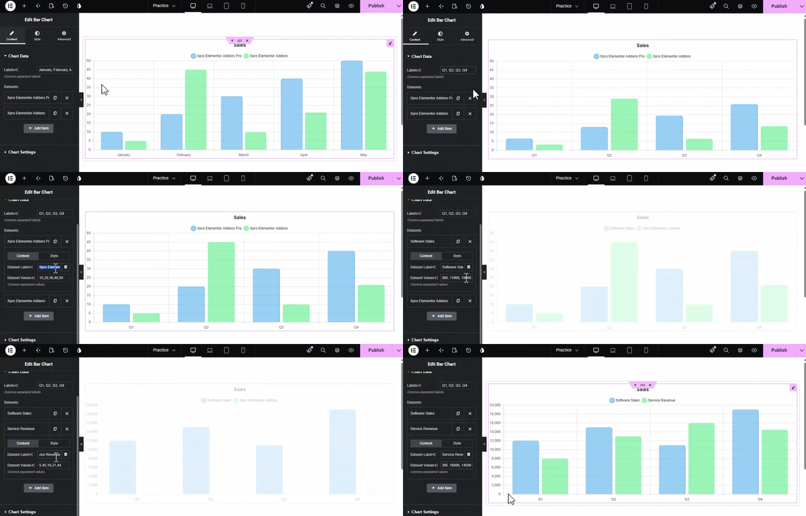
Under the Content Tab, you will find the Chart Data section where you manage the raw information for your chart:
- Labels: Enter your categories (e.g., months or years) as comma-separated labels. You can also use the AI icon to help generate these labels automatically.
- Datasets: This area allows you to manage different data series. You can add an item, duplicate existing datasets, or delete them to compare multiple sets of values side-by-side.
Dataset Style Options
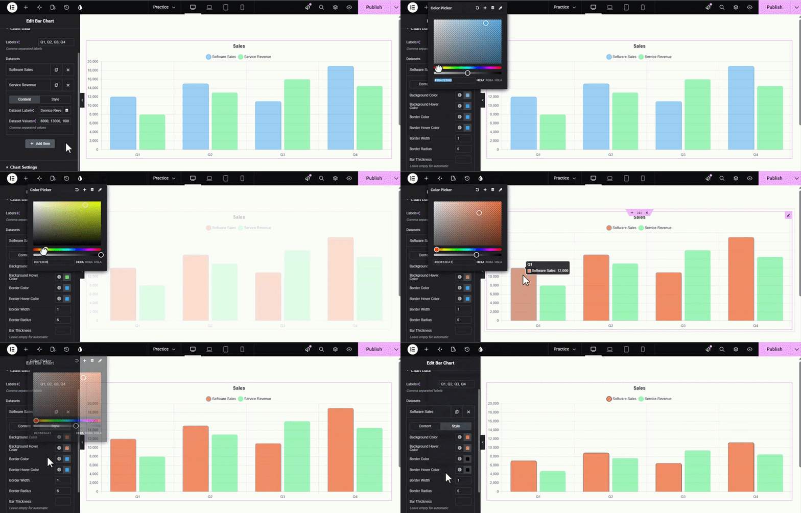
The Style tab within a Dataset allows for per-series customization:
- Background & Hover Colors: Set a unique Background Color for the bars in this dataset and a Background Hover Color to create an interactive effect when a user’s mouse passes over them.
- Border Customization: Define the Border Color and Border Hover Color, and set a specific Border Width to outline your bars.
- Border Radius: Use this to round the corners of your bars for a softer, modern look.
- Bar Thickness: Manually define how wide the bars should be for this specific dataset. You can leave this empty for automatic sizing based on the chart’s overall dimensions.
2. Adjusting Chart Settings
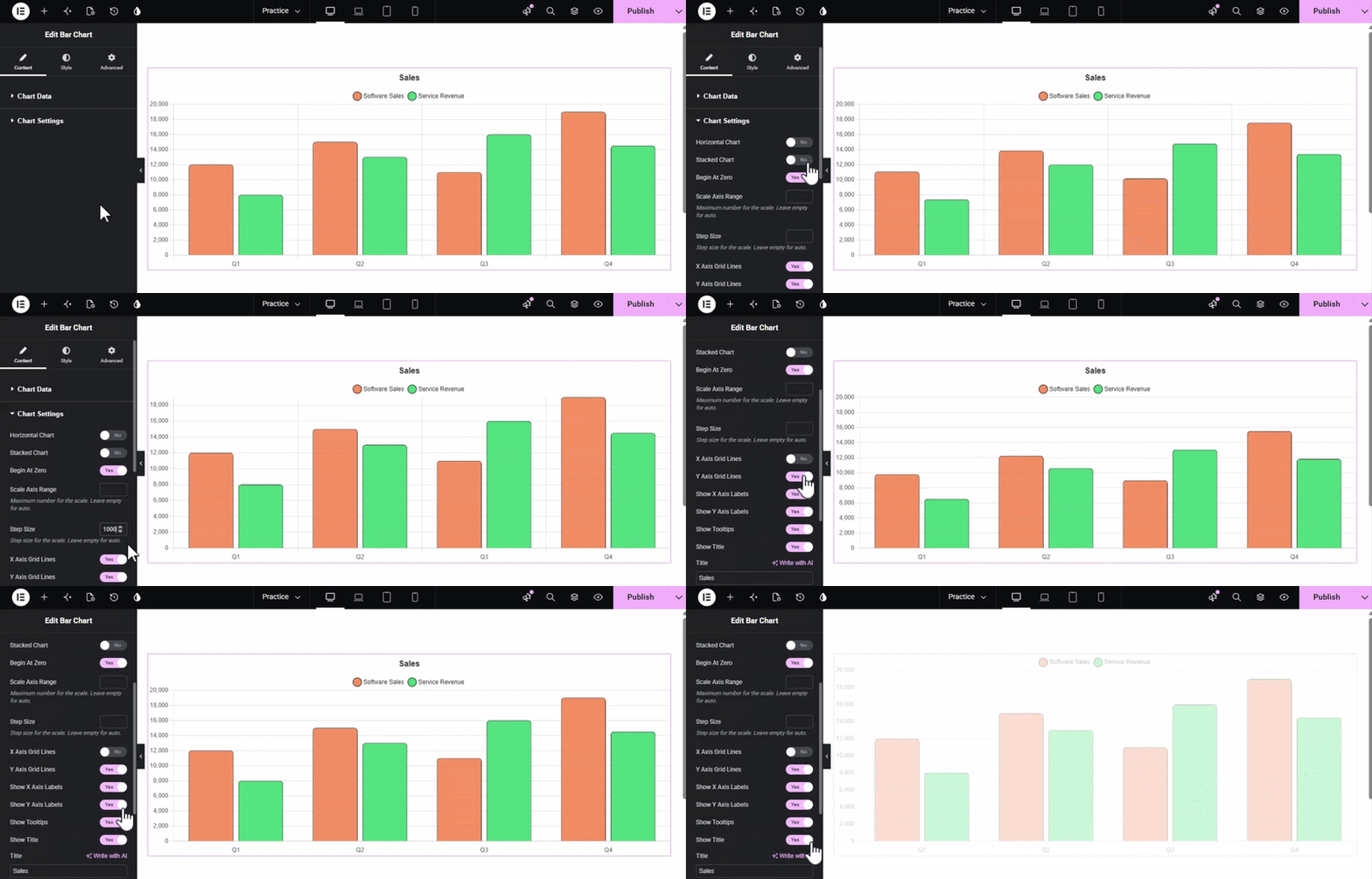
The Chart Settings menu provides control over the layout and scale of your visualization:
- Layout Toggles: Easily switch to a Horizontal Chart or enable a Stacked Chart view.
- Scale Control: Ensure accuracy by toggling Begin At Zero. You can also manually define the Scale Axis Range and Step Size.
- Visibility: Use toggles to show or hide X/Y Axes Grid Lines, Axes Labels, Tooltips, and the Chart Title.
3. Customizing the Legend
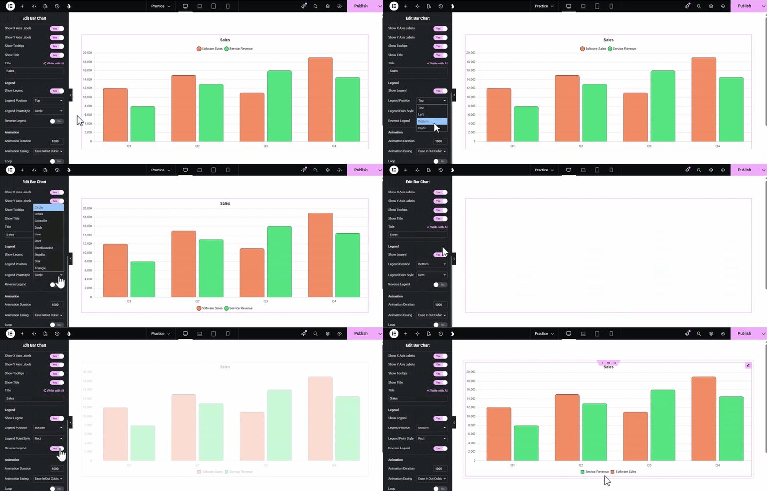
Help your users understand the data by configuring the Legend:
- Position: Place the legend at the Top, Bottom, Left, or Right.
- Point Style: Choose different styles for the legend markers, such as Circle.
- Reverse Legend: Toggle this to change the order in which datasets are listed.
4. Setting Animations
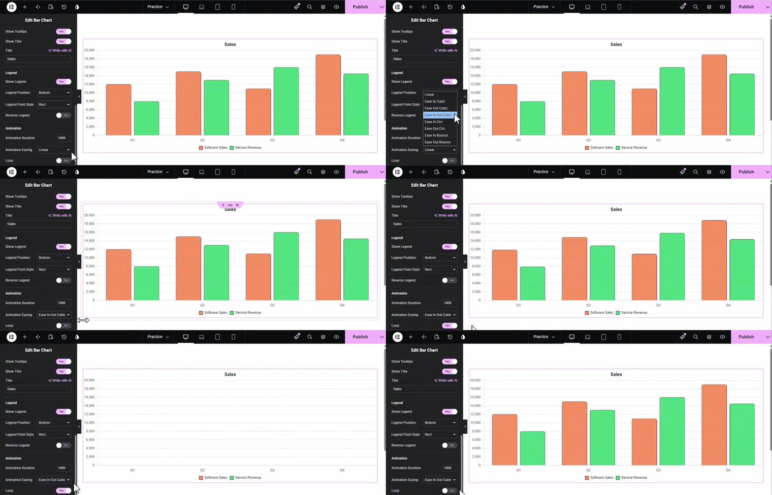
Bring your data to life with entrance effects:
- Animation Duration: Set the speed of the animation in milliseconds (e.g., 1000).
- Animation Easing: Select your preferred motion style, such as Linear, from the dropdown menu.
Style Tab Customization
The Style tab is divided into several collapsible sections to give you granular control over every visual element of your chart.
1. Canvas
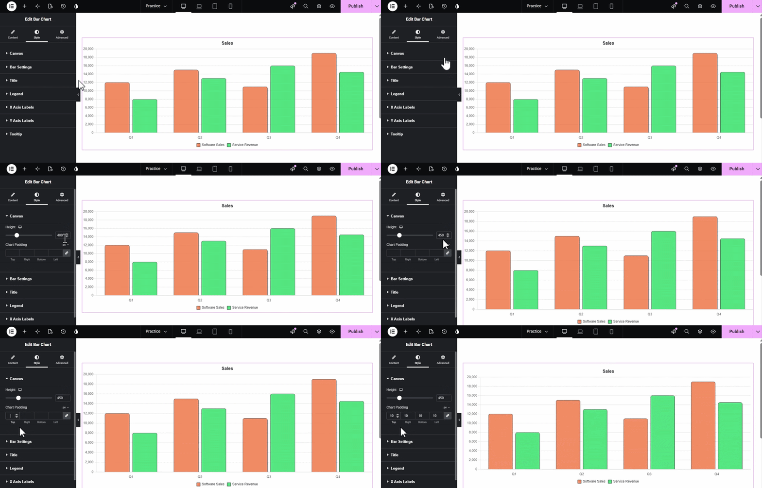
This section controls the overall dimensions and spacing of the chart area.
- Height: Use the slider or input field to set the specific height of your chart (e.g., 400px).
- Chart Padding: Adjust the internal spacing (Top, Right, Bottom, Left) around your chart to ensure it sits perfectly within your layout.
2. Bar Settings
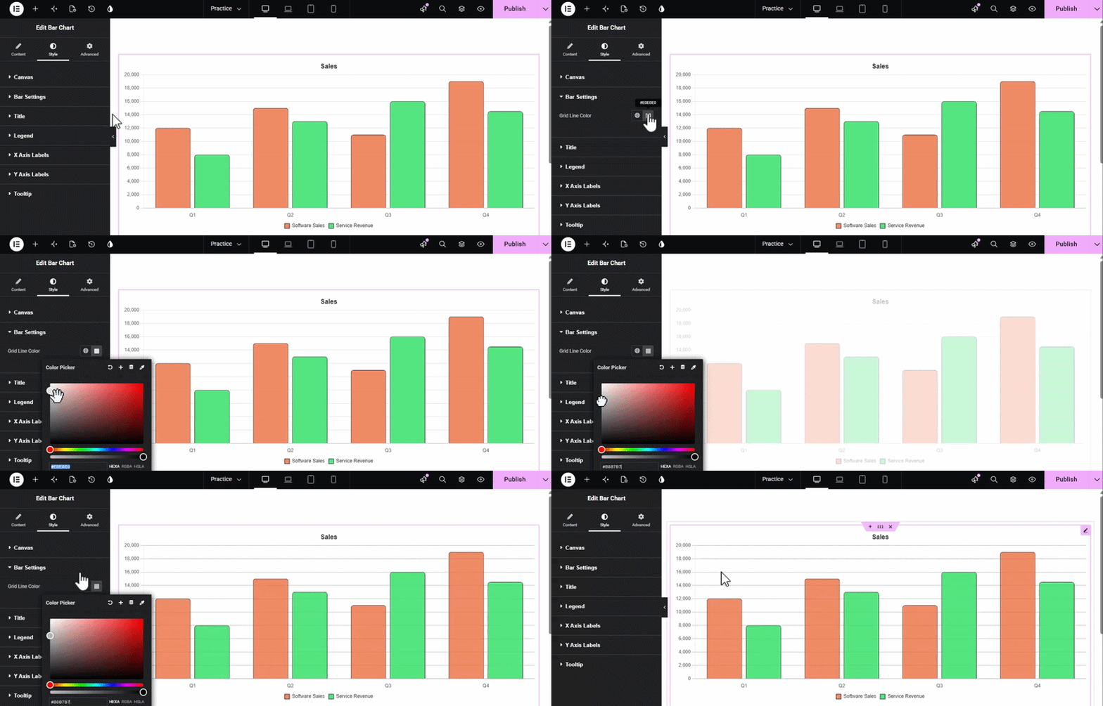
This section focuses on the styling of the bars and background elements.
Grid Line Color: Select a custom color for your X and Y axes grid lines to make them subtle or prominent.
3. Title
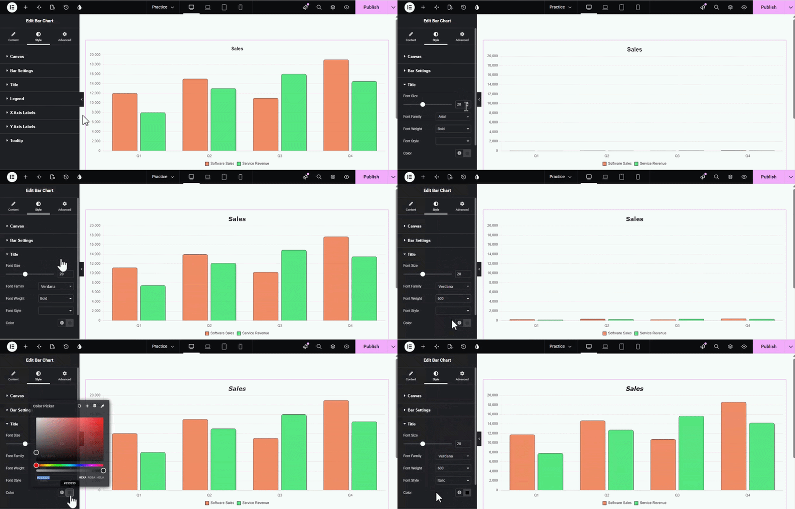
Style the chart heading to ensure it stands out.
- Typography Controls: Customize the Font Size, Font Family, Font Weight (e.g., Bold), and Font Style.
- Color: Choose a specific color for your chart title text.
4. Legend
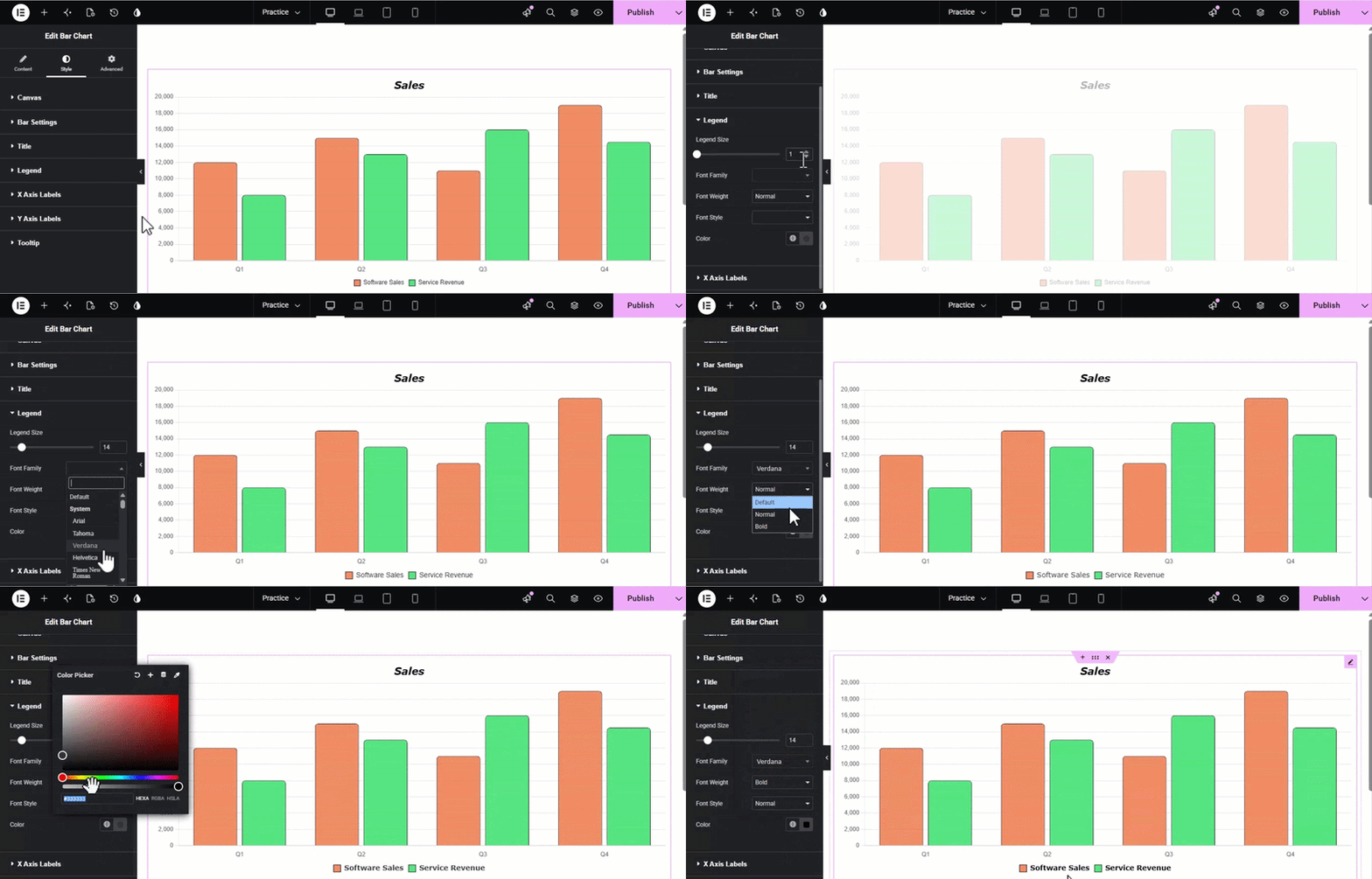
Customize the appearance of the data legend for better readability.
- Legend Size: Set the font size for the legend text.
- Typography & Color: Full control over the Font Family, Weight, Style, and Text Color of the legend items.
5. X and Y Axis Labels
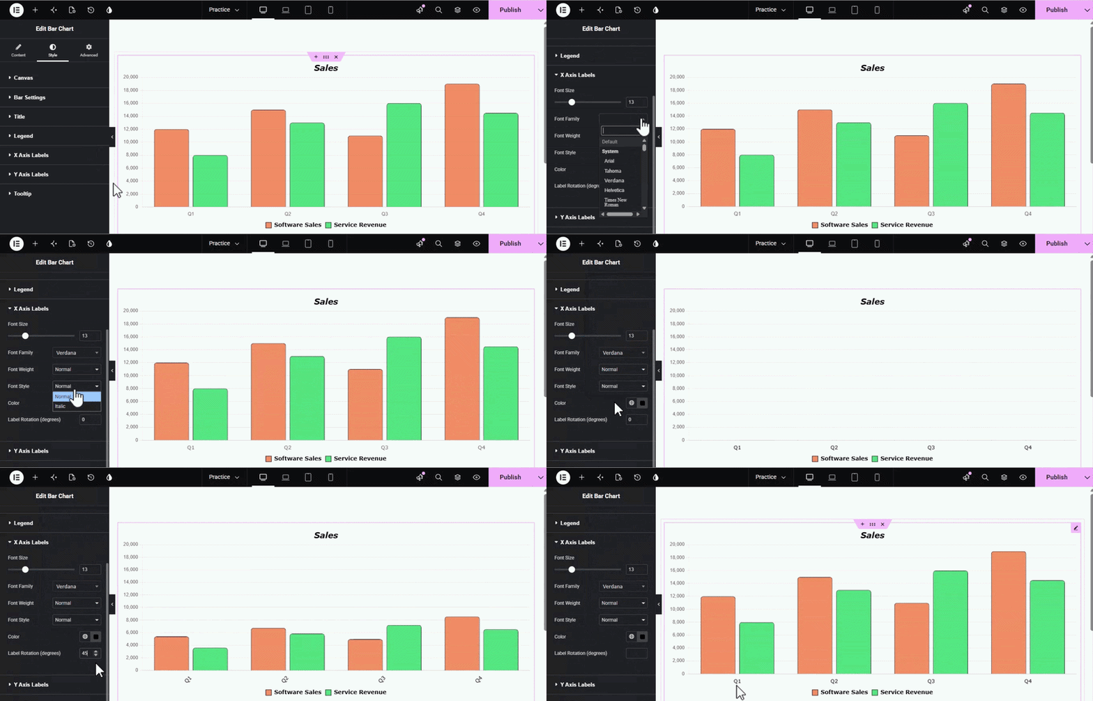
Refine how your category labels appear at the bottom (or side) of the chart.
- Typography: Set the Font Size, Family, Weight, and Style.
- Color: Choose the color for your X-axis labels.
- Label Rotation (degrees): If you have many categories, use this setting to tilt your labels (e.g., 45 or 90 degrees) to prevent overlapping.
6. Tooltip
Customize the floating box that appears when a user hovers over a bar.
- Box Styling: Control the Background Color, Border Color, Border Width, and Padding.
- Pointer Settings: Adjust the Caret Size (the small triangle pointing to the bar).
- Interaction Mode: Use Tooltip Mode (e.g., Nearest) to determine how the tooltip triggers relative to the mouse position.
- Content Styling: Separately style the Title Font Size/Color and the Body Font Size/Color within the tooltip box for clear data hierarchy.
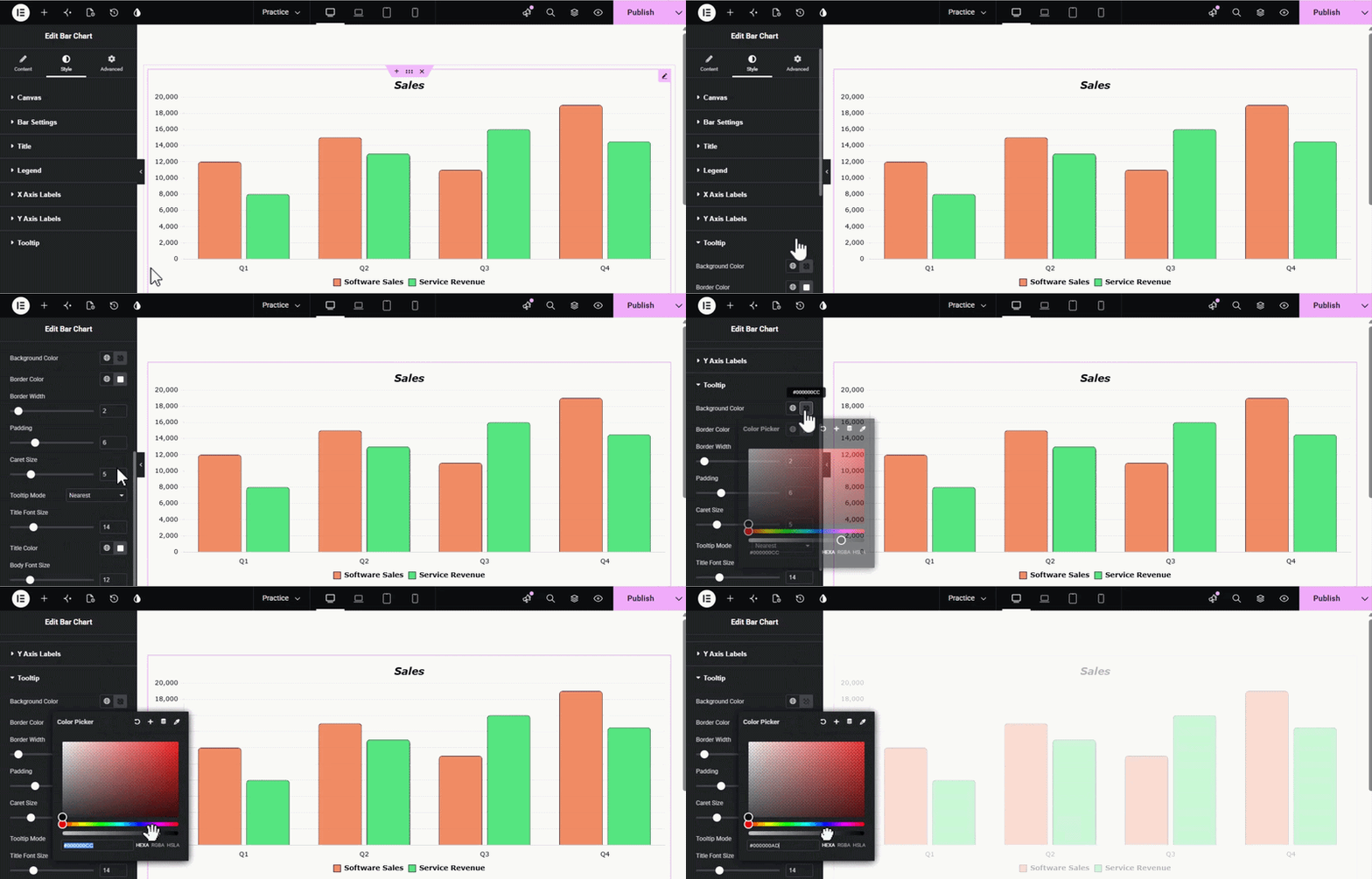
And your pixel-perfect Elementor bar chart is ready. Need more help? Explore our complete set of Elementor widgets or check out our other data-focused tools like the Line Chart widget.