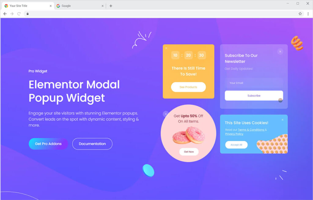
Xpro Elementor Addons are filled with amazing widgets, features, and theme templates that allow developers to create a fully functional and appealing WordPress website. Model Popup by Xpro Elementor is another amazing widget that showcases popups on the website.
Elementor Model Popup is an excellent widget to be used when you want to showcase any important information to your website users. Display the popup after the user clicks somewhere on the website, enters, or before exiting the website.
How to Install Modal Popup Widget
Requirement
You need to install and activate the pro version by Xpro Elementor Addons to use this amazing widget. If you already have the plugin installed, just ensure the Modal Popup Widget is ‘Enabled’, so you can find it in the Elementor editor.
To enable the widget, simply follow these steps:
Step 1
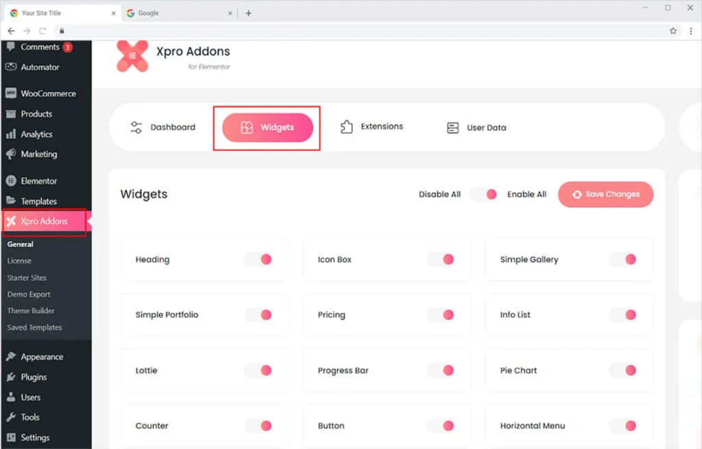
Click on the Xpro Addons option available on the WordPress Dashboard Menu.
Step 2
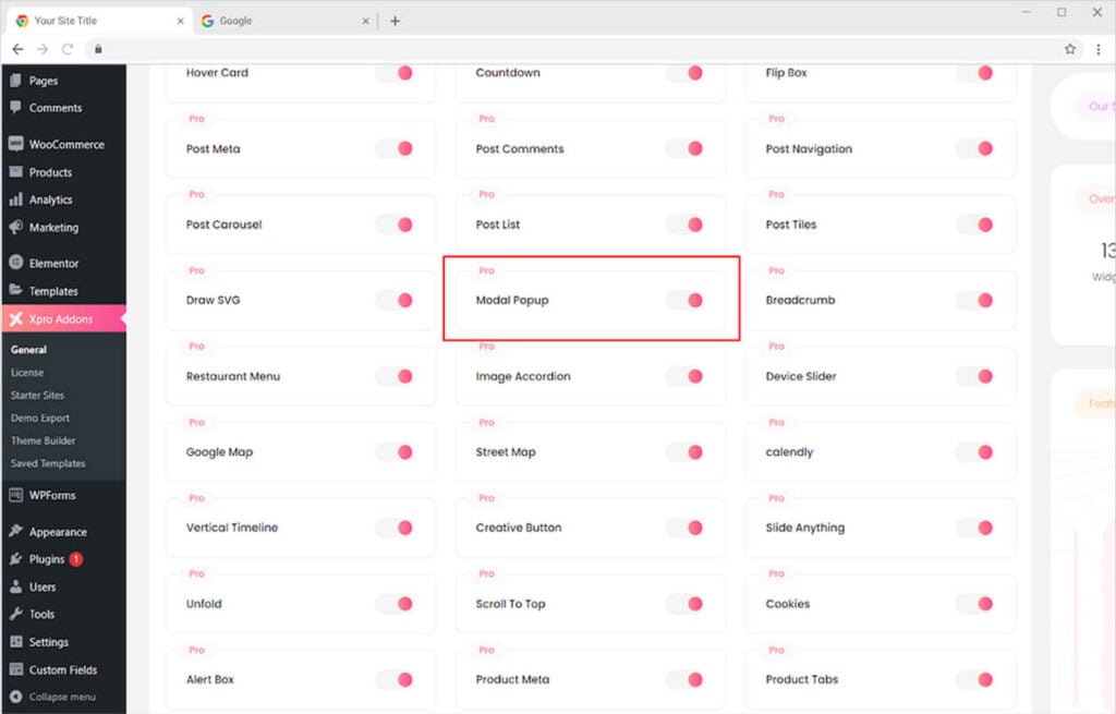
From the Xpro Addons Dashboard, click on the Widgets Tab, find the Modal Popup widget, and finally, toggle the button ON to enable it.
How to Use Modal Popup Widget for Elementor
Design and showcase amazing popups for your viewers to see and understand your latest offering or any other task that you want them to perform. Create and display any kind of content in the popup. Customize the button and display box. Let’s talk further about how you can use this amazing widget.
Step 1
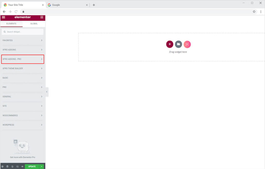
Click on the Xpro Addons – Pro section available in the Elementor Editor.
Step 2
From the Xpro Addons section, find and simply drag’n’drop the Modul Popup widget on your desired page location.
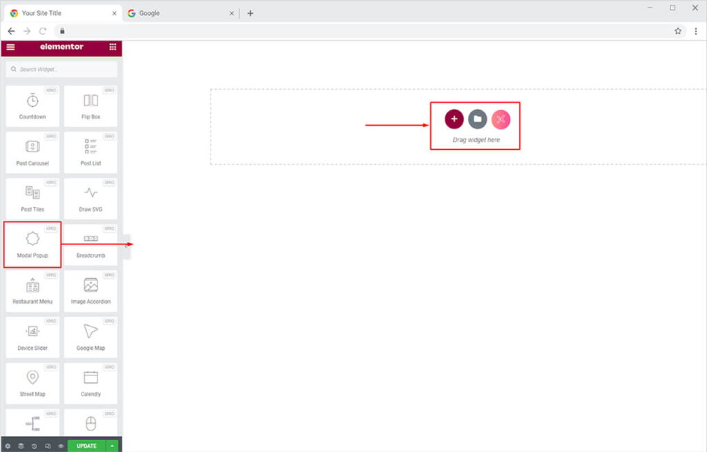
This is the default view of the widget when you select and drop it into the page.
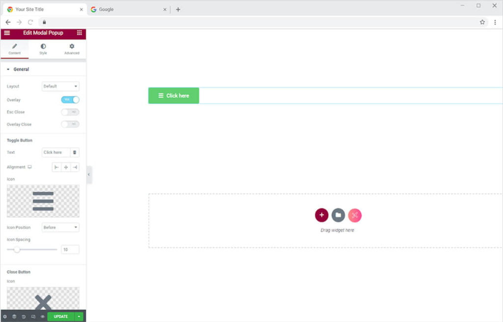
How to Add Content in the Xpro Model Popup
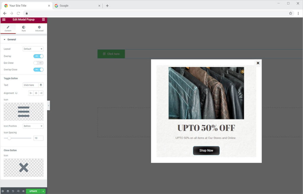
Click on the button on the page to open up the popup box. Now click on the edit icon to add content to the popup.
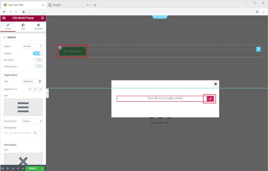
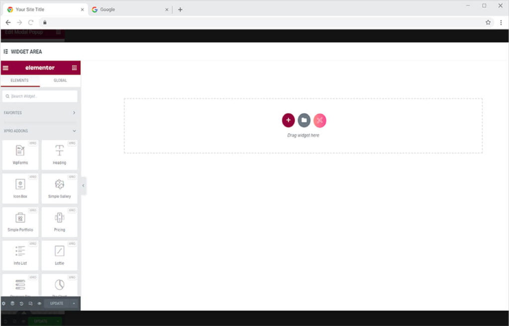
An Elementor page will open up from where you can include any content in the popup.
How to Change the Layout of the Xpro Modal Popup Widget
Xpro Elementor provides four different layouts to present popups. Each layout has a special way of presenting the content so choose what you find best.
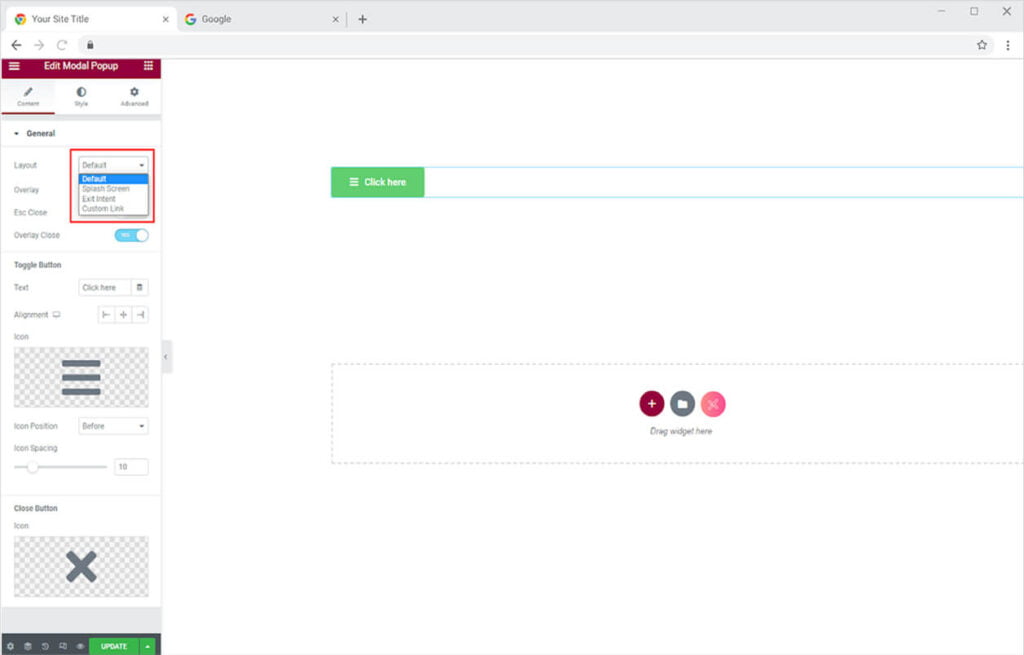
Default: The default layout provides a button that will show the popup when the user clicks on it.

Splash Screen: The splash screen layout allows the widget to open up after a few seconds visitors enter your site. You can manage the time after which the popup will show up.

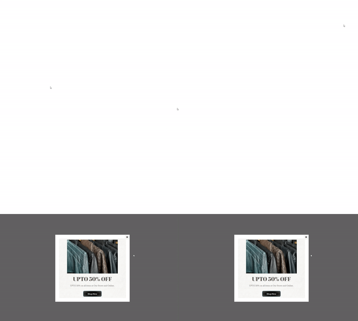
Exit Intent: The exit Intent layout option allows the popup to show before the user exit the website. The content will show up as the user drag mouse to exit the site.
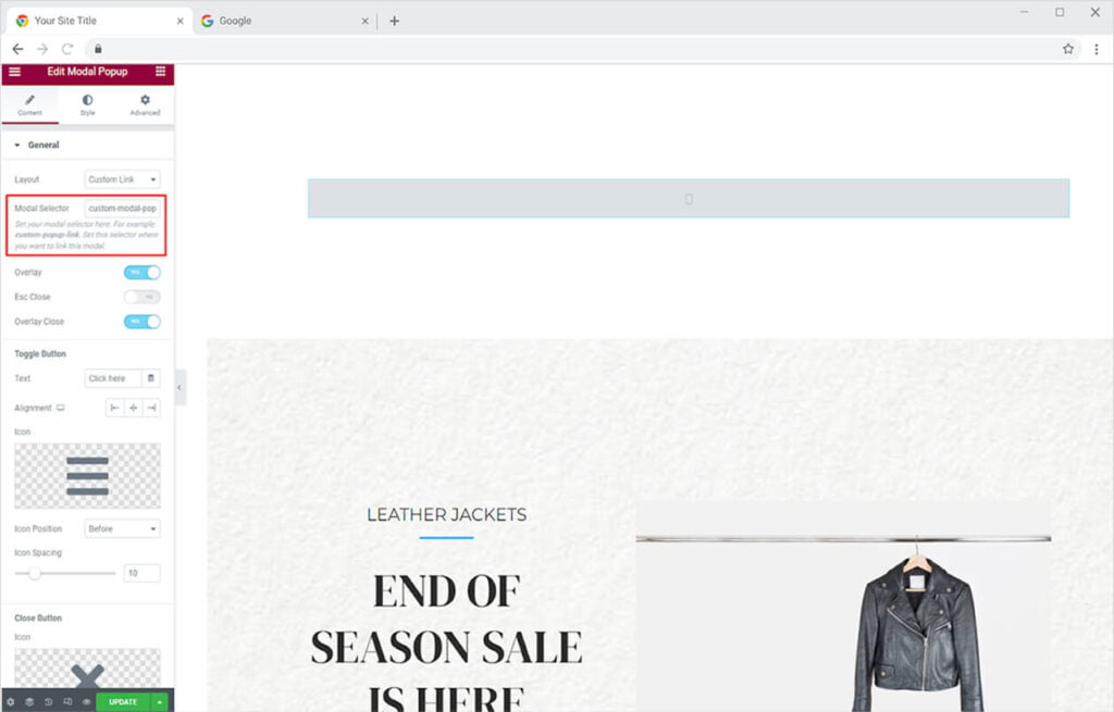
Custom Link: The custom link layout option allows you to add popups on any content or widget. Copy the link from the Modal Selector bar. Then click on the element and go to the advanced settings and paste the link in the CSS Classes bar
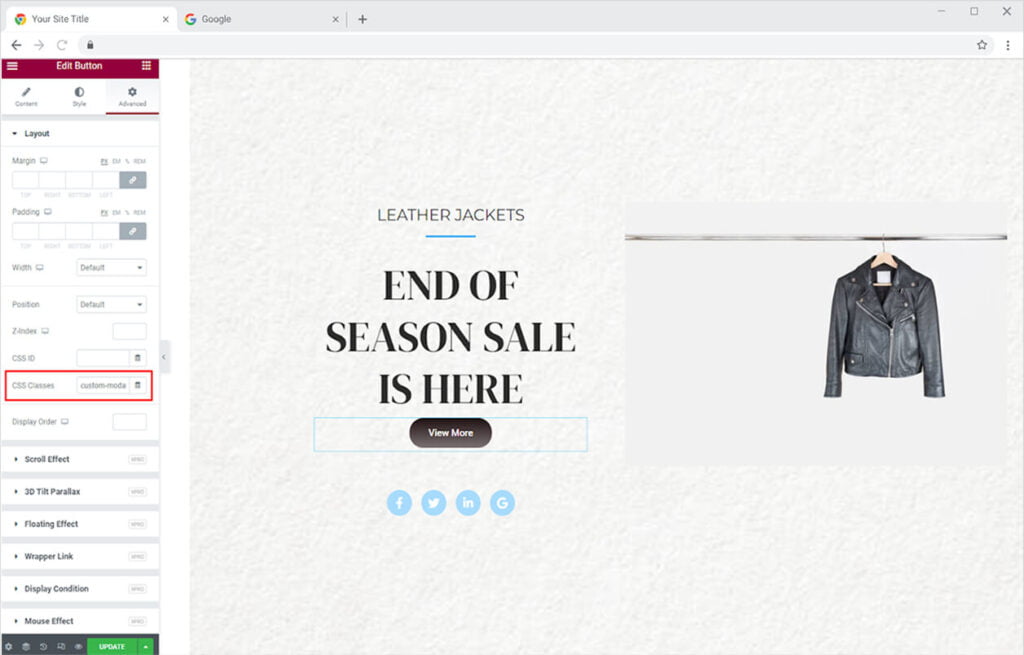
Now the popup will display when you click on the content.
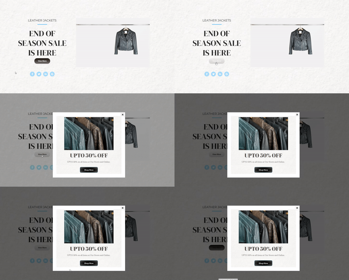
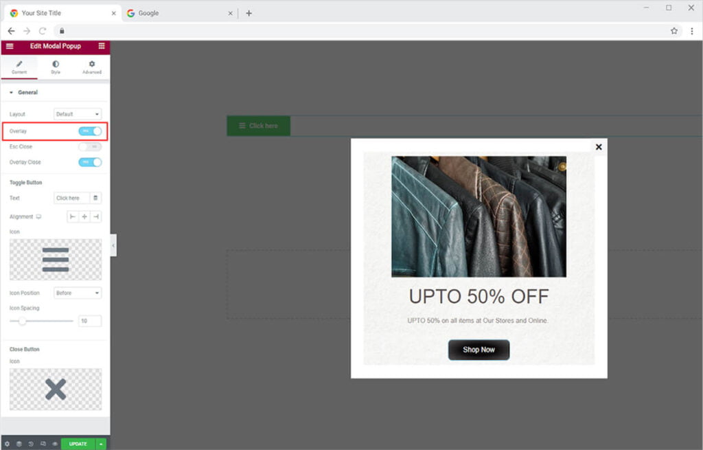
After choosing a layout and designing a popup, you perform different settings like adding an overlay to the popup.
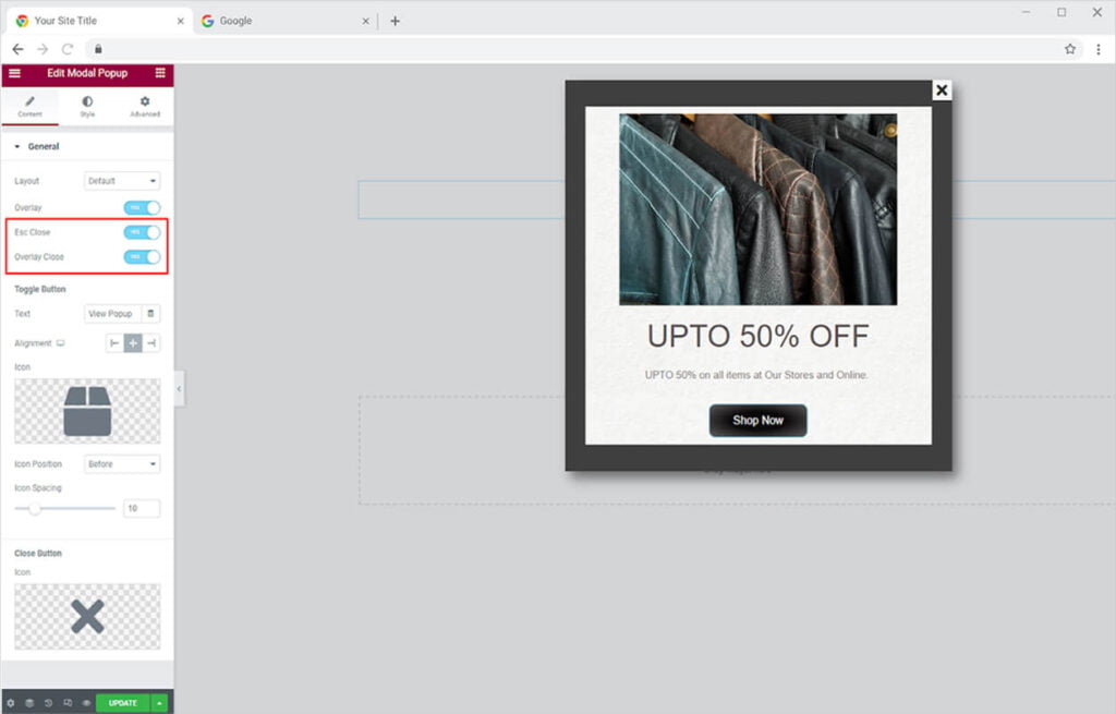
Decide how website visitors will close the popup. In addition to clicking on the close icon, you can activate Esc Close, which allows users to close the popup box by using the Esc key on their keyboard. You can also include Overlay Close, which allows users to close the box by clicking anywhere on the screen other than the popup box.
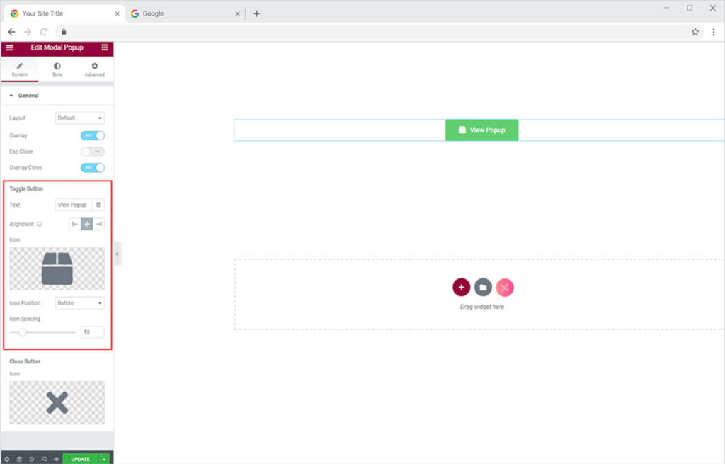
If you have chosen the default layout then you can edit the button. Change the content inside the button by entering text in the text bar. Set the alignment of the button to left, right, or center of the screen. Choose to include an icon and adjust its position and spacing.
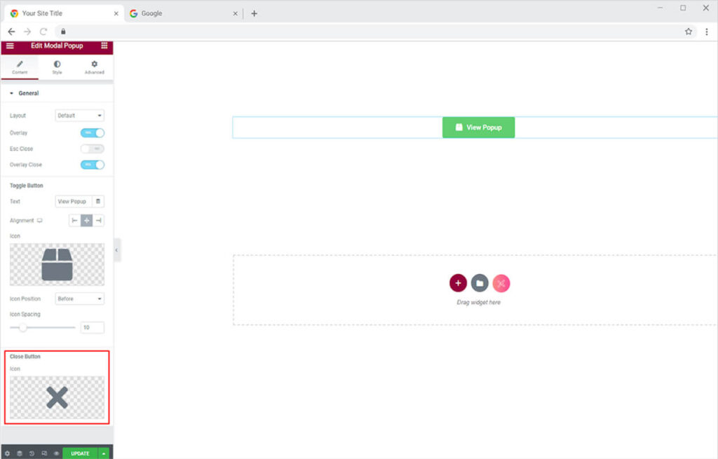
Choose to Change the close icon from the last option in Content Section.
How to Style Xpro Modal Popup Widget
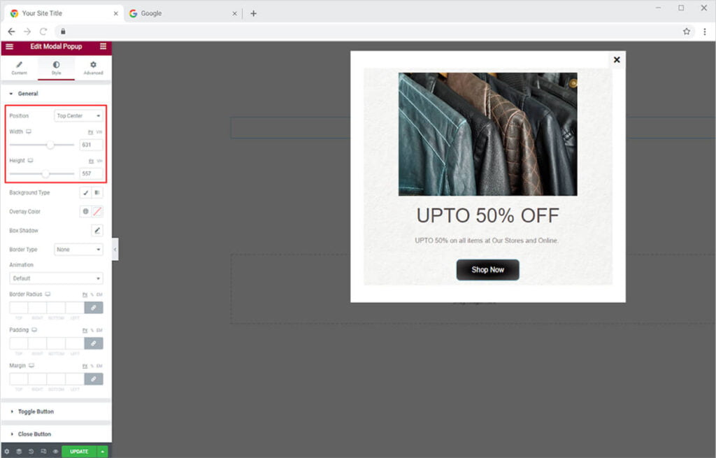
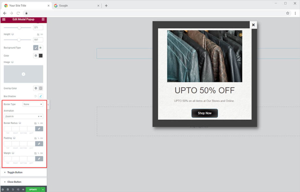
Begin styling by adjusting the position of the popup box. Additionally, you can change the size of the box by adjusting the width and height.
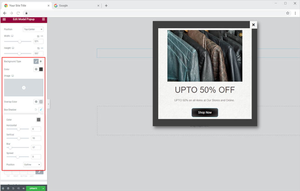
Add a background and an overlay color to the box. Give the box a shadow and control its direction and appearance.
You can also modify the box’s border to make it more visually appealing. There are five different types of borders to pick from.
- None
- Solid
- Double
- Dotted
- Dashed
- Groove
Change the border’s width and radius to suit your needs. You can also alter the color of the border. Moreover, there are amazing animations to introduce your popup to visitors.
How to Style the Button
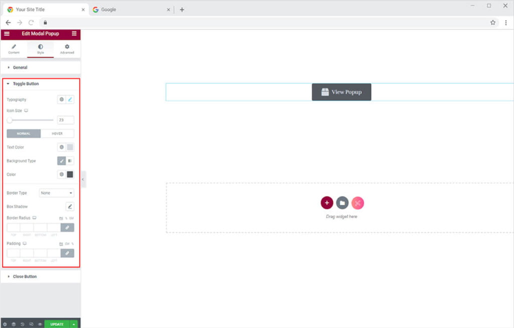
If you have chosen to include the default layout then you can style the button. Change the typography of the text in the button and adjust the size of the icon. Color the text and background of the button for a normal state and hover. Include a border and adjust its appearance.
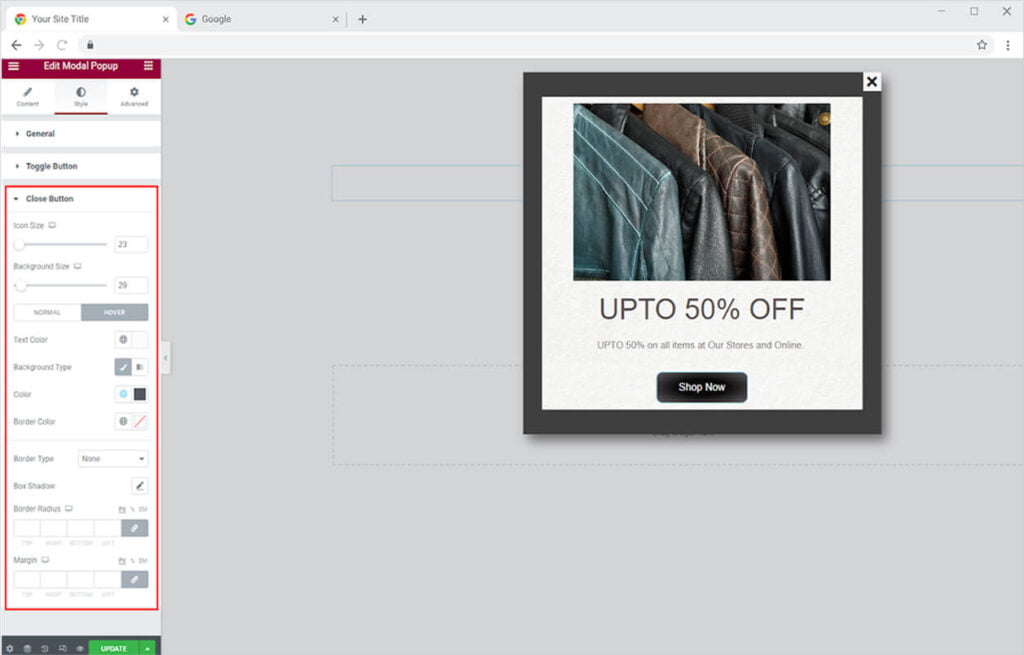
Style the close button in the popup box to your liking. Adjust the size of the icon and the background. Color the text and background for normal and hover state. Add a border and adjust its appearance.
Best Modal Popup for Elementor
We hope you fully understand the functionality and complexity of the Modal Popup widget for Elementor. Test your imagination to make your site look its best by utilizing this widget. Combine Modal Popup with Cookie widget for Elementor and enhance user experience.
Xpro Elementor Addons offer a wide range of widgets, Elementor templates, and features that help you develop an attractive site. Check our 50+ free Elementor widgets which are enough to create a professional WordPress website. If you want to explore and add more attractive Elementor widgets then check our complete list of Premium Elementor widgets and download our Pro Elementor addons right now.