Xpro Woo Checkout widget for Elementor
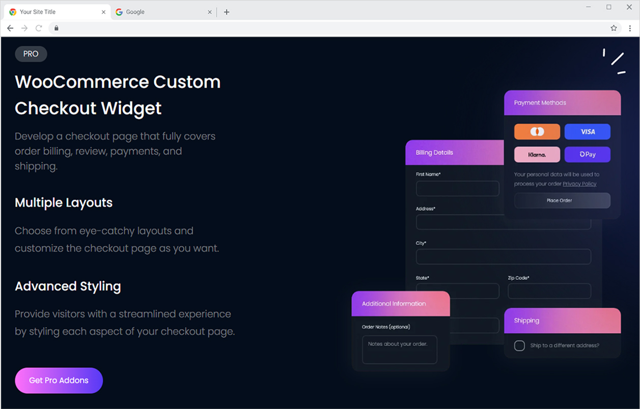
After a customer selects a product they want to purchase and puts it into the cart, he or she will be guided to the checkout page where they will be asked for information about shipping. Woo Checkout widget for Elementor is another widget offering in the Xpro WooCommerce product widget collection that assists you here as it allows developers to easily create a checkout page.
The Elementor WooCommerce Checkout widget allows a developer to display a checkout information table without the requirement for any fields to be created. All of the necessary fields and layouts are pre-built, and all you have to do is customize the display to your preference.
Xpro offers a range of customization in every widget to personalize it according to your requirement. Drag and drop the widget to include it in your checkout page and further perform styling to each field in the checkout layout.
Xpro Elementor Addons include a variety of widgets and features that enable developers to efficiently create an appealing site. Xpro recognizes the importance of an online business and offers a variety of Xpro WooCommerce widgets to help businesses establish effective online websites.
How To Install Xpro Woo Checkout Widget for Elementor
Requirement
Download and activate the WooCommerce plugin. You need to install and activate the Pro version by Xpro Elementor Addons. If you already have the plugin installed, just make sure the Woo Checkout Widget is ‘Enabled’, so you can find it in the Elementor editor.
To enable the widget, simply follow these steps:
Step 1
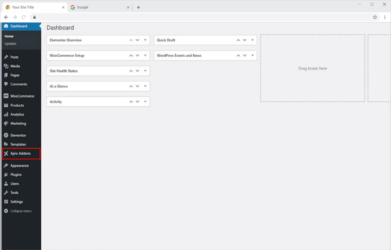
Click on the Xpro Addons option available on the WordPress Dashboard Menu.
Step 2
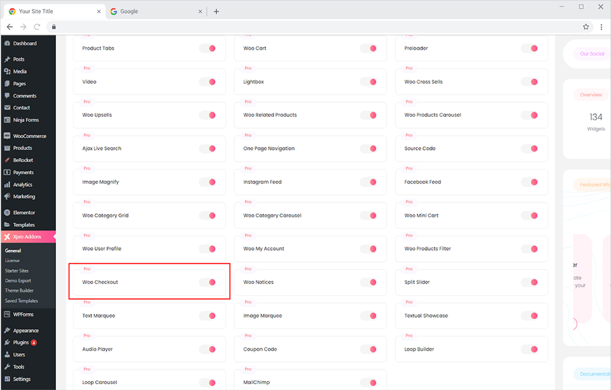
From the Xpro Addons Dashboard, click on the Widgets Tab, find the Woo Checkout widget, and finally, toggle the button ON to enable it.
How to Use Xpro Woo Checkout Widget
Create a checkout page from different layouts that consist of all the fields such as customer contact information, billing address, payment, shipment, etc. Customize the layout display with advanced styling options. In order to use any Xpro Woo Product widget, you must install and activate the WooCommerce plugin in your WordPress dashboard.
Step 1
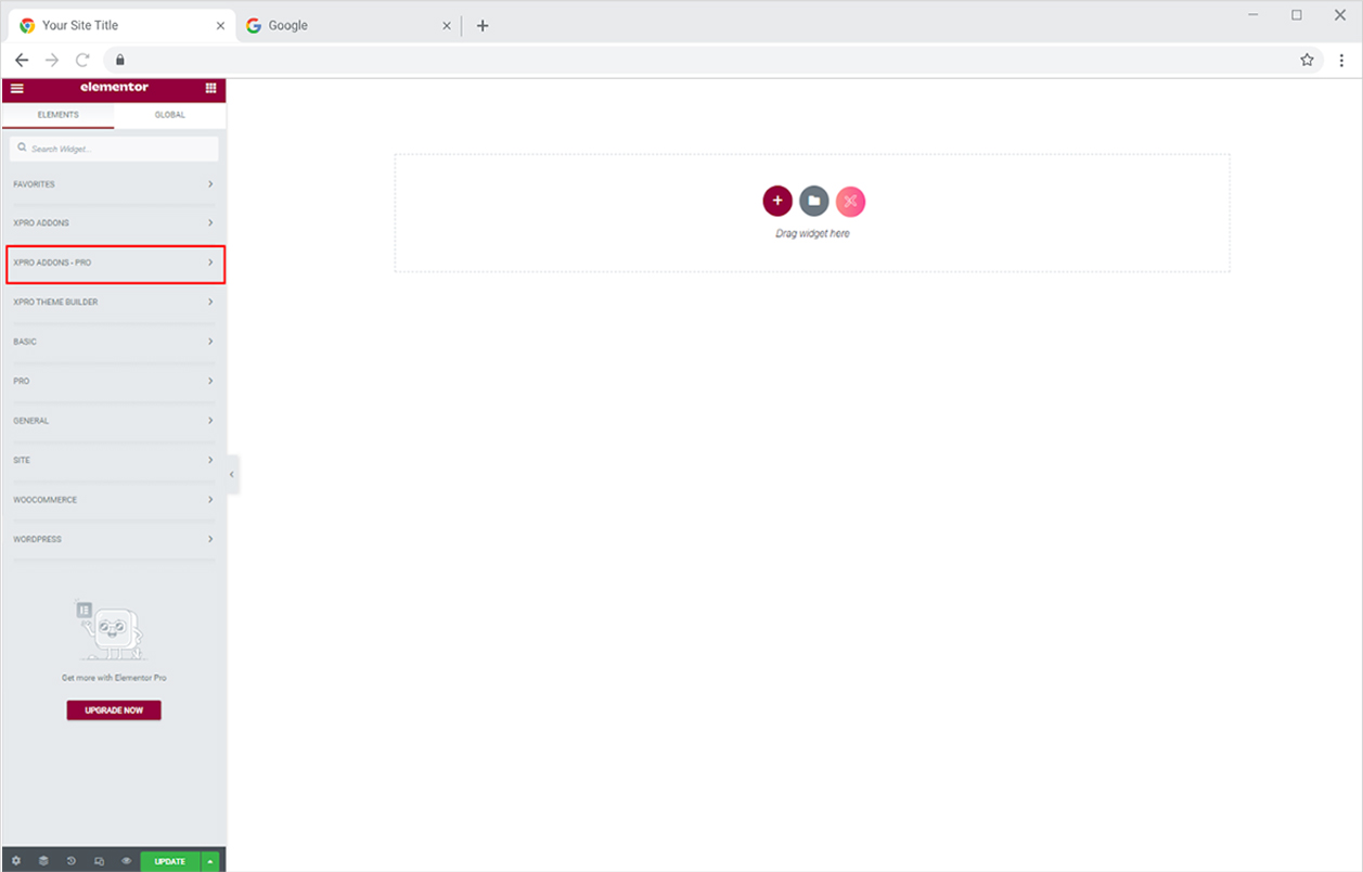
Click on the Xpro Addons – Pro section available in the Elementor Editor.
Step 2
From the Xpro Addons – Pro section, simply drag’n’drop the Woo Checkout widget on your desired page location.
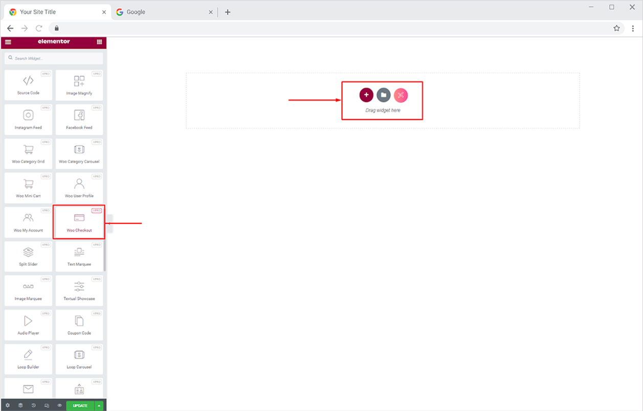
The default view of the widget after you drop it into the Page builder will look like this.
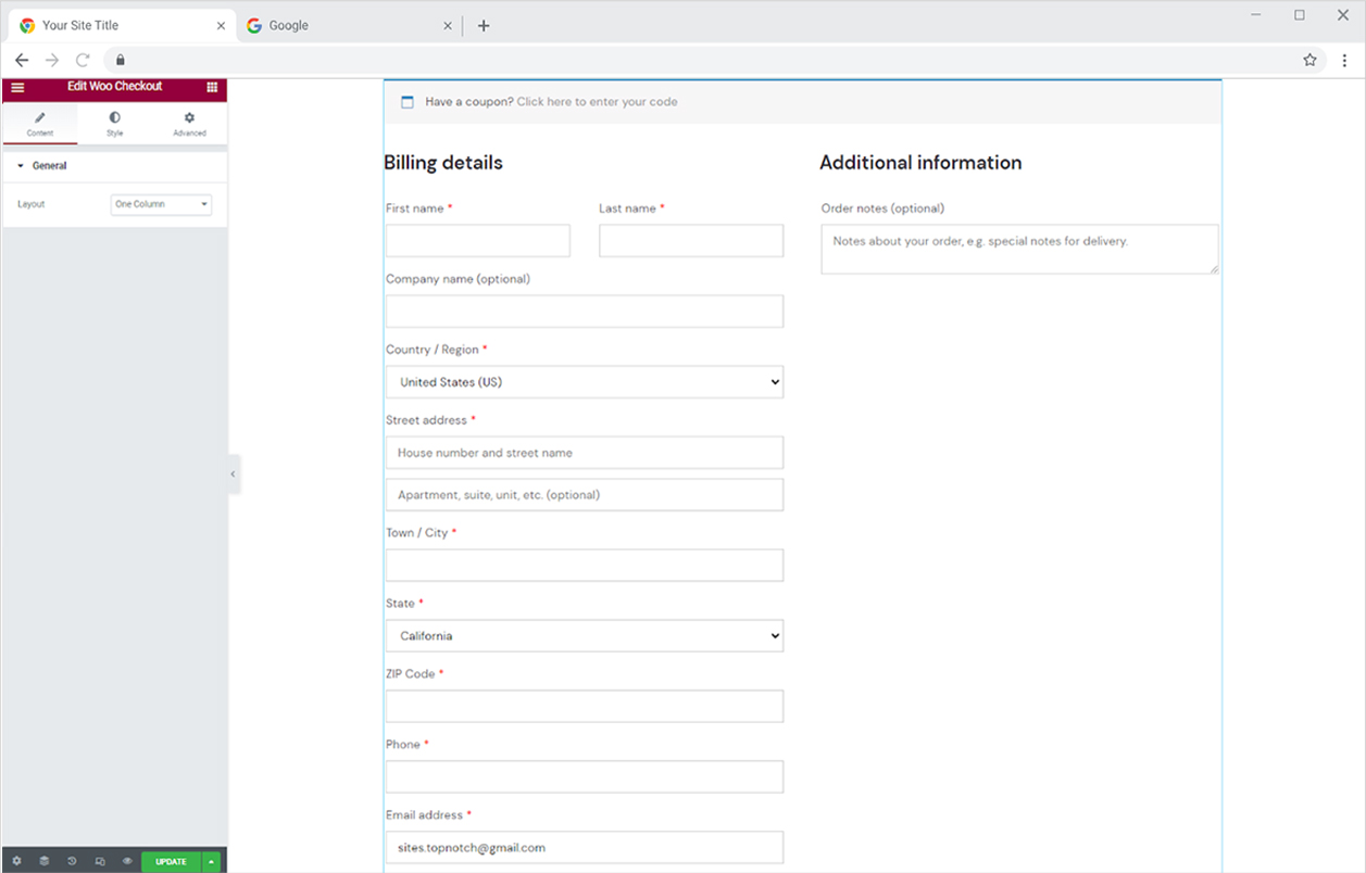
Content Section
Select the layout of one column or two columns. If you select two column layout then you will have further options to customize it.
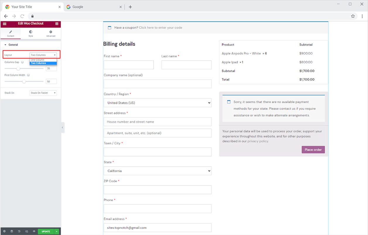
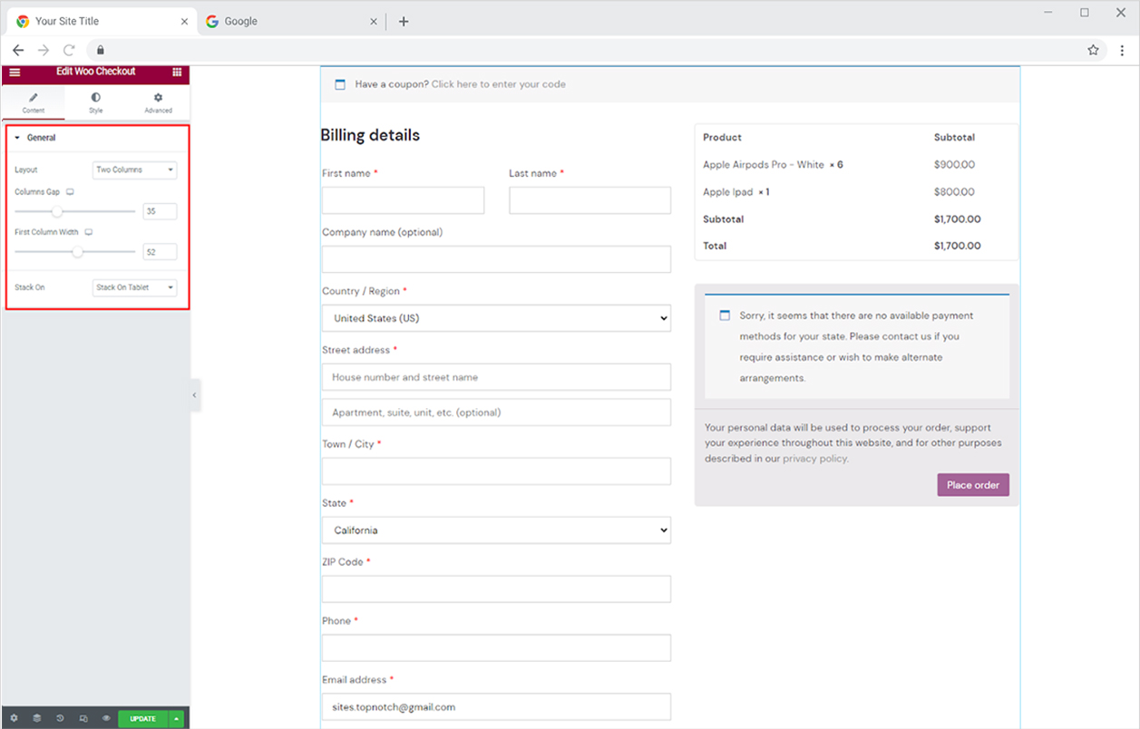
If you selected two columns then adjust the gap between the column and the first column width. Stack it on a tablet or mobile.
How to Style Xpro Woo Checkout Widget
Adjust the space between sections from the Space Between option. Give a background like color or image to the sections from the background type. If you want a background for the whole section then select the section, go to the style tab, and add a background.
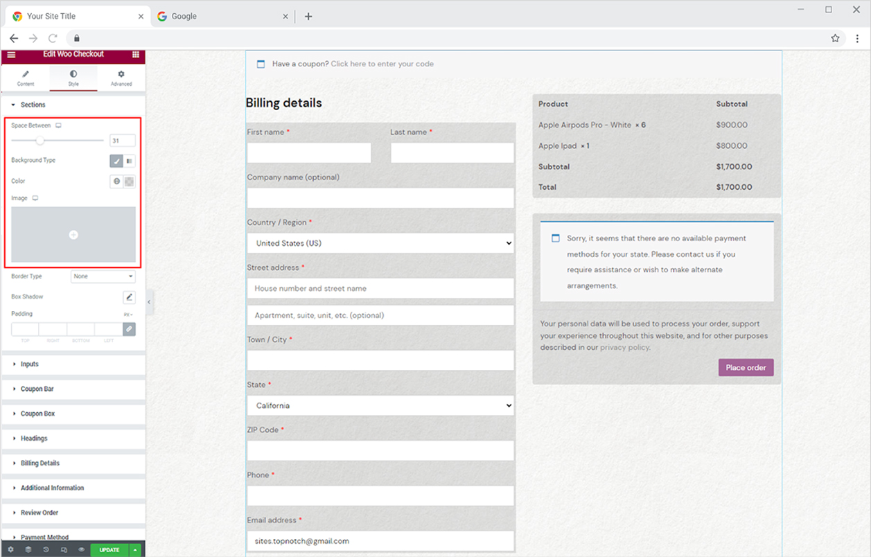
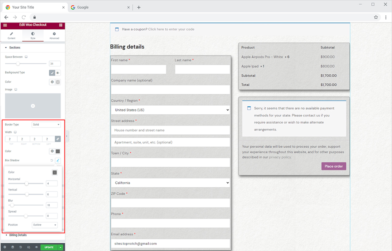
Furthermore, you can add a border to the sections by selecting a border type between solid, double, dashed, dotted, and grove. After you add a border, you can customize its width and color. You may also create a shadow from the shadow box and further adjust its position and appearance.
How to style Input in Elementor Woo Checkout Widget
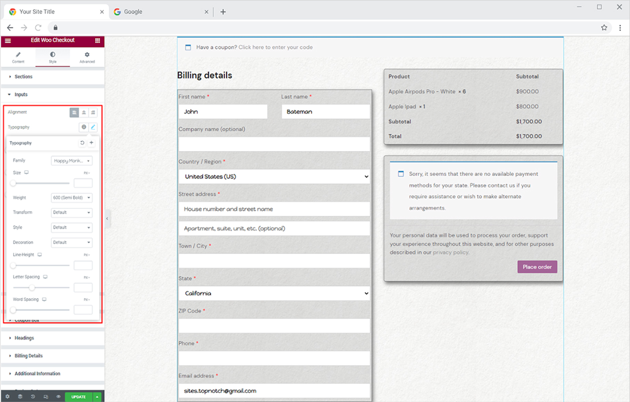
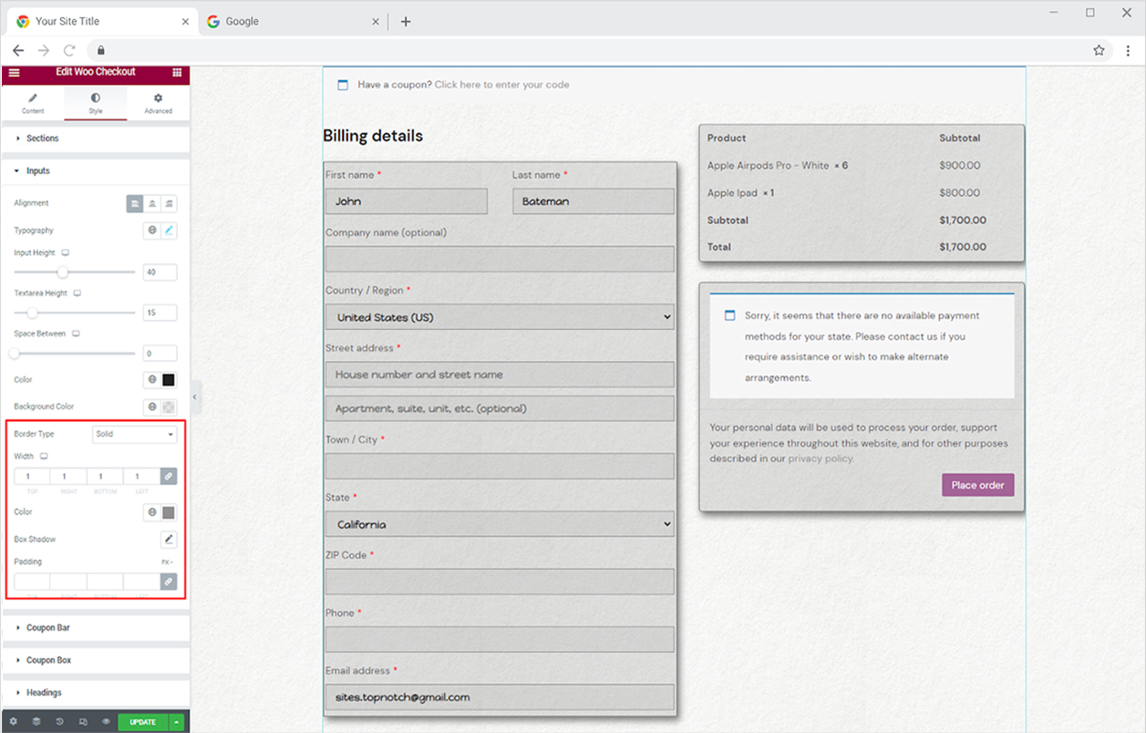
Customize the display of text input that will be added by the customers. Adjust the alignment of the text to the left, right, or center of the input box. Style the text from the typography box where you can change the font, size, weight, letter spacing, and other text customizations.
Adjust the height of the input field and the space between each field using the input height and Space Between options respectively. Furthermore, color the input text and background field.
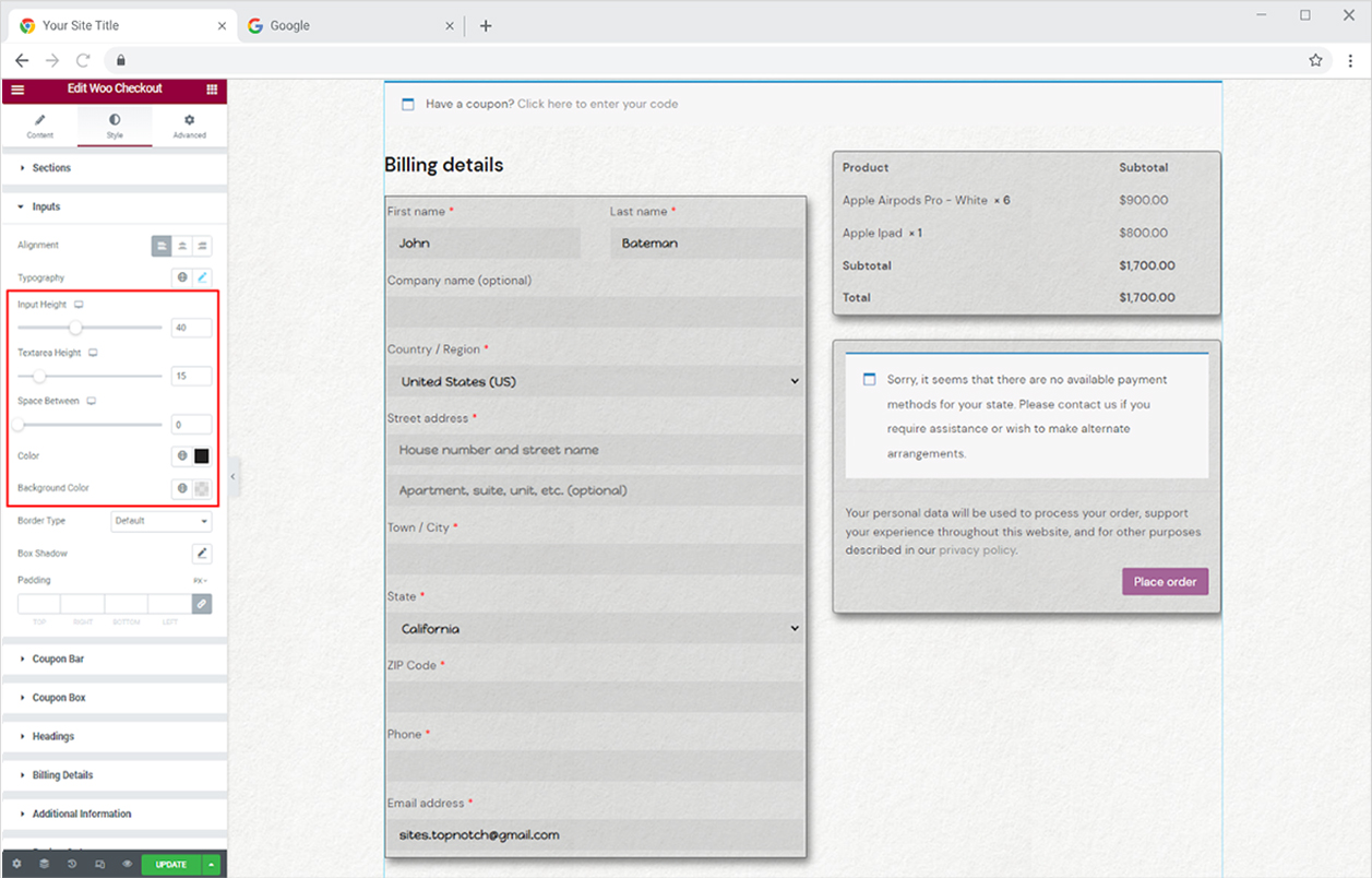
You may also add a border to each field by selecting a border type, and you can create a shadow using the shadow box.
How to Style Coupon Bar in Woo Checkout Widget for Elementor
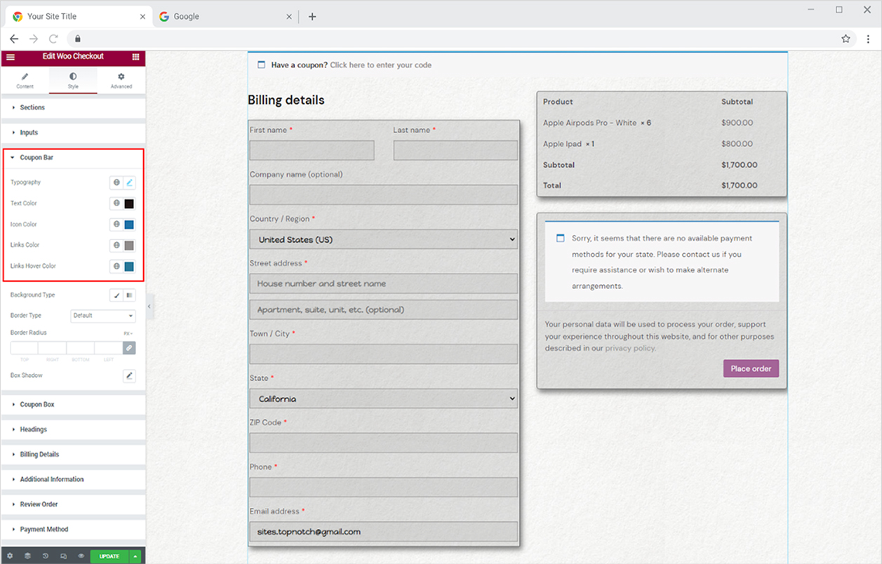
From the Coupon Bar, you can customize the following
Typography: Style text display
Text Color: Select a color for the text
Icon Color: Select a color for the icon
Link Color: Select a color for anchor text
Link Hover Color: Select a color for anchor text when the user moves the mouse above it.
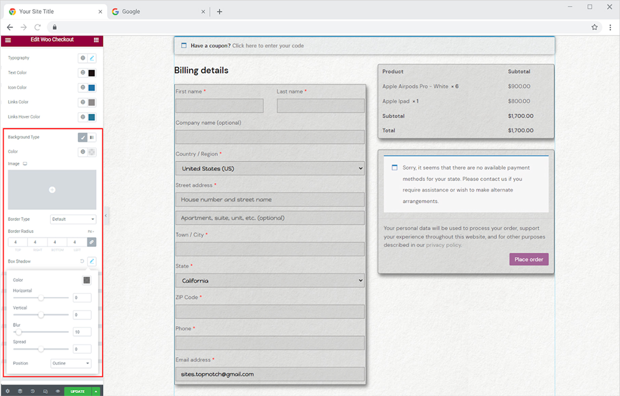
Make a background for the coupon by adding classic or two layers of gradient colors. You may go in advance and add an image. Moreover, you can make a border and add a shadow.
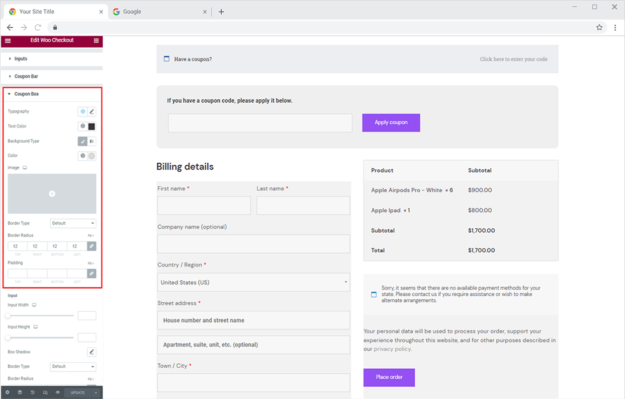
If you have offered any coupon code to your customers by which they can avail of discount, the Xpro widget displays a coupon box where they can add coupon code. Style the coupon box by customizing the typography and color of the box description and text field. Moreover, you can add background colors or an image. You may add a border by selecting a border type and further customizing width, color, and radius.
Under the Input section, you can customize the input field size from its height and width option. You have the option to make a shadow from the shadow box and border by selecting a border type. Just like before, you have the option to style shadow and border appearance. Color the text and background of the field where the customer will input the code.
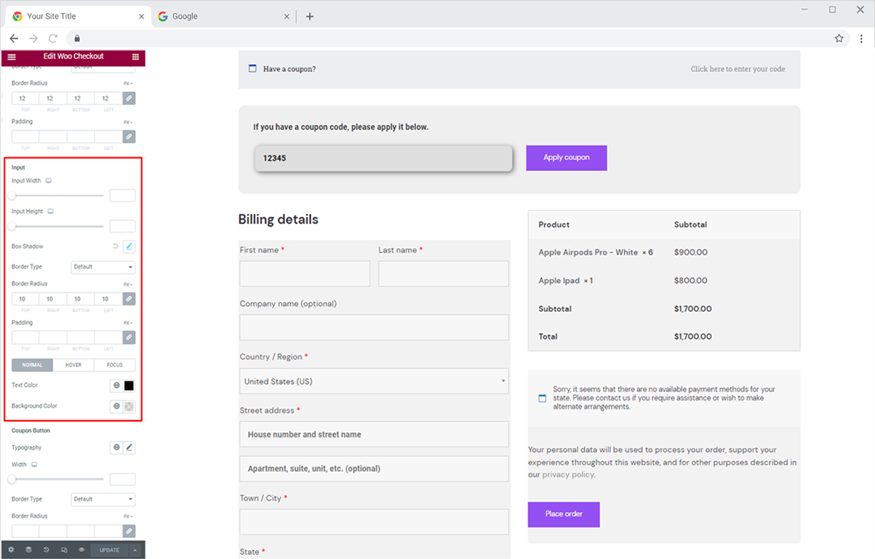
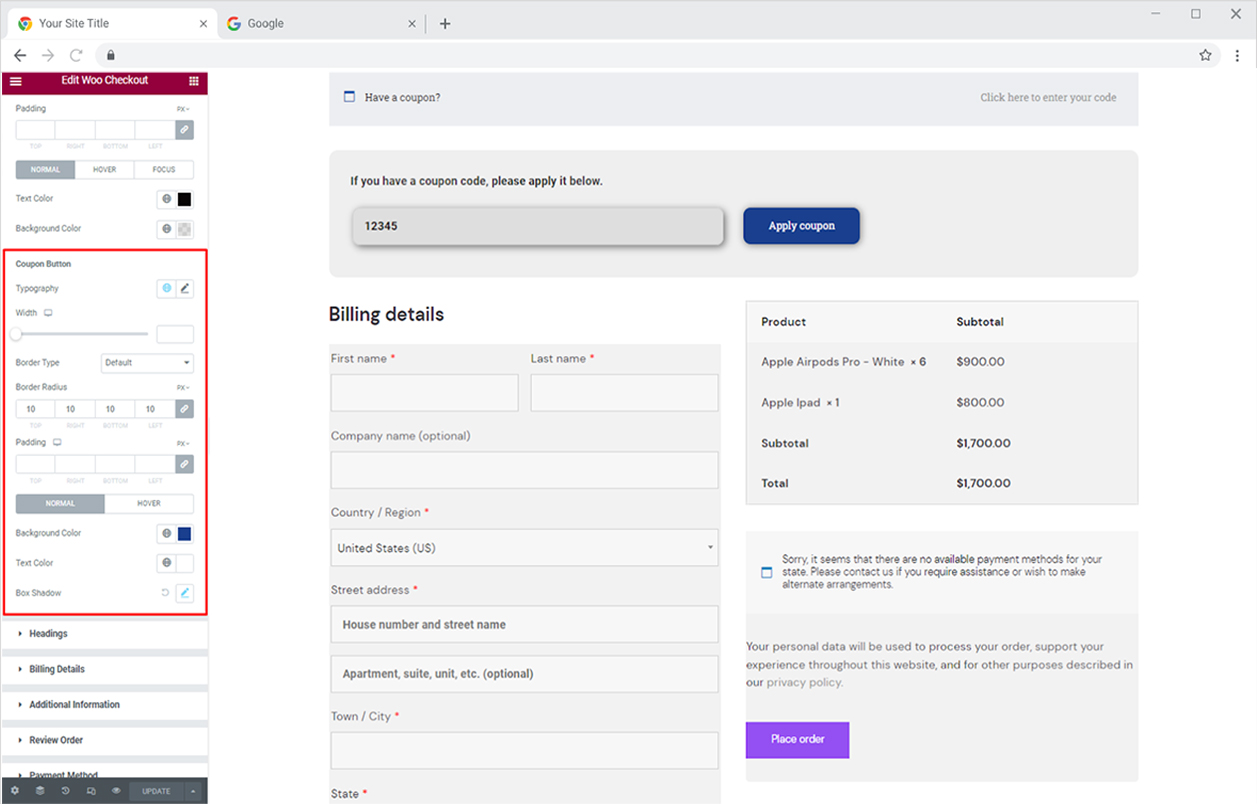
Style the “Apply Coupon” button that a customer will click on to activate the coupon after they add a code. Style the button with all the required customization options like typography, width, shadow, and border. Color the text and background in buttons for normal and hover display.
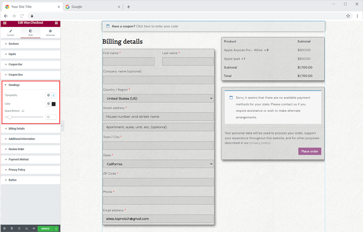
How to Style Heading in Xpro Woo Checkout Widget
Customize the heading display with typography and color. In addition, adjust the space between the heading and the bottom.
How to Style Billing Details in Xpro Woo Checkout Widget
Now coming to the billing detail section where customers add their information for billing and shipment. The first section allows you to customize the background with a classic color, gradient colors, and an image. You may further add a shadow and border.
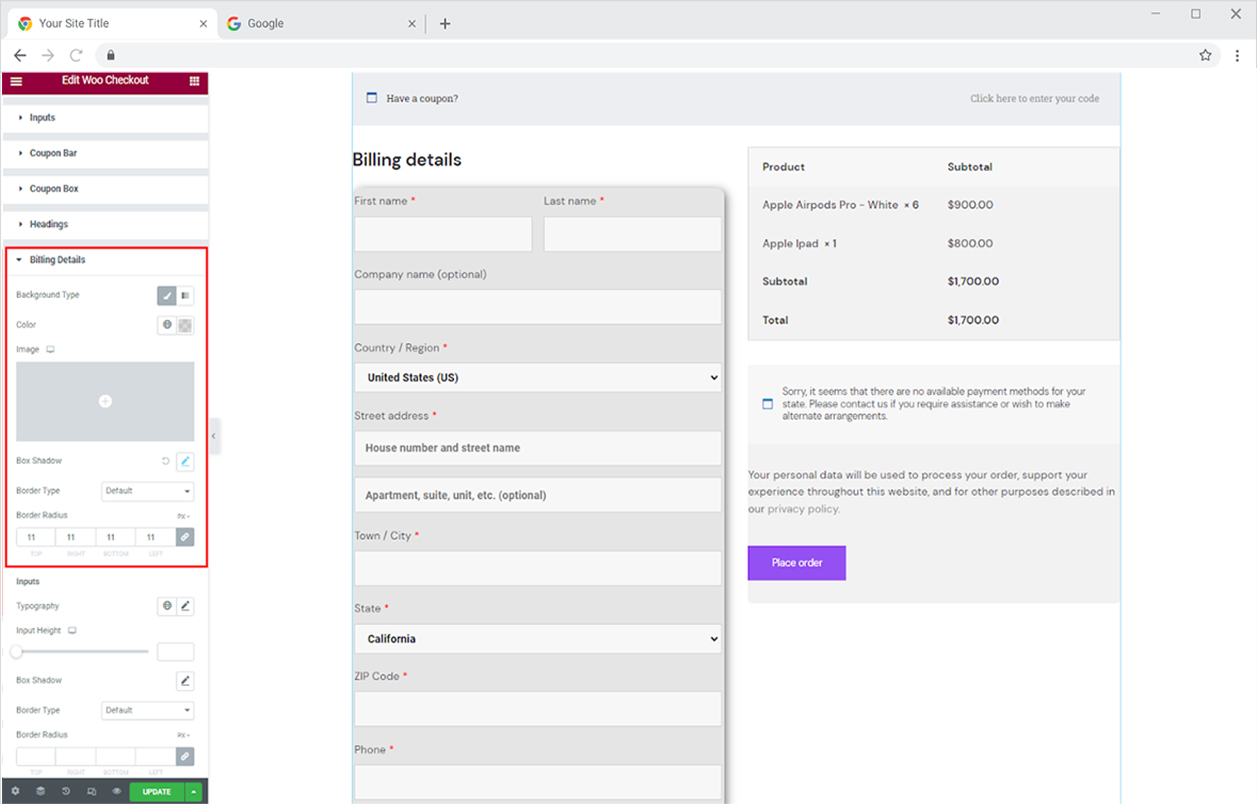
Personalize the fields in the billing details where a customer will put in their information. Style typography, width, shadow, and border from their respective option. Color the field background and text for their normal, hover, and focused display.
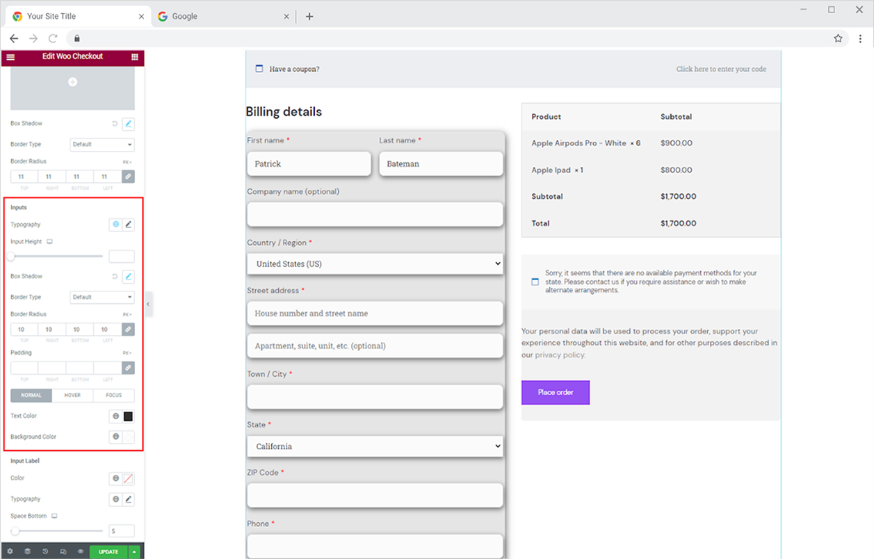
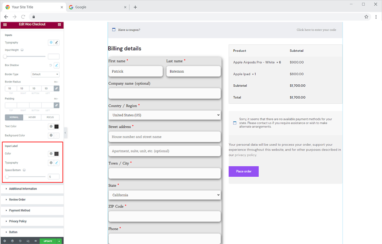
For the label above the fields, choose the text color and personalize its typography. Adjust the space between the label and the field.
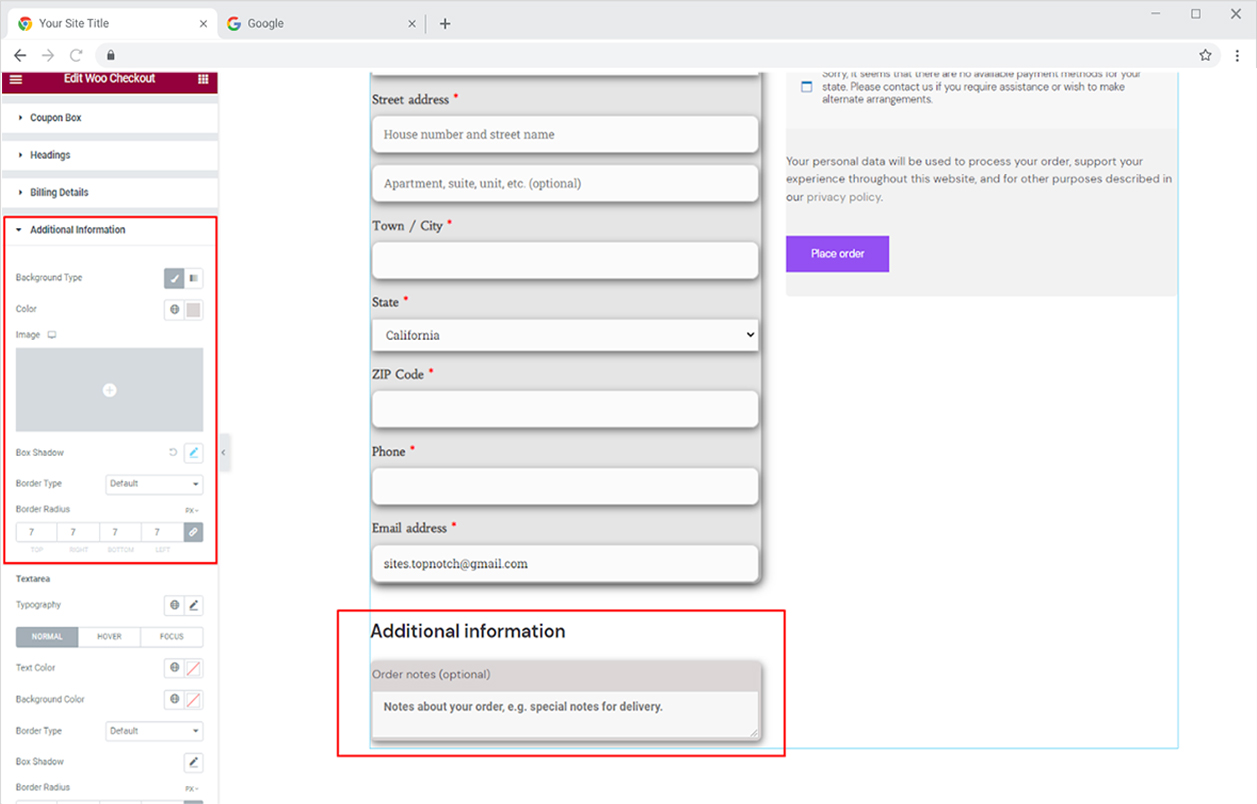
How to Style Additional Information Section in Xpro Woo Checkout
The additional information section allows customers to add any information or requirement for shipping. Style the background of the section with classic colors, gradient colors, or an image. You may make a shadow and border and enhance the appearance of the layout.
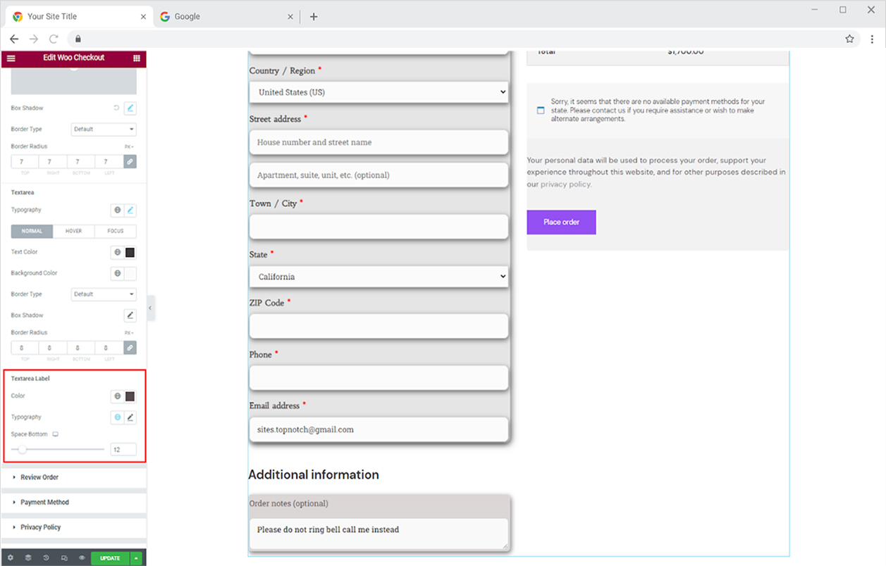
Customize the display of textarea within the additional information section. This area is used by customers to write information or instructions. Personalize the font with typography, color the text, and make borders and shadows. You can customize text color for normal, hover, and focused displays.
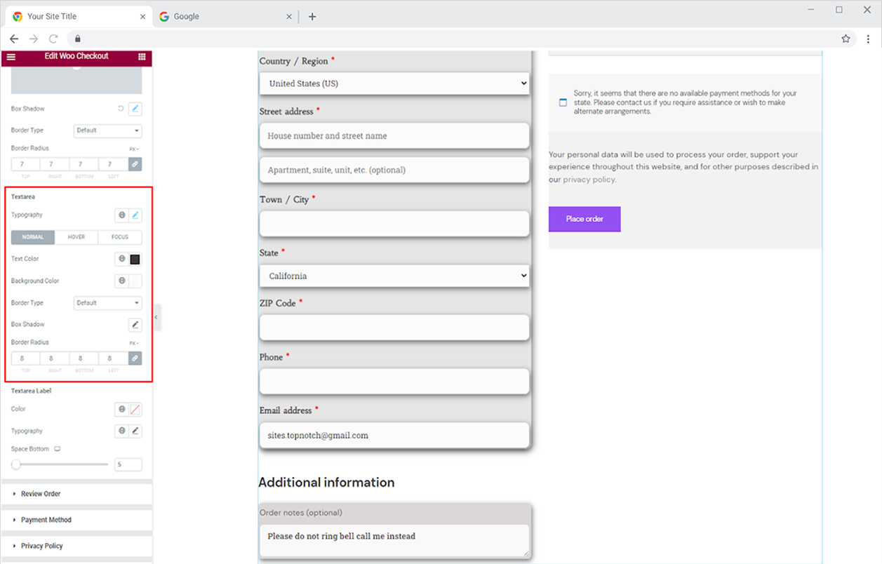
You can also customize the style of the text area label by personalizing its typography, and color, and adjusting space.
How to Style Order Review Section in Woo Checkout Widget
The checkout widget displays an order review section so customers can ensure that everything they ordered is in the cart and that no additional products have been added. Just like the rest of the sections, you can customize its typography, background, border, and shadow.
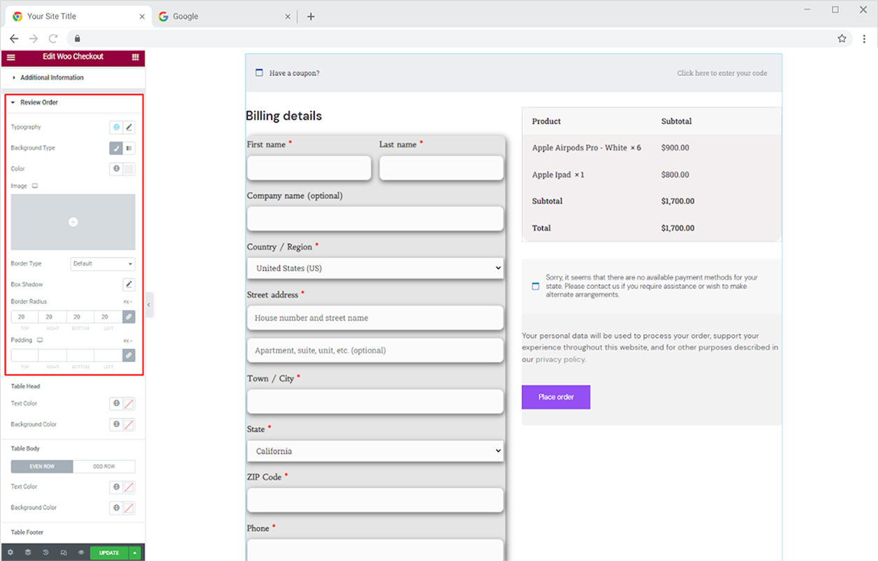
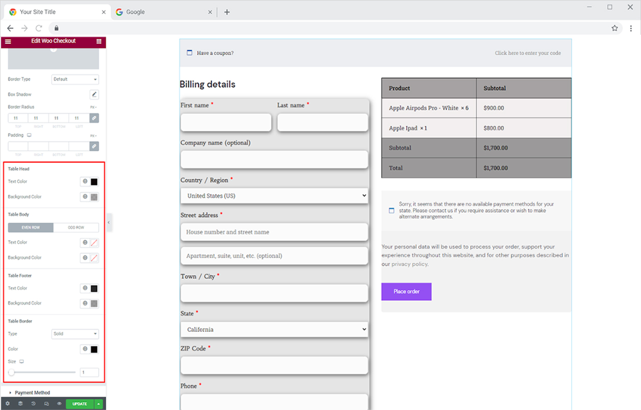
Additionally, choose the text color and background color of subsections within the order review sections. You can choose different colors for even and odd rows of the body. You have the option to make a border and divide each section.
How to Style Payment Method Section in Elementor Checkout Widget
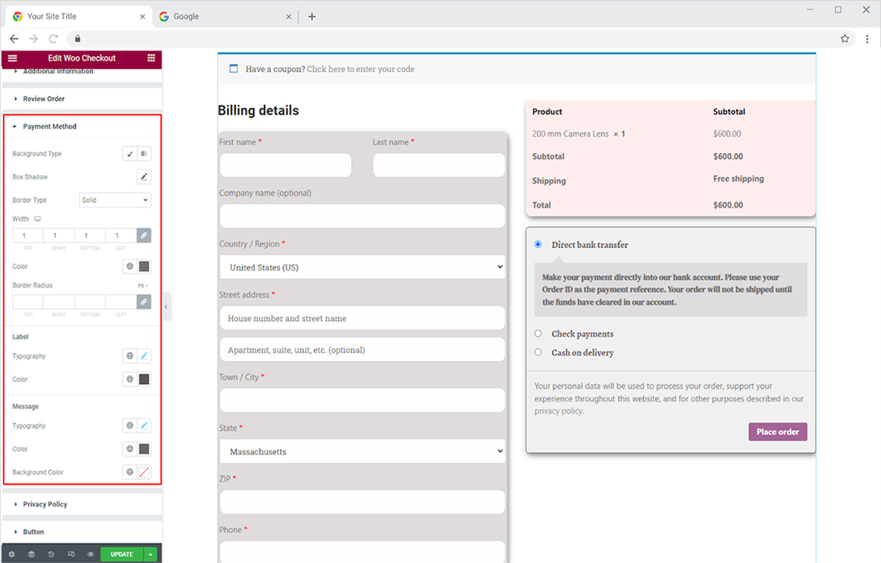
As the name suggests, the payment method section will allow the customers to select how they choose to pay for the product. The styling options available for this layout consist of background colors, shadows, and border types. Furthermore, the text in the field can be personalized with typography and color options.
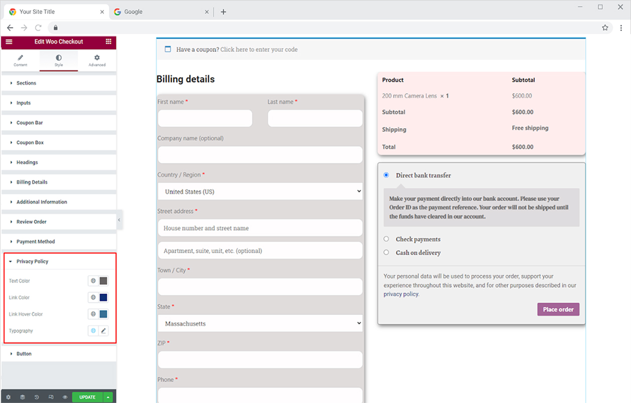
The widget default setting displays a privacy policy message to ensure the customer that their data is secure with the business and will be used according to the agreement of the user. You can customize this section by adding colors for text, link, and link hover. In addition, you can personalize the text display with the typography option.
How to Style Button in Woo Checkout Widget
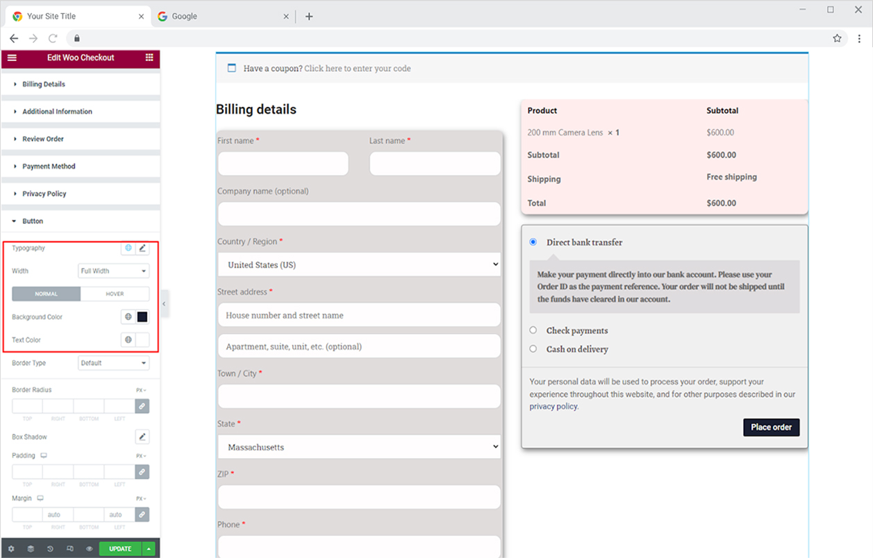
The button in the widget allows customers to place orders and complete their online purchases. The styling options for the button include typography and width adjustment. Furthermore, distinct colors can be added for text and background for their normal and hover state.
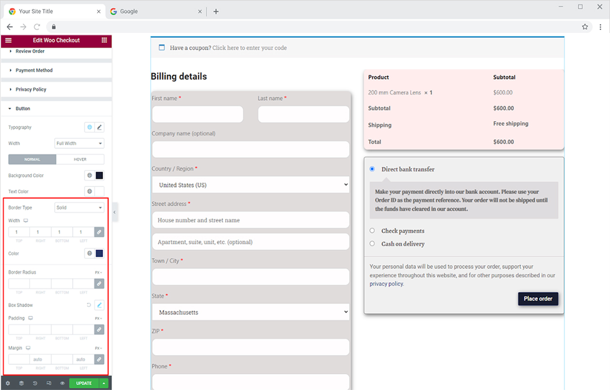
Make a border if you want around the button and customize it further with color, width, and radius. You can also give it a shadow from the shadow box option.
Best Woo Checkout Widget for Elementor
This is all from the Elementor WooCommerce Checkout widget. Create an online store with Elementor Woo Widgets and start making money. Display your products in a beautiful display carousel with the Elementor WooCommerce Product Carousel Widget and increase your sales.
Xpro Elementor Addons consist of vast widgets, extensions, and theme templates that are used to create a professional website without the need for coding. Xpro also provides free Elementor Theme Builder which is comprised of vast functionality and lets developers build a theme and manage data.