Mega Menu Widget & Extension for Elementor
You might be familiar with simple menus that consist of submenus that you access with hover or click. Xpro Mega Menu takes this a step further by providing a far more advanced and appealing approach to display menus. Elementor Mega Menu is a large expandable menu that provides the user with more options than the regular menu. Allow users to find the information or page they are looking for rather than leaving them to navigate themselves.
The Xpro Elementor Addons’ flexibility makes any complicated widget and features simple to use. With Xpro, you can effortlessly create a powerful mega menu display. With the vast range of customizations, it is easy for designers to make the layout meet their requirements.
Recently, Mega Menu has shown a huge demand because of their usefulness and accessibility. The widget is perfect for e-commerce websites to show much of the data to their potential customers. Let’s discuss how you can utilize this Pro Elementor Addon for your WordPress site.
How to Install Xpro Mega Menu for Elementor
Requirement
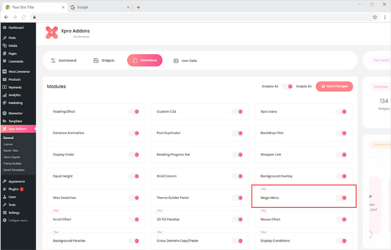
You need to install and activate the Pro version of Xpro Elementor Addons to use our Mega Menu for your WordPress websites. Once the plugin is installed, just make sure Xpro Mega Menu is ‘Enabled’ from the Extensions tab of the Xpro Dashboard. This way you will easily find & use the effect in the Elementor editor.
To enable the widget, simply follow these steps:
Step 1
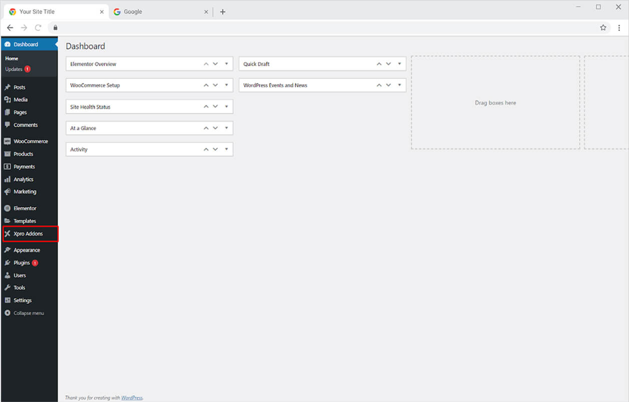
Click on the Xpro Addons option available on the WordPress Dashboard Menu.
Step 2
From the Xpro Addons Dashboard, click on the Extension Tab, find the Mega Menu widget, and finally, toggle the button to enable it.

How to Use Xpro Elementor Mega Menu
When you enable the Feature from the Xpro Addons Extension Tab, the Mega Menu widget will appear in the Xpro Addons – Pro area. In the WordPress Menu, you can create a menu from the appearance section. Let’s go over how to make and show a Mega Menu step by step.
Step 1
After you created a menu in the Menu tab under the Appearance section in WordPress, toggle On to enable the option for Mega Menu.
Step 2
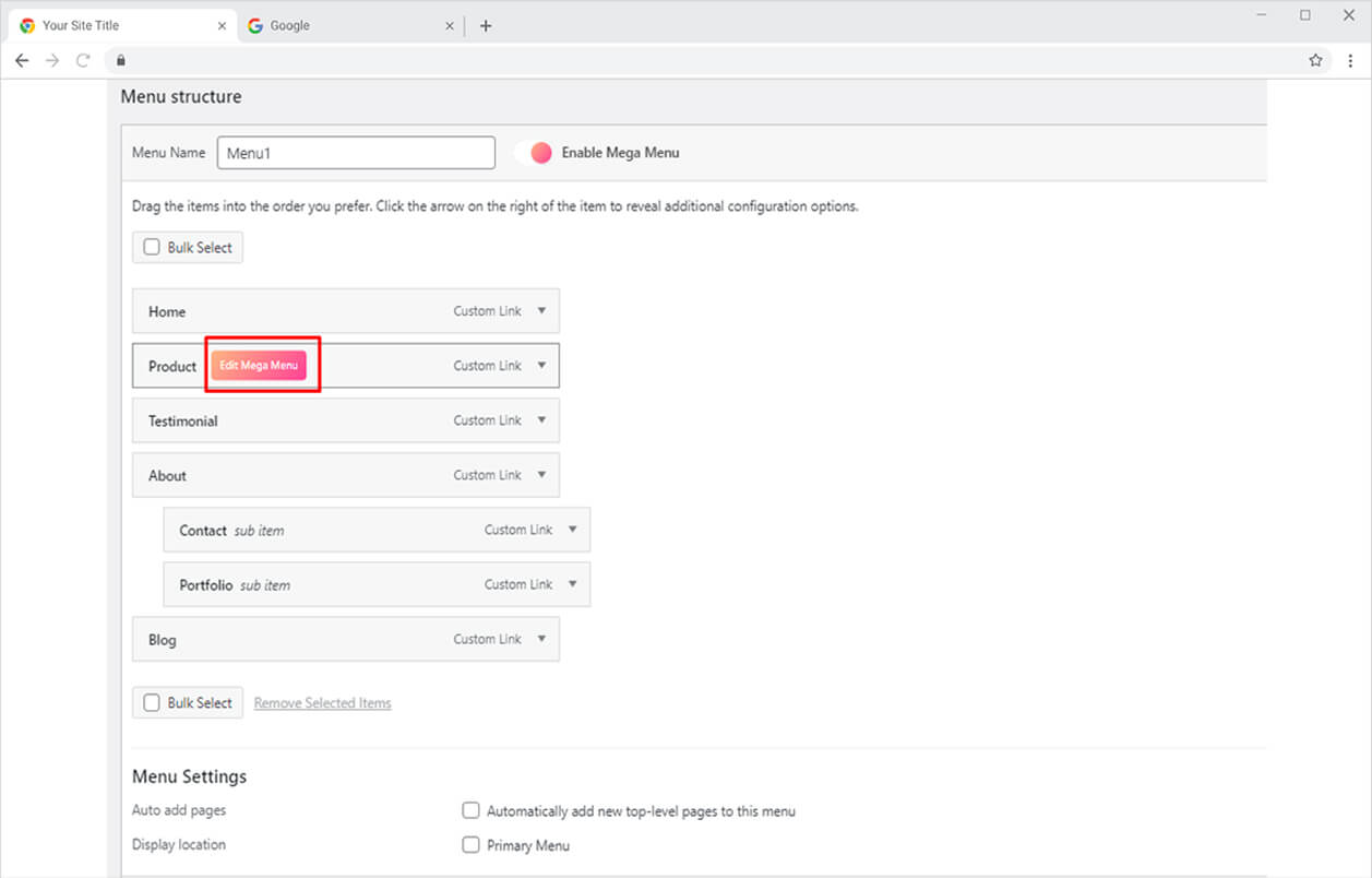
Hover over the menu where you want to add a mega menu and click on Edit Mega Menu.
Step 3
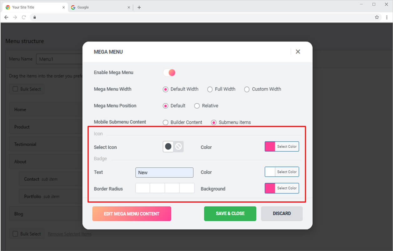
The Mega Menu edit box opens after you click on the Edit Mega Menu button. From there toggle on the “Enable Mega Menu” option. Furthermore, the box allows you to perform different settings to the Mega Menu display by providing you with the following options.
Mega Menu Width: You have three options for managing menu width here: default, full width, and custom modification.
Mega Menu Position: Set the mega menu position to default or relative.
Mobile Submenu Content: Choose what to show on mobile; content builder or submenu item.
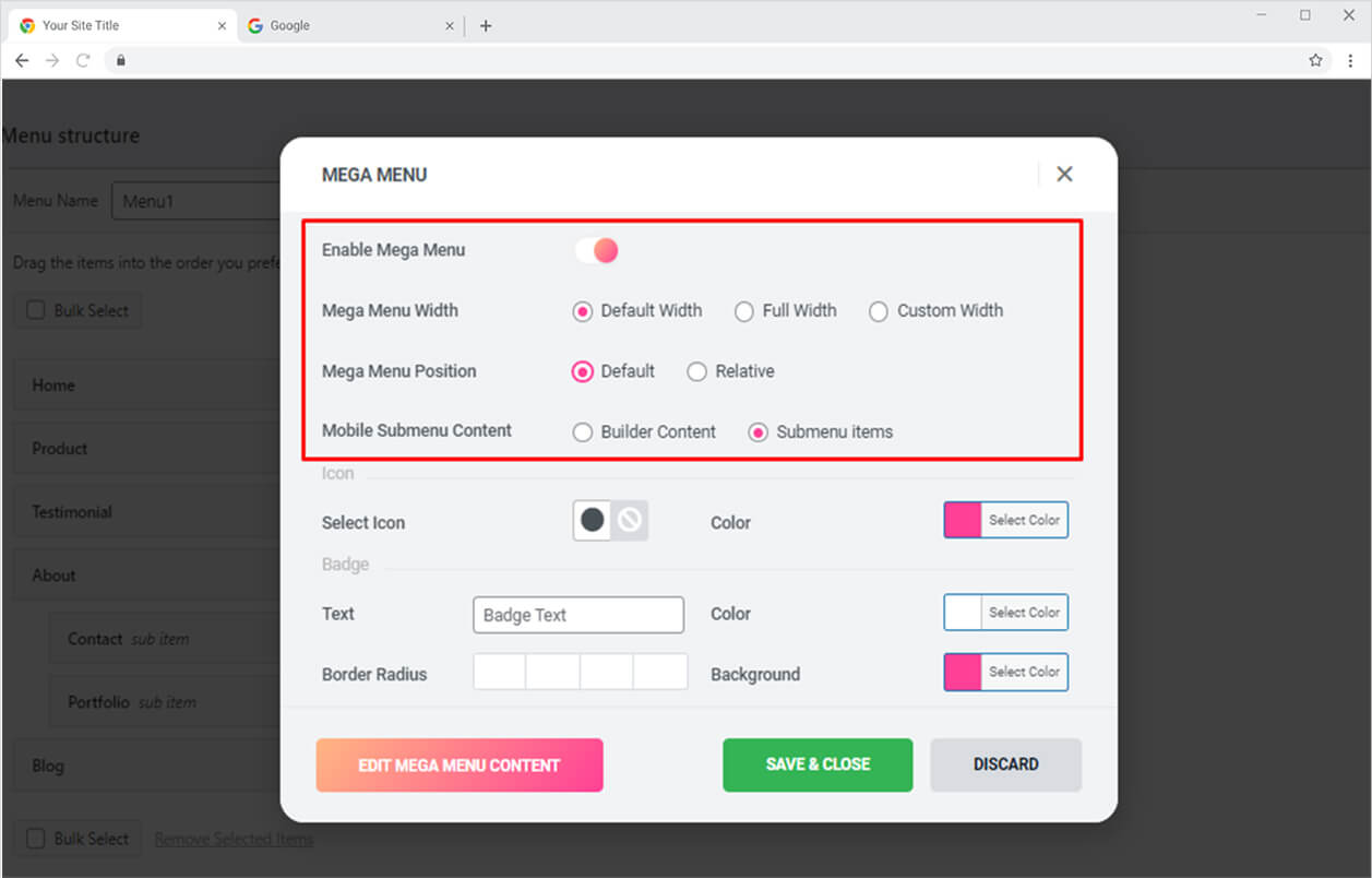
If you want to display an icon along with the menu then choose an icon and color it according to your requirement. Add a badge if you want by typing in the text that will display above the menu. You can further add color for text and background and adjust the border radius.
Step 4
Click on the “Edit Mega Menu Content” to open the Elementor Page.
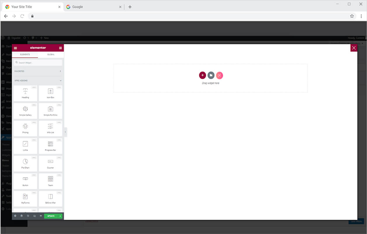
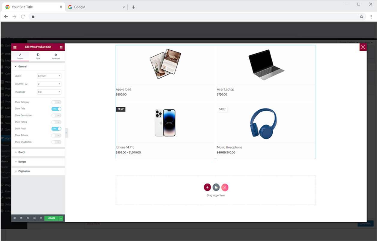
Here you can create anything you want that will be displayed under the menu in the mega menu.
Step 5
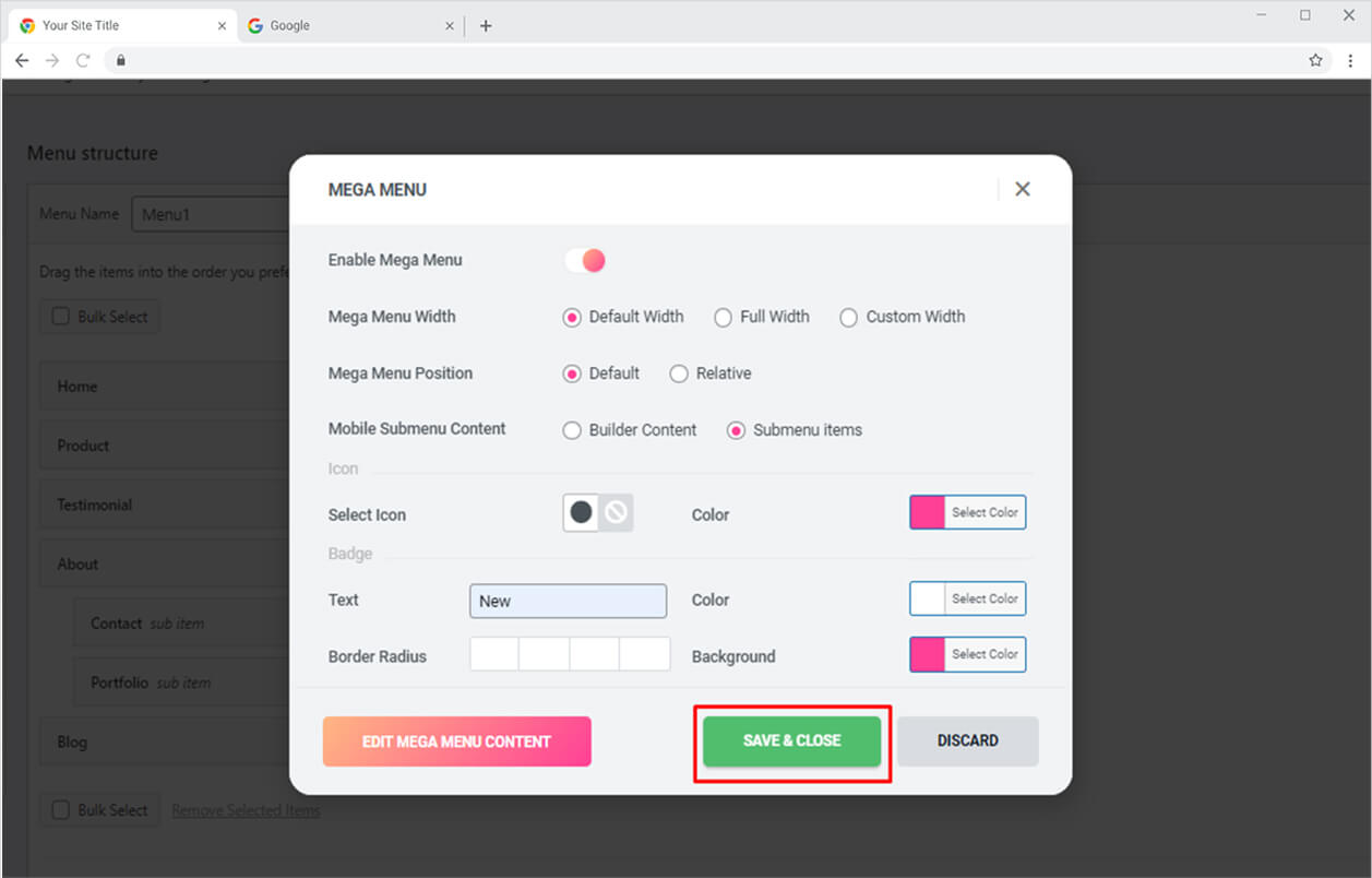
Close the Elementor Page after you created the display and then click on the button “Save and Close” and Save Menu.
Step 6
Click on the Xpro Addons – Pro section available in the Elementor Editor.
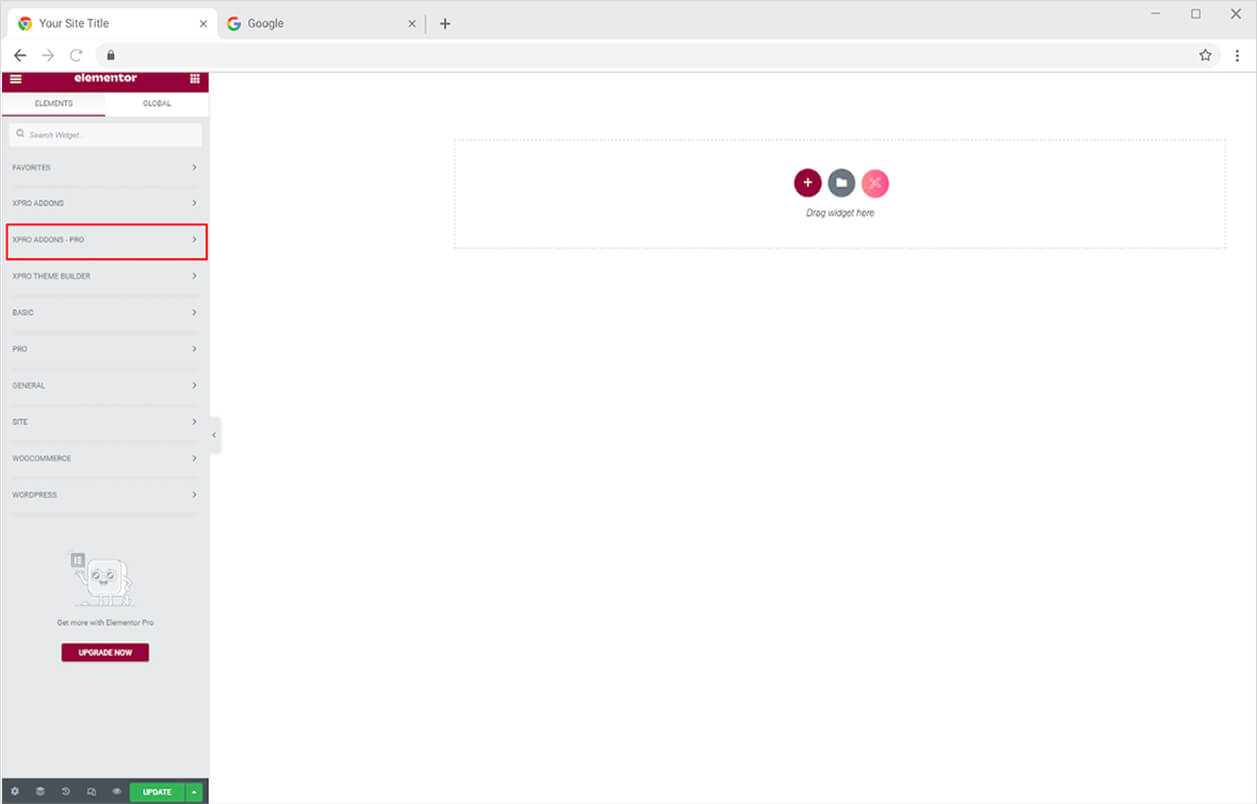
Step 7
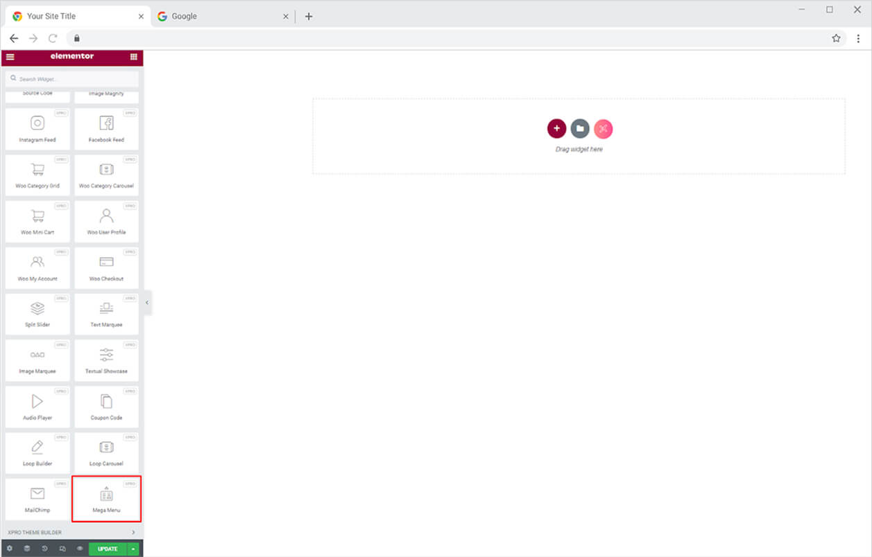
Search for Mega Menu in the search bar and drag’n’drop the widget to your desired page location.
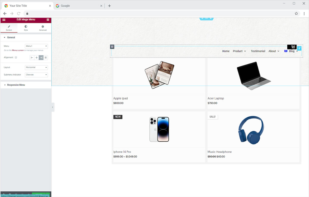
The default view of the widget will show you the menu with the default mega menu.
Content Tab
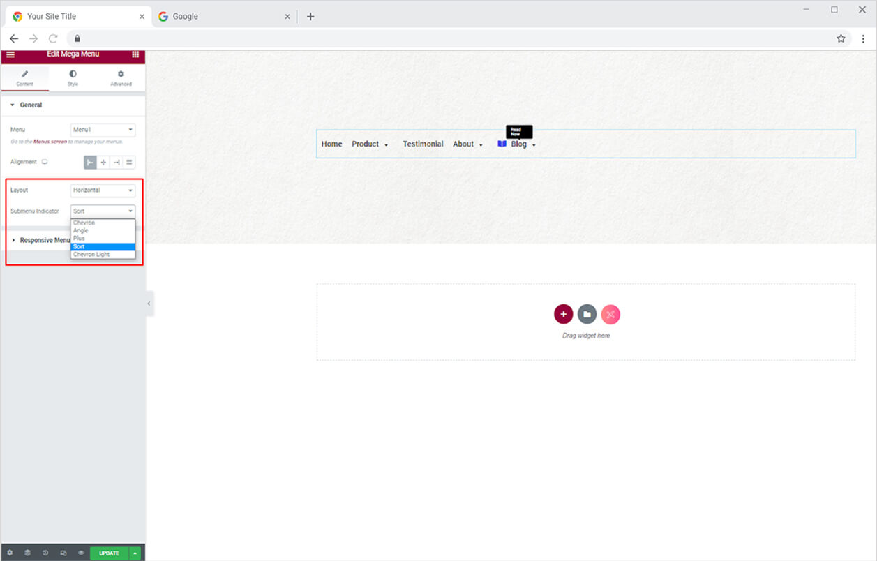
If you have created more than one menu then choose the menu that you want to be displayed in the Elementor Pagebuilder. Moreover, you have the option to align the menu to left, right, center, or justified.
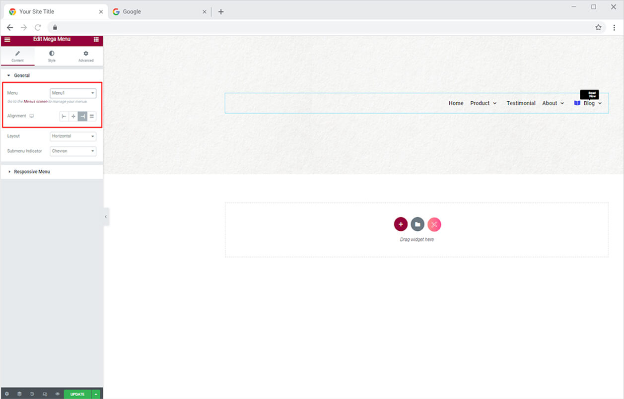
Style the layout in a horizontal and vertical way. From the Submenu Indicator, you can change the submenu arrow style.
How to Manage Mega Menu for Responsive Mode
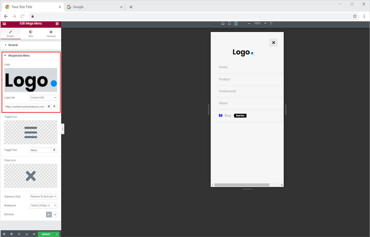
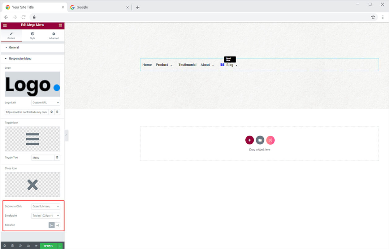
Click and open the Responsive Mode menu to style the website menu for mobile view. Here you have the option to add a logo above the menu and give it a link.
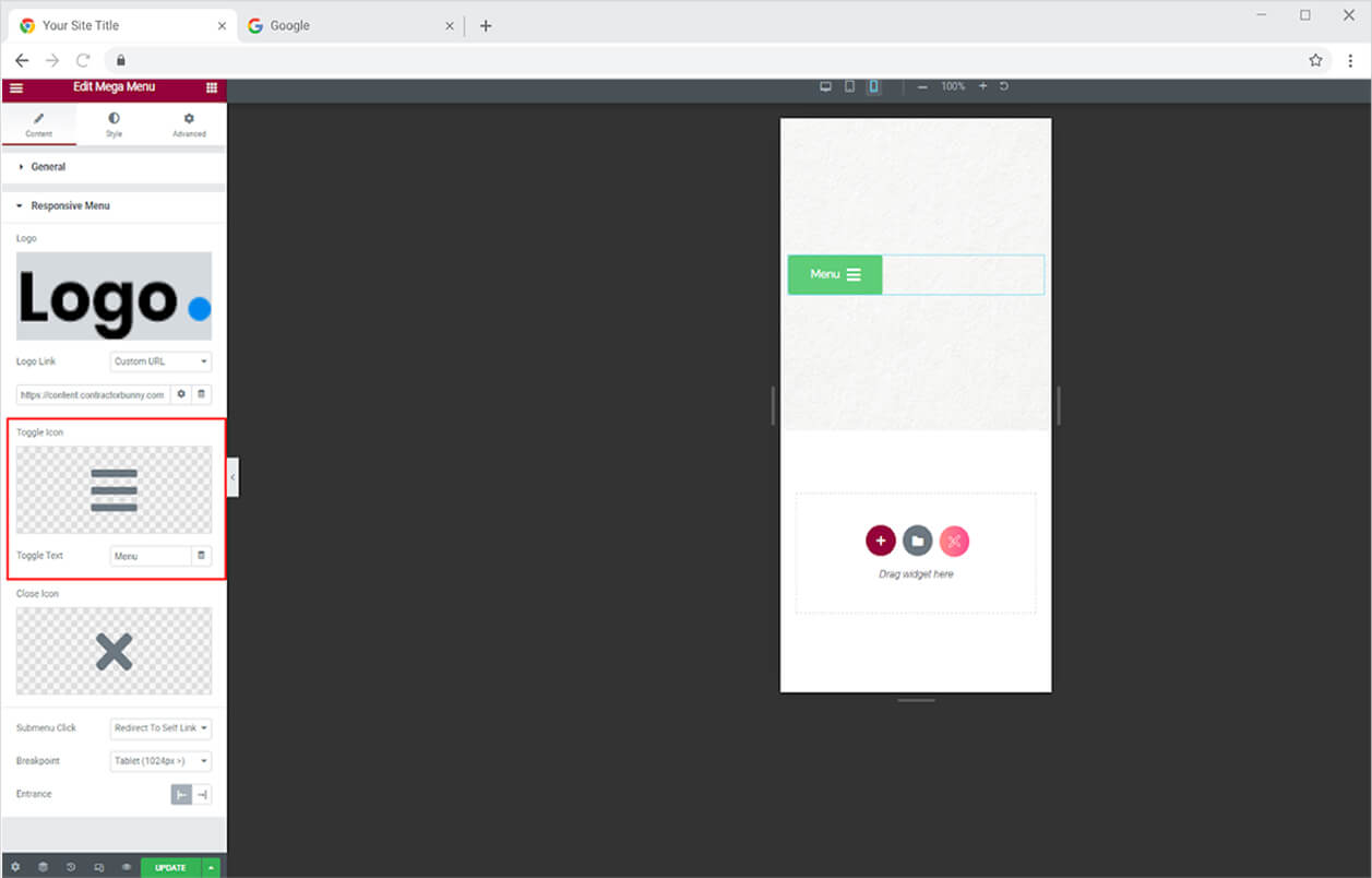
Add a toggle icon and text from where the user can access the menu.
Change an icon if you want for closing the menu.
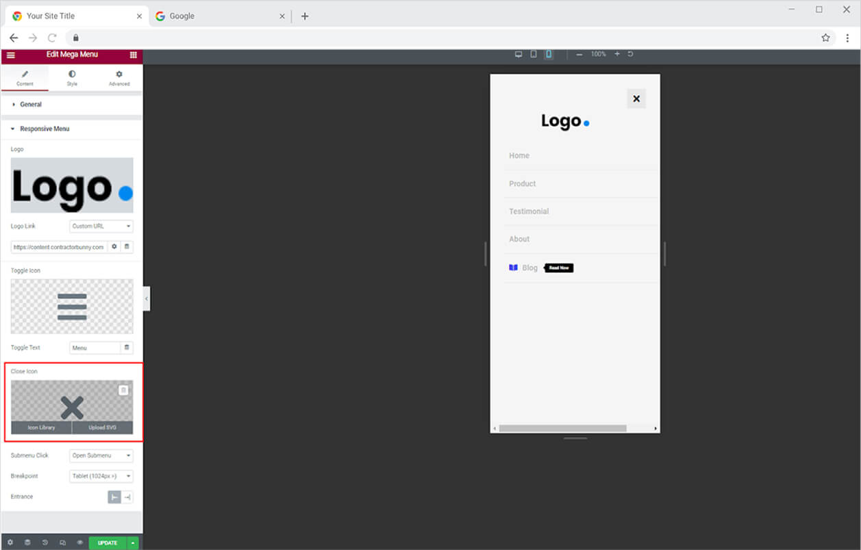
Select the action after the user clicks on the submenu; Open Submenu or Redirect to Self Link. The select breakpoint for tablet or mobile. In addition, select the entrance for the menu from right to left or left to right.
How to Style Elementor Mega Menu Widget
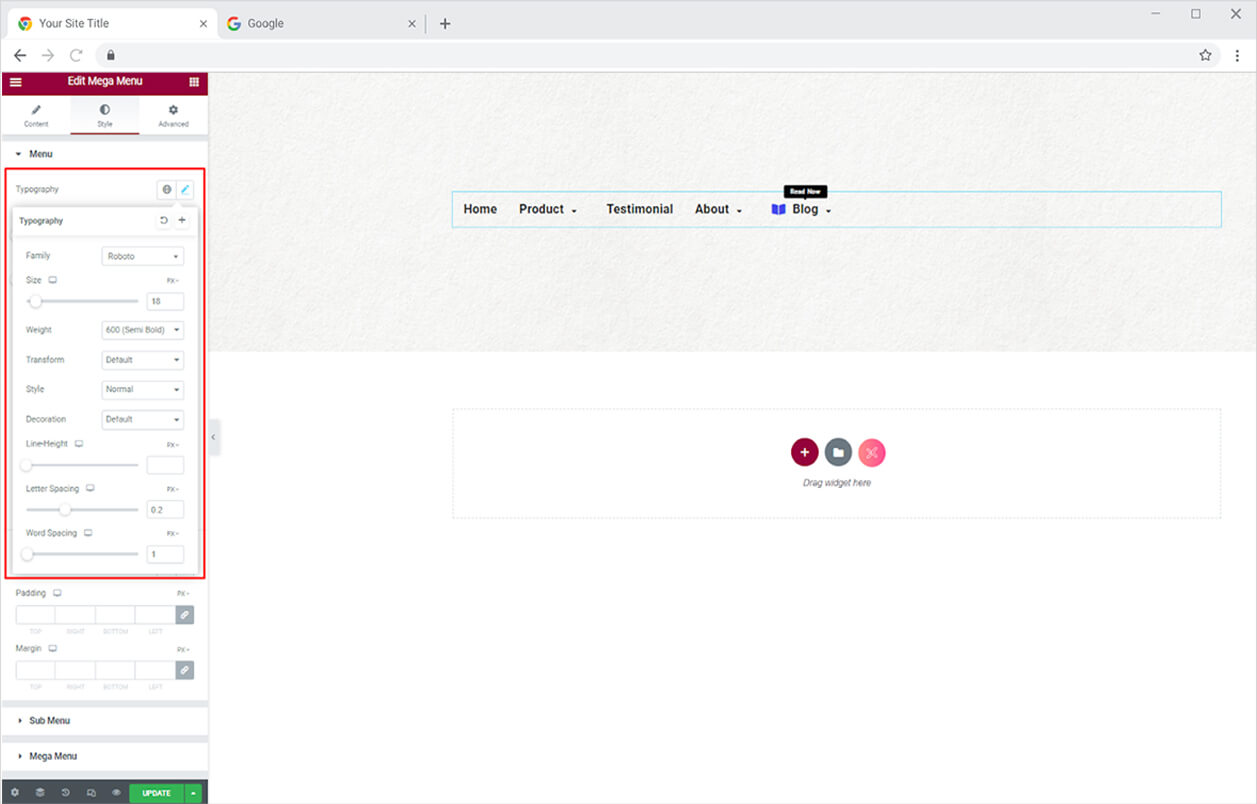
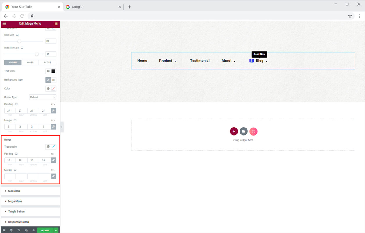
The first section in the Style Tab let you customize the text in the menu with a typography box. Click and open the typography box to personalize the font, size, weight, spacing, and other text customization.
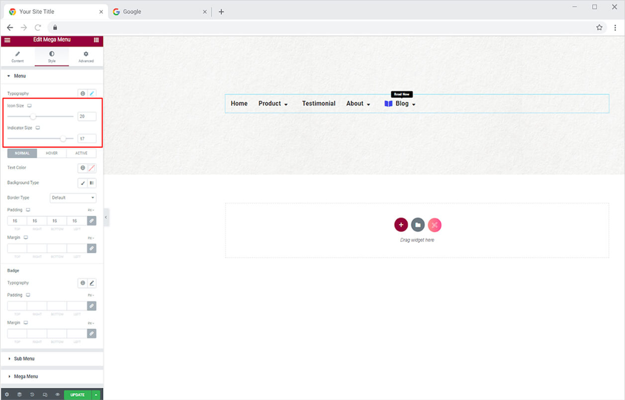
If you have included an icon, you can adjust its size of it. Also, change the size of the mega and submenu indicators.
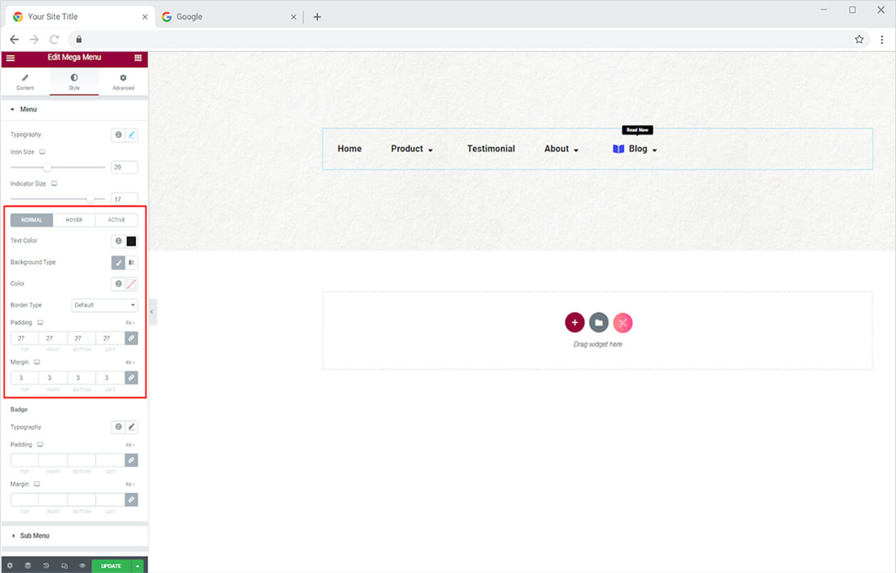
Color the menu’s text and background in the normal, hover, and active states. Furthermore, you may create a border by selecting one of the five border styles available, which allows you to control the width, radius, and color. Adjust the menu’s placement using the margin and padding parameters.
If you have added a badge to a menu, you can customize it as well. Style the text’s typography and adjust its padding and margin.
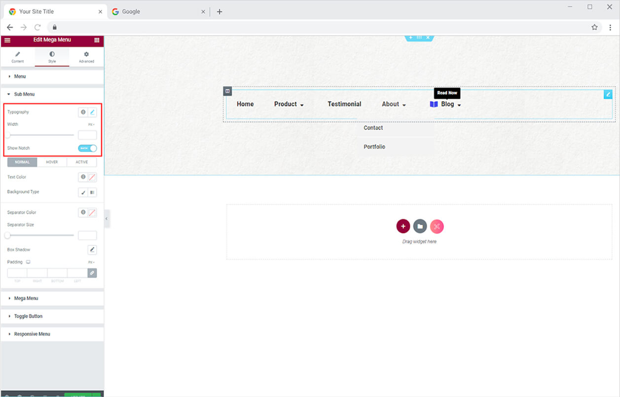
How to Style Sub Menu
Customize the typography and width of the text in the submenu. If the submenu contains more menus, display a notch to help the user understand what else is on the menu.
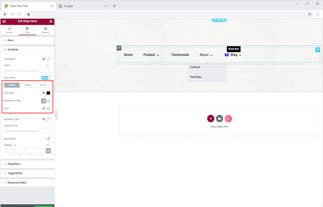
In the submenu, color the text and background for the normal, hover, and active states.
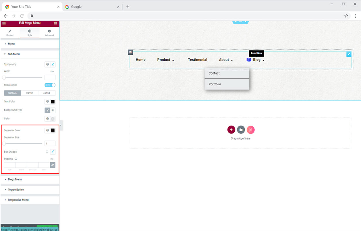
Colorize and resize the separator line that separates each submenu. You can also use the shadow box to add a shadow to the submenu and change its horizontal and vertical location, as well as blurriness and spread.
How to Style the Mega Menu Display
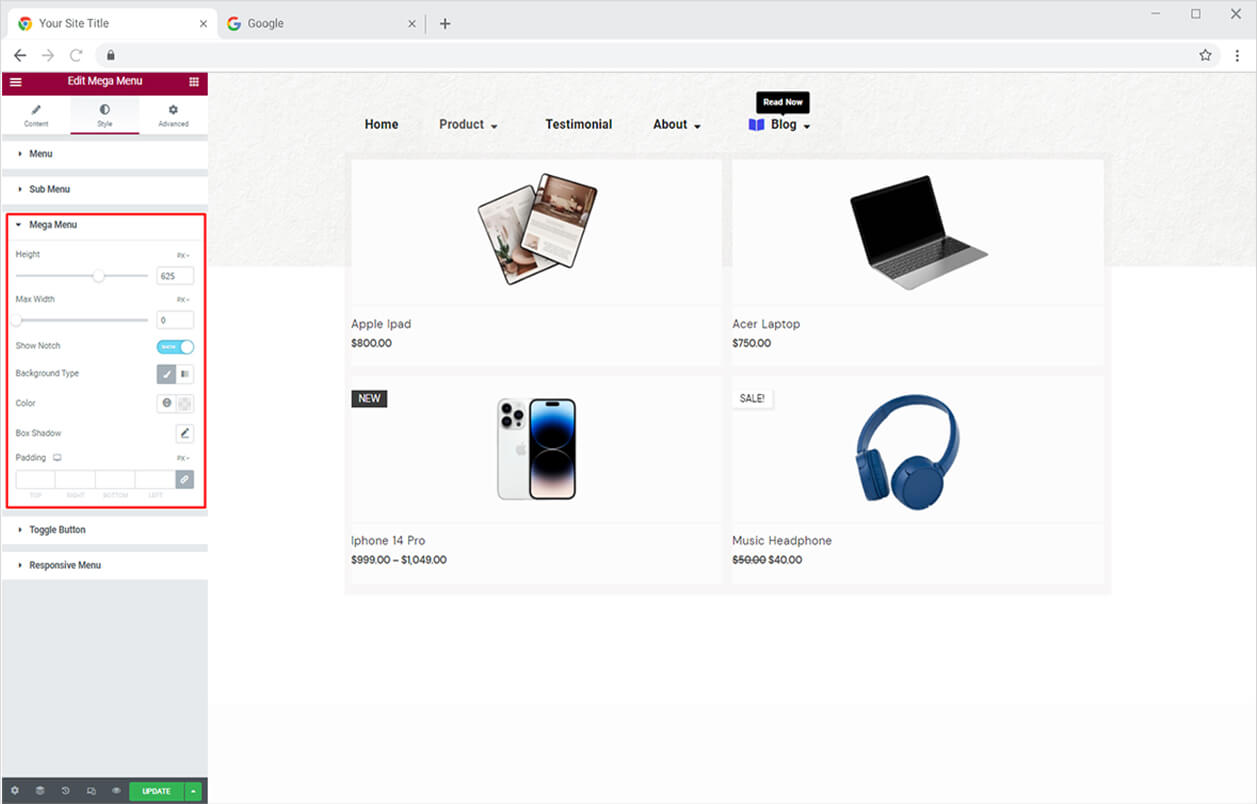
The height and width settings allow you to customize the size of the mega menu. Enable the notch display option. Give your Mega Menu a background color and use the shadow box to create a shadow.
How to Style the Toggle Button in Mega Menu Widget for Elementor
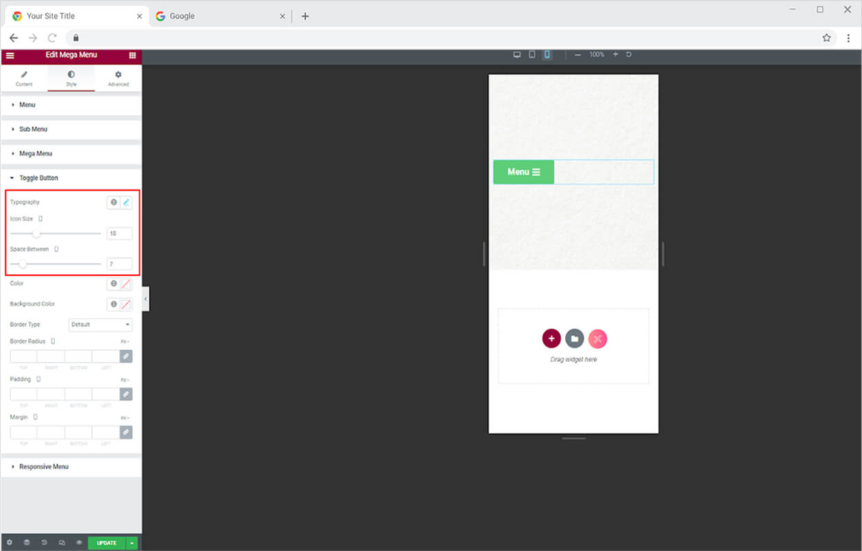
Personalize the text in the button from the typography option. Adjust the size of the icon along the text and manage the gap between them.
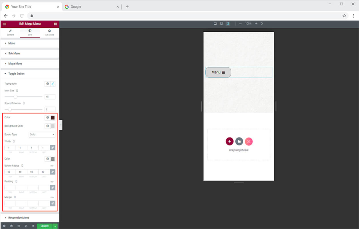
Color the text, icon, and background from its specified option. Create a border by choosing a border type and modifying the width, radius, and color.
How to Style Menu for Responsive Mode
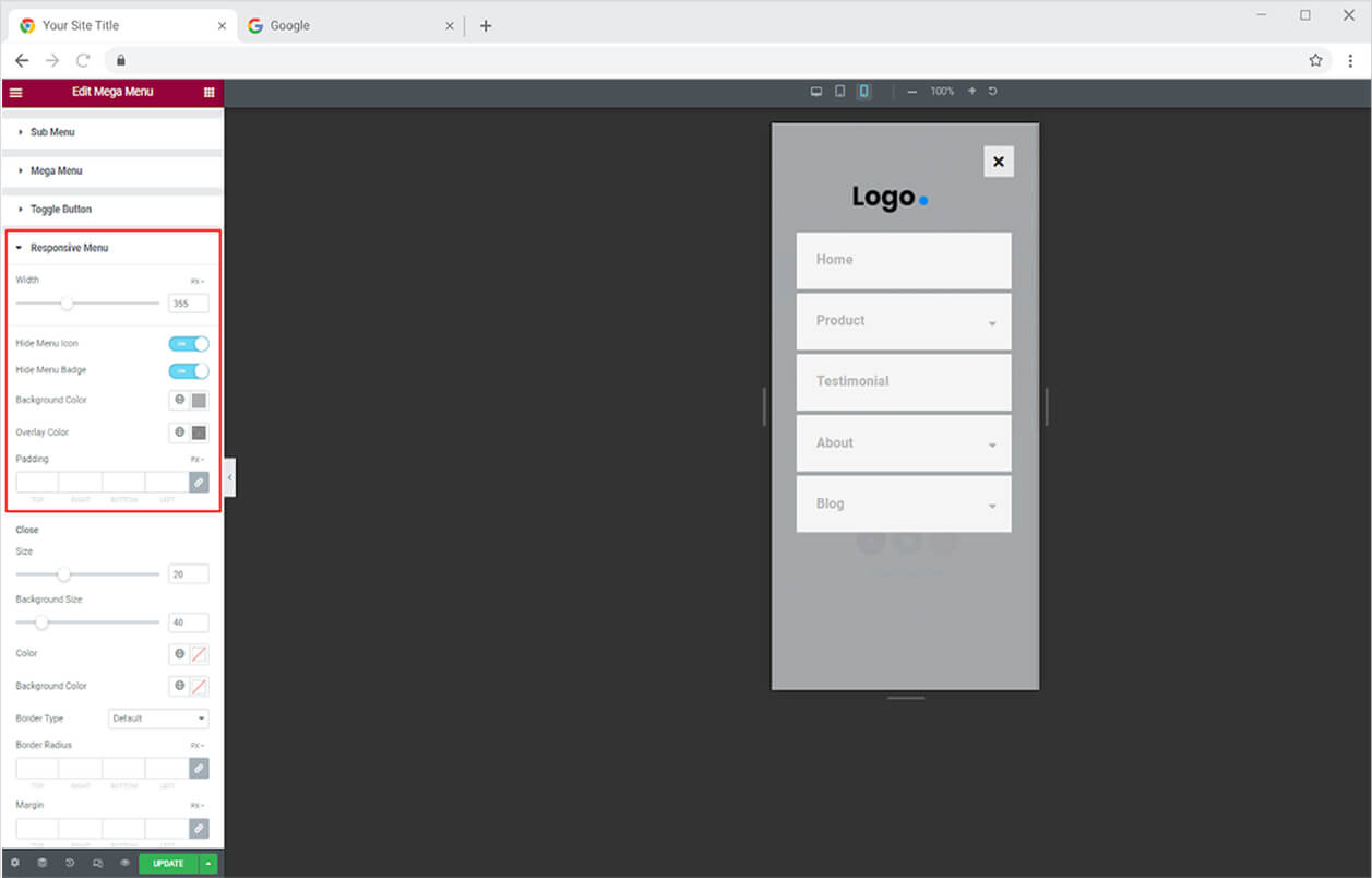
For responsive mode, adjust the menu width. In the responsive mode menu, you can choose to hide the badge and icon. Add a background color for the menu and overlay color.
How to Style Close Button in Responsive Mode
Adjust the size and color of the icon and background for the close button. You have the choice to add a border to the background and customize its width, radius, and color.
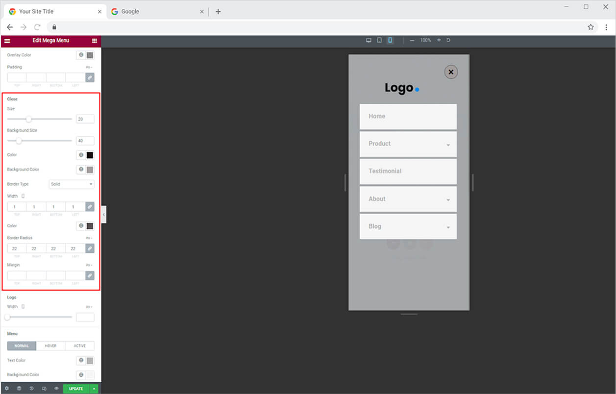
Adjust the width of the logo by dragging the circle horizontally to increase or decrease its size.
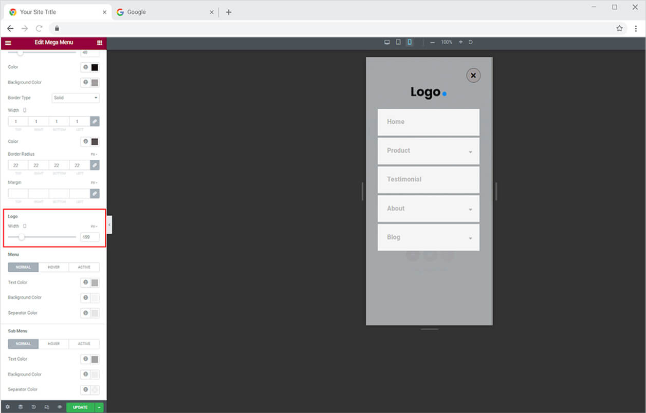
How to Style Menu in Responsive Mode
Color the text, background, and separator for normal, hover, and active display from the menu section.
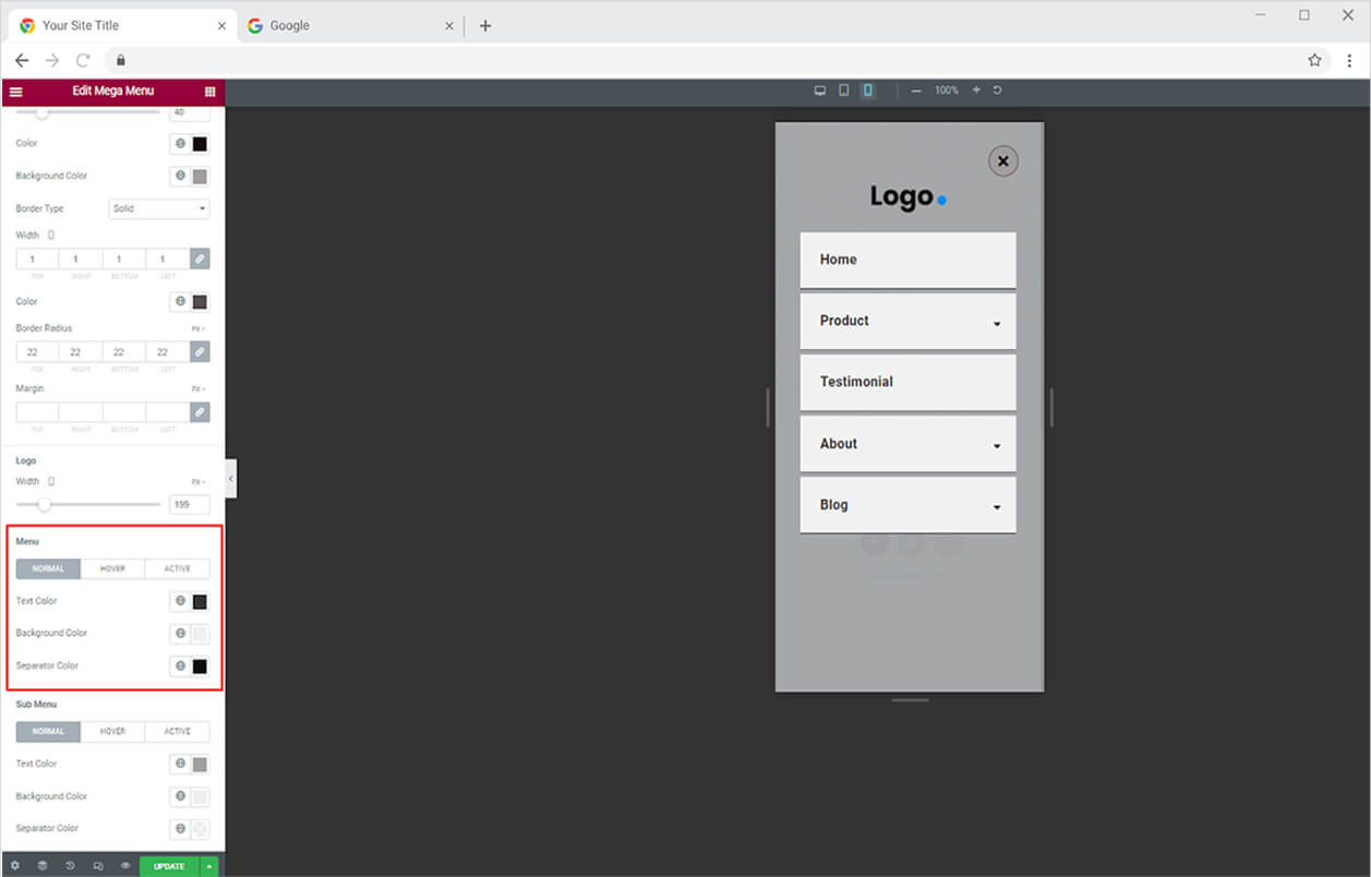
How to Style Sub Menu in Responsive Mode
Just like the Menu, style the sub menu by adding color to the text, background, and separator for its normal, hover, and active.

Best Mega Menu for Elementor
This was all from the powerful Mega Menu for Elementor. We hope that you fully understand the functionality and complexity of this feature and widget. Fully utilize this feature to create an amazing layout. Combine the widget with the Breadcrumbs widget and enhance the user experience.
Xpro Elementor Addons consist of stunning and advanced widgets and features which are easy to use and let you create an appealing website. Check out our 130+ Elementor widgets and more than 25 Elementor Features which can help you to create a professional WordPress website.