
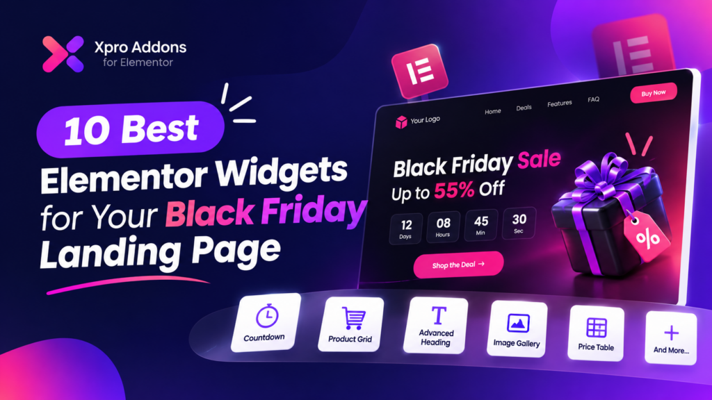
Black Friday is your biggest chance to make serious sales. But the biggest threat is that a buyer doesn’t wait to figure out your page. It shows up, looks around for three seconds, and either converts or bounces. If your Black Friday landing page isn’t built to answer “what’s the deal, why now, and how do I buy” instantly, you’re paying for clicks that never turn into sales.
This guide breaks down what a Black Friday landing page actually is, top 10 widgets ranked by what holds up under real holiday traffic, what each one is good at, where each one tends to fail, and how to pick and launch the right one before November 27. No fluff, no generic “add urgency” advice, just what actually survives real traffic pressure.
Let’s start!
Why Does Your Black Friday Landing Page Need to Be Different From Your Regular Store Pages?
A Black Friday landing page needs to communicate extreme urgency, immediate discount clarity, and an undeniable deadline in a way your standard WordPress or Elementor pages don’t. Black Friday shoppers are actively comparison-shopping across multiple open browser tabs and making split-second purchasing decisions.
Regular site pages are built to educate visitors and build brand trust over a prolonged browsing session. A Black Friday landing page engineered with best elementor widgets does the exact opposite: it delivers the core offer instantly, because the visitor already knows what they want and is scanning for maximum value, not discovering your brand for the first time.
This architectural distinction matters more than most site owners realize. A complex, multi-layered UI layout designed for a general homepage can actually tank conversions on a Black Friday campaign if it introduces friction or delays how fast a user finds the discount.
Essential elements and the widget for each
| # | Part | What goes there | Why it matters |
|---|---|---|---|
| 1 | Headline with your offer | Text Marquee (Pro) display of core promotional messaging | Links and indexing carry over year-over-year |
| 2 | Subheading with details | Advanced Heading highlighting offer conditions and dates | Shoppers decide on the first screen view |
| 3 | Call-to-action button | High-contrast interactive Button component routing to checkout | Directs immediate user conversion paths |
| 4 | Product images | Image Box elements showcasing curated hardware items | Visual clarity drives immediate product interest |
| 5 | Social proof | Counter, Testimonial, and Logo Grid blocks | Builds trust and shopper confidence instantly |
| 6 | Urgency | Countdown (Pro) timer tracking expiring flash deals | Creates FOMO and accelerates purchasing decisions |
| 7 | Product blocks | Woo Product Grid or Pricing matrix layouts | Displays discount tiers and specifications clearly |
| 8 | Benefits | Info List outlining customer guarantees and perks | Highlights core value propositions effectively |
| 9 | Objection handling | Icon Box addressing return policies and support | Removes final friction points before checkout |
| 10 | FAQs | Advanced Accordion (Pro) resolving common buyer questions | Improves user experience and SEO relevance |
To use any widget, open Xpro Addons → Widgets in your WordPress dashboard, switch it on, then find it in the Xpro section of the Elementor panel and drag it onto the page.
What to include on your Black Friday landing page
1. Headline that states your offer
Every high-converting Black Friday landing page starts with a headline that tells visitors exactly what the Black Friday offer is. People arriving from your emails, ads or social posts already know your brand, so this is not the place for clever wordplay. State the discount, state what it applies to, and let the deal do the selling.
As it is shown on Hostinger website, a moving headline works especially well on a Black Friday sale page. Motion catches the eye in the first second, signals that something special is happening, and lets you repeat the offer several times in one line without cluttering the layout.
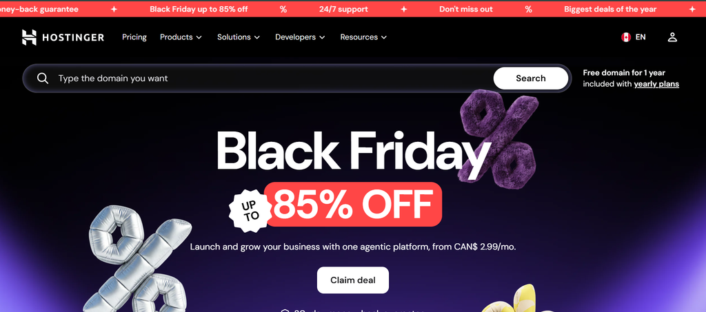
Widget: Text Marquee (Pro). The Text Marquee widget in Xpro Elementor Addons creates a continuously scrolling line of text. Use it as the headline strip at the very top of your Black Friday landing page, or as a thin ticker above your hero section.
How to build it in the Elementor editor
- Open the Elementor editor and add a full-width section at the top of the page.
- Drag the Text Marquee widget from the Xpro Addons group into the section.
- Enter your offer text, for example “BLACK FRIDAY — 40% OFF EVERYTHING”, and add a separator symbol between repeats.
- Set the scroll speed and direction. A slow, steady speed is easier to read than a fast one.
- Choose a dark background with a gold or white text color so the banner stands out, and set the font size and weight in the Style tab.
- Check the mobile view and reduce the font size so the offer stays readable on small screens.
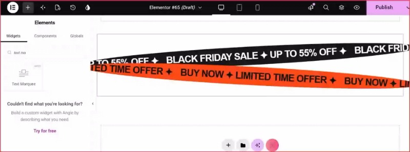
Offer headline built with the Text Marquee widget.
Copy ideas
- Save up to 40% this Black Friday
- Black Friday: 40% off everything
- This Black Friday, enjoy 40% off all our courses
- Simplify your routine with 40% off this Black Friday
Pro tip: Pair the marquee with a static headline in the hero section. The moving banner grabs attention, while the static headline gives screen readers and search engines a stable line of text to read.
2. Subheading with essential details
Your subheading adds context to the headline. Think of it as the fine print that answers the first questions a shopper has: how long does the sale run, how much can I save, what is included, and who can use it? Get more designs from here to recreate it.
Keeping these details in the subheading means visitors never have to scroll to understand your Black Friday sale. Combined with the headline and button, it forms a hero section that delivers the whole offer in a single glance.
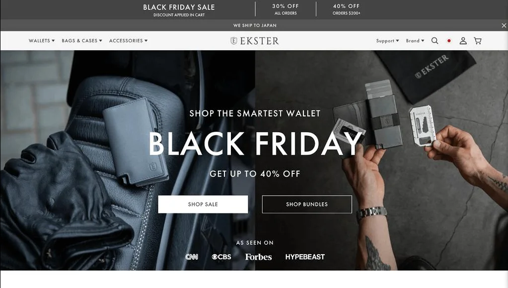
Widget: Advanced Heading. The Advanced Heading widget lets you build a main title and a sub-title inside one Elementor widget. You can highlight the discount in a second color or a gradient while keeping the supporting details in a calmer, muted style.
How to build it in the Elementor editor
- Drag the Advanced Heading widget under your Text Marquee banner.
- Write a short main title that repeats or supports the offer, such as “Save up to 40%”.
- Add the sub-title with dates, products and conditions.
- Apply a gradient or accent color to the discount number so it stands out.
- Set the sub-title in a smaller size and softer color to create a clear visual hierarchy.
- Use the alignment controls to center the text on mobile.
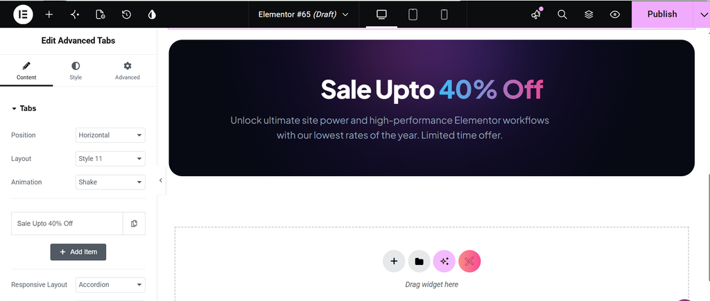
Title and sub-title in one Advanced Heading widget.
Copy ideas
- Runs Nov 27 – Dec 1 on all annual plans
- Up to 40% off — free shipping on orders over $50
- Open to new and existing customers
- Includes lifetime updates and priority support
Pro tip: Keep the sub-title to one or two short lines. If you need more room, move the extra detail into the FAQ section instead of crowding the hero.
3. Call-to-action button
The call-to-action button is the most important click on your Black Friday landing page. For a store, it should lead to the page where shoppers browse discounted products. For software, courses or memberships, it should go directly to the sign-up or checkout page.
You do not need to overthink it. Choose a color that contrasts clearly with the background, use text that describes what happens next, and open the link in the same tab so buyers do not have to switch windows.
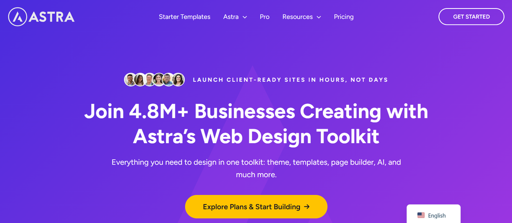
Widget: Button. The Xpro Button widget gives you full control over size, color, icon, hover effect and animation, so your main call to action is the easiest element on the page to spot and click.
How to build it in the Elementor editor
- Drag the Button widget below your subheading.
- Enter action-focused text such as “Browse the sale” or “Claim 40% off”.
- Paste your sale or checkout URL and leave the link opening in the same tab.
- In the Style tab, choose a bright background color that contrasts with the section, and a readable text color.
- Add an arrow icon and a subtle hover effect to invite the click.
- Copy the same button and place it again after the product section and at the bottom of the page.
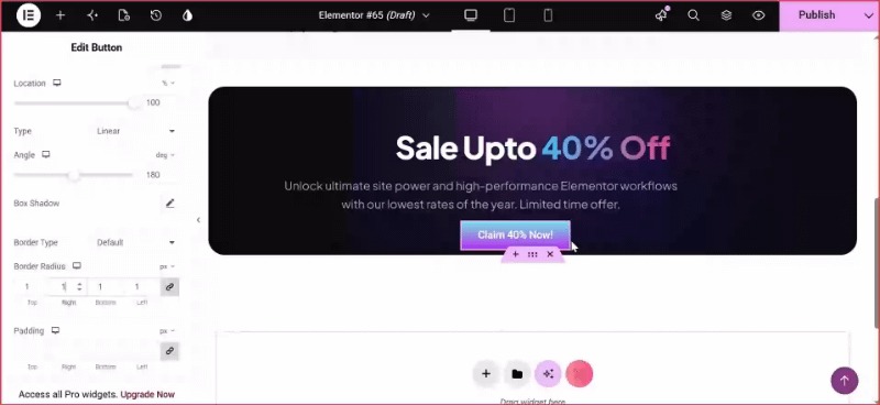
A high-contrast CTA using the Button widget.
Copy ideas
- Browse the sale
- Shop Black Friday deals
- Get 40% off now
- Start my course
Pro tip: Repeat the same button text and destination every time it appears. A consistent call to action removes doubt about where the click leads.
4. Product images
Visuals help visitors understand the offer instantly. Place your strongest product photo or a graphic made especially for your Black Friday sale next to the headline. If you already have product shots, reuse your best ones and add a discount badge.
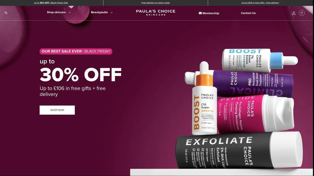
Images are not limited to physical goods. For software, add a screenshot of the dashboard. For courses and memberships, use images of students, results or the learning platform.
Widget: Image Box. The Image Box widget places clickable points on top of an image. Each point opens a tooltip, so you can attach short deal details to the exact part of the product they describe.
How to build it in the Elementor editor
- Drag the image Box widget into the right column of your hero section.
- Upload your product or bundle image and keep it a reasonable file size so the page loads quickly.
- Add an Image Box on each feature or bonus item and write a short tooltip, such as “−40% today” or “Free gift included”.
- Style the Image Boxdots in your accent color and choose a tooltip that appears on hover and tap.
- Add descriptive alt text to the image so it is accessible and easier for search engines to understand.
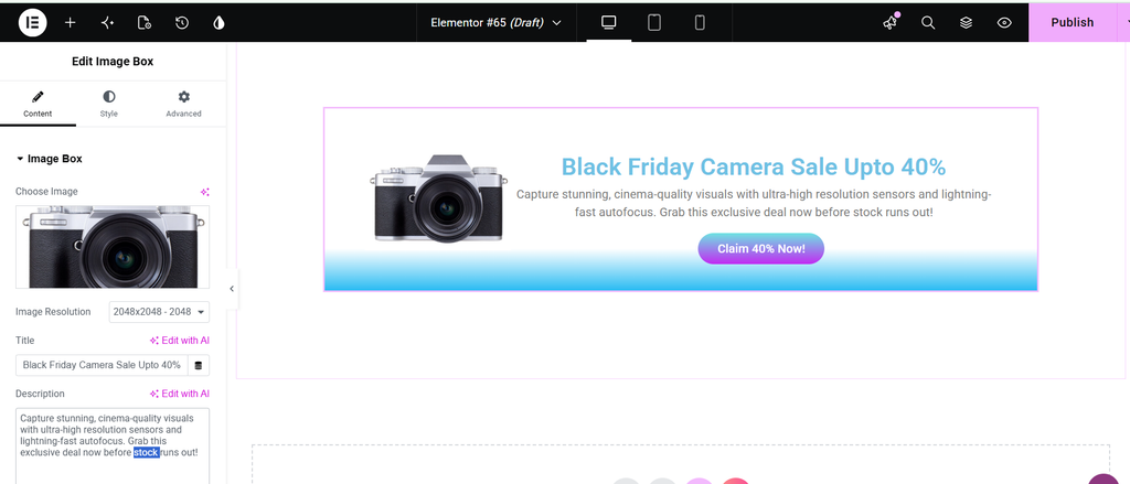
Interactive deal tags on a product image.
Copy ideas
- Place a “−40%” badge on the main product
- Show a bundle photo with a “Free bonus” hotspot
- Use a lifestyle image next to a product close-up
- Use a screenshot with callouts for software offers
Pro tip: Compress images before uploading and use a modern format such as WebP. A fast hero is part of a good Black Friday landing page, because slow pages lose shoppers on the busiest shopping days.
5. Social proof
Social proof builds trust, which is especially important for first-time buyers who are not yet loyal to your brand. It shows that other people have bought, enjoyed and recommended what you sell.
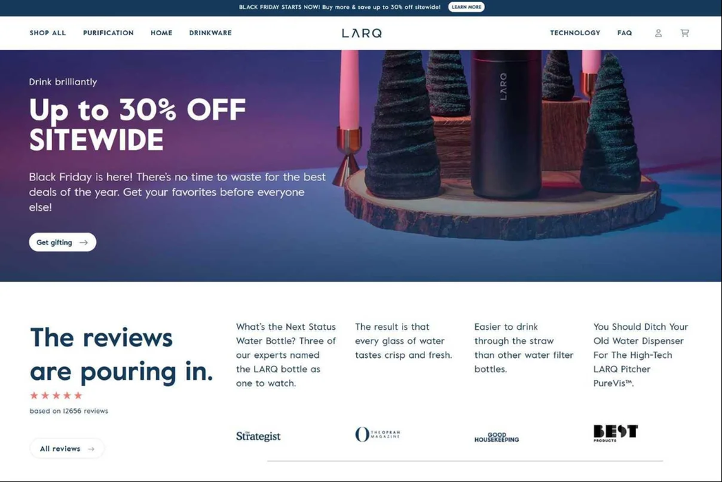
There are many forms to choose from: total customers, star ratings, written reviews, rating-site badges, press mentions, social posts and examples of results. Start with a short line directly under your call to action, such as “Trusted by 10,000 customers”, then add fuller proof lower down.
No reviews yet? Send a review request email now so you have fresh quotes to use before the sale begins.
Widgets: Counter, Testimonial and Logo Grid. Use the Counter widget for animated numbers, the Testimonial widget for individual review cards (or the Pro Testimonial Carousel to rotate several), and the Logo Grid widget for press or partner logos.
How to build it in the Elementor editor
- Add a three-column row below the hero and place a Counter widget in the first two columns for customers and average rating.
- Set each Counter’s ending number, suffix (such as “+” or “★”) and animation duration.
- Place a Testimonial widget in the third column with a customer photo, name and a one-line quote.
- Add a Logo Grid underneath with press logos or brands that use your product.
- Use the same card background and spacing across all three so the proof section looks tidy.
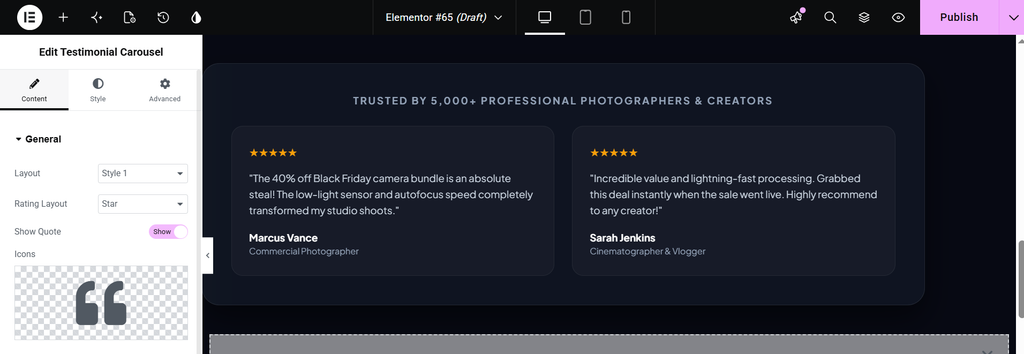
Counter, Testimonial and Logo Grid working together.
Copy ideas
- 10,000+ happy customers
- 4.8 out of 5 average rating
- “Best deal I found this year.” — Sarah K.
- As featured in your favorite publications
Pro tip: Use real numbers and real names where you can. Specific, believable proof converts better than round figures with no source.
6. Urgency
Social proof builds trust; urgency gives people a reason to act today. It does not have to feel pushy. A Black Friday sale genuinely has an end date, so simply make that deadline visible.
If your stock is limited, mention that offers last only while supplies last. Place urgency near the top of the page, in the headline, subheading or a countdown, so visitors feel it right away.
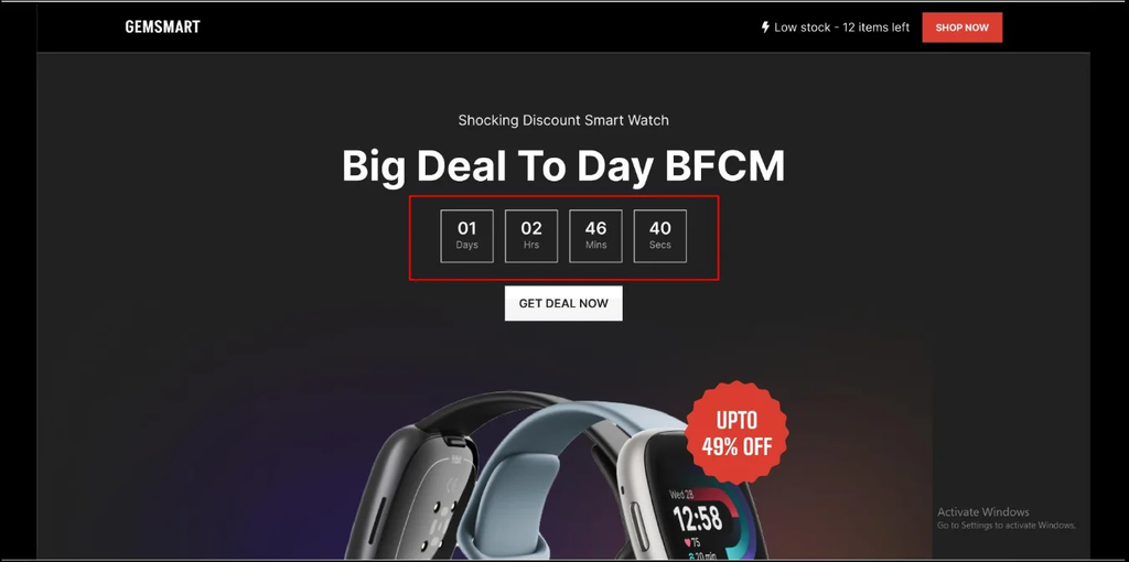
Widget: Countdown (Pro). The Countdown widget displays the days, hours, minutes and seconds left until a date you choose. It turns the end of your Black Friday offer into something visitors can see.
How to build it in the Elementor editor
- Drag the Countdown widget into the hero section, under the button or next to the headline.
- Choose the due date and time for the end of your sale and double-check the time zone.
- Enable or disable days, hours, minutes and seconds depending on how long the sale runs.
- Style the digit boxes with a dark background and gold digits to match your Black Friday color palette.
- Set what happens when the timer ends, for example a message such as “This sale has ended — join the list for next year”.
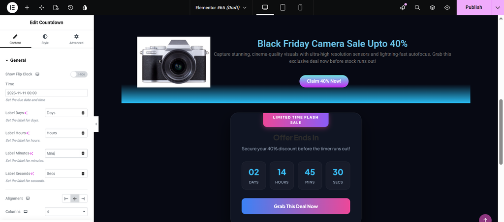
Sale countdown built with the Countdown widget.
Copy ideas
- Offer ends in:
- Sale ends Monday at midnight
- Only a few hours left
- Last chance for 40% off
Pro tip: Only use a countdown that reflects a real deadline. Visitors notice fake timers, and honesty protects your brand.
7. Product blocks
After the hero, show what shoppers can actually buy. How you do this depends on your business. Stores can feature a selection of best sellers or link to categories, with images, prices and a short description. Businesses with a single product, like software or a membership, can use a pricing block that explains what each plan includes.
Display the original price beside the sale price so the saving is clear at a glance and visitors do not have to calculate it themselves.
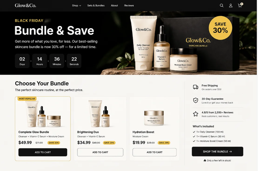
Widgets: Woo Product Grid or Pricing. For WooCommerce stores, the Woo Product Grid widget pulls products from your store automatically, with options for image, title, rating, description, price and quick view. For plans and memberships, the Pricing widget builds clean pricing tables, and the Pro Pricing Carousel and Pricing Matrix handle larger comparisons.
How to build it in the Elementor editor
- Drag the Woo Product Grid widget below your social proof section.
- Choose the columns and number of products, and filter by sale category or tag so only discounted items appear.
- Switch on price, rating and add-to-cart or quick view options.
- Style the price so the sale price is bold and the regular price is crossed out.
- For plans, add the Pricing widget instead, list the features included and add a button to each plan.
- Highlight your best-value plan with a badge such as “Most popular”.
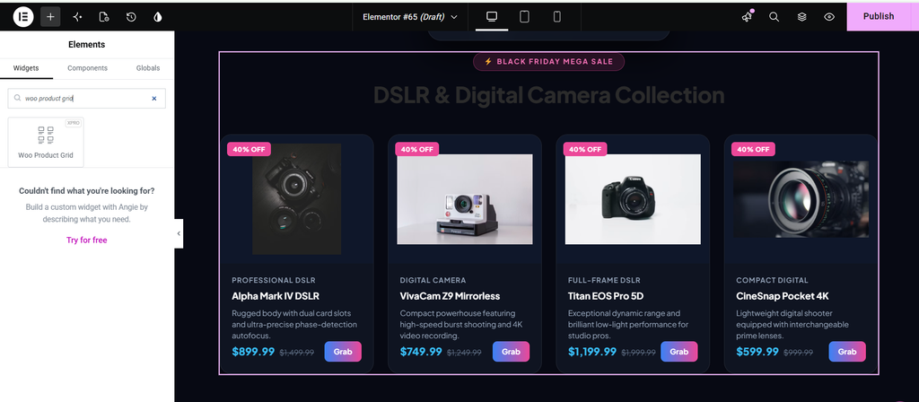
Sale price beside the original price makes the saving obvious.
Copy ideas
- Shop our best sellers
- Browse by category
- Starter, Pro and Agency plans at 40% off
- Bundles: save even more
Pro tip: Limit the grid to six to nine products. Too many choices slow down decisions, while a focused selection keeps shoppers moving toward checkout.
8. Benefits
Your benefits block reminds shoppers why your product is worth buying. Because most visitors to a Black Friday sale page already know your brand, keep it short and focused on the offer rather than selling the product from scratch.
Three or four benefits are usually enough. You can also work benefits into other parts of the page, like the headline or product descriptions.
Widget: Info List. The Info List widget lays out short, icon-led points in a clean list. It is ideal for features and benefits because each point stays brief and easy to scan.
How to build it in the Elementor editor
- Place the Info List widget in a two-column section next to an image or short paragraph.
- Add one item for each benefit and give it a matching icon or small image.
- Write a short title and a one-line description for each item.
- Choose a horizontal layout for a row of benefits or vertical for a stacked list.
- Style the icon color to match your call-to-action button so the page feels consistent.
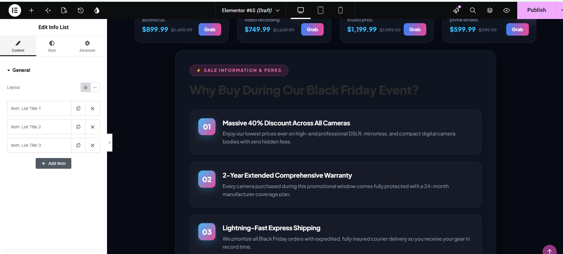
Benefits laid out with the Info List widget.
Copy ideas
- Lifetime updates included
- Setup in under an hour
- Works with any Elementor theme
- Friendly support, seven days a week
Pro tip: Write benefits in terms of what the customer gains, not the technical feature. “Save hours each week” is stronger than “Includes automation”.
9. Objection handling
Objection handling quietly removes the reasons a visitor might have for not buying. Typical worries include shipping costs, whether purchases can be returned, and whether the product delivers on its promise.
Address them directly with a short strip of reassurance: your refund policy, free shipping, secure payment and customer support. Pair these with the social proof earlier on the page to reinforce trust.
Widget: Icon Box. The Icon Box widget combines an icon, a title and a short description in a compact card. Placed in a row of three or four, it creates a clean reassurance strip.
How to build it in the Elementor editor
- Create a four-column row after the product section.
- Add an Icon Box to each column.
- Pick a simple icon for each: a truck for shipping, a shield for secure checkout, an arrow for returns, and a chat bubble for support.
- Write a short title such as “30-day refund” and a single reassuring sentence.
- Use a light background and consistent spacing so the badges read as one unit.
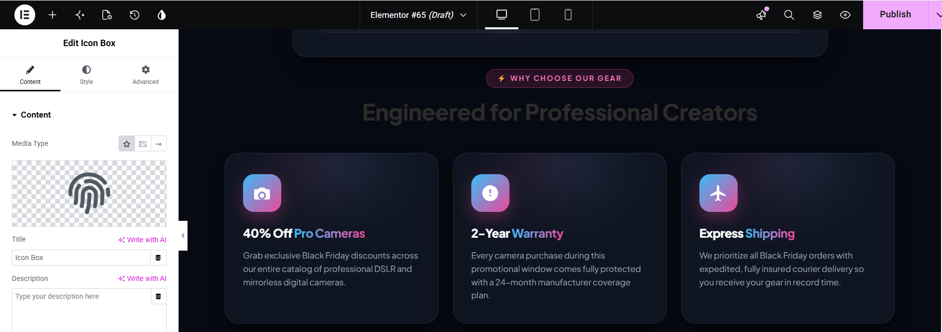
Reassurance badges using Icon Box widgets.
Copy ideas
- Free shipping on orders over $50
- 30-day money-back guarantee
- Secure checkout
- Real people, fast support
Pro tip: Base each claim on your actual policy. If a guarantee has conditions, state them clearly so there are no surprises after purchase.
10. FAQs
Even a focused Black Friday landing page benefits from a few answers at the bottom. Think about the questions customers usually ask before buying and answer them in plain language.
Making each answer expandable lets you include many questions without turning the page into a wall of text.
Widget: Advanced Accordion (Pro). The Advanced Accordion widget builds collapsible question-and-answer items with full control over icons, spacing and active-state styling.
How to build it in the Elementor editor
- Add the Advanced Accordion widget near the bottom of the page.
- Create one item per question and write a concise answer for each.
- Set the first item to open by default so visitors see how it works.
- Choose a plus or arrow icon and style the active item with your accent color.
- Keep the widget width narrower than the page so the text is comfortable to read.
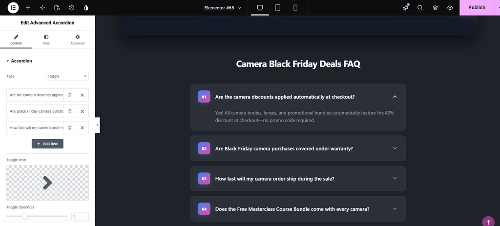
Expandable FAQs built with Advanced Accordion.
Copy ideas
- When does the sale end?
- Is the discount applied automatically?
- Can I combine it with other offers?
- What is your refund policy?
Pro tip: Place a final call-to-action button directly under the FAQ so shoppers who finish reading can act immediately.
Black Friday landing page design tips
1. Keep the essentials above the fold
Your headline, subheading, button, image and first proof form the hero. Visitors should have everything they need without scrolling.
2. Choose your colors deliberately
Black with gold or a bold accent signals something special. Set the palette once in Elementor’s Global Colors so every Xpro widget picks it up, and keep your logo and fonts so the page still feels like you. Make sure the Button contrasts strongly with the background.
3. Match the campaign
Use the same colors, headline, and offer wording in your emails, social posts, and ads, so visitors know they are in the right place.
4. Pick clarity over clutter
Cover what is on offer, how much people save, how long it lasts, and how to claim it. Showing original and sale prices together saves visitors from doing math.
5. Remove distractions
Hide the menu and footer links that lead away from the offer. In Elementor, use a blank page template such as Canvas, or Xpro’s Theme Builder display conditions to apply a minimal header to this page only.
Start from Xpro templates
You do not have to start from a blank page. Xpro Elementor Addons includes ready-made blocks and full-page templates in the Elementor library. Import a layout that suits your store or service, replace the copy and images, then swap in the widgets from this guide to fill any gaps. Check the template library for the current Black Friday and sale layouts.
Black Friday Landing Page SEO Tips
- Treat SEO as secondary. Conversion comes first; make small tweaks so the page can be found.
- Target branded terms. Aim for “your brand black friday” rather than broad searches.
- Use an evergreen URL. Reuse the same address every year and update the offer.
- Keep key information in real text. Put the offer high on the page as text, not baked into images. The Text Marquee, Advanced Heading and Countdown widgets all output live text.
- Link to the page. Add internal links from your homepage and relevant pages.
Build Your Black Friday Page with Xpro Elementor Addons
Drag in the widgets above and launch your sale page today. Explore the widgets at https://elementor.wpxpro.com/
Black Friday landing page FAQs
1. What should a Black Friday landing page include?
A clear hero with the offer, urgency, social proof, product details or benefits, and few links away from the page. Use the ten sections in this guide as a checklist.
2. When should I launch it?
Publish when the sale goes live, or run a pre-launch version that collects emails and switch the content on the day.
3. Should I add a countdown timer?
Yes, if the deadline is real. The Xpro Countdown widget (Pro) shows exactly how long the deal lasts.
4. Do I need Xpro Pro?
Not for everything. Button, Advanced Heading, Counter, Testimonial, Logo Grid, image box, Info List, Icon Box, Pricing and Woo Product Grid are free. Text Marquee, Countdown and Advanced Accordion are Pro.
5. Should I delete the page after the sale?
No. Keep the URL live, switch to a “see you next year” message with an email sign-up, and update it next season.

