How To Install Elementor Simple Portfolio Widget
Xpro Simple Portfolio Widget for Elementor is an amazing FREE widget that lets you create striking portfolios on your Elementor website. It is simple, free, and offers a lot of modern features to showcase your work perfectly. You can do full customization with multiple popup styles, preview layouts, buttons, and much more. The most powerful feature is that you can easily create your portfolio detail pages and directly call them in your portfolio items. Style your portfolio with amazing filter animations, hover effects, and more. Our Simple Portfolio Widget for Elementor is fully responsive on all display devices and you can style the responsive layout too. Let’s check out these remarkable features and how you can fully utilize them for your website.
Requirements
You need to install and activate the free version by Xpro Elementor Addons. If you already have the plugin installed, just make sure the Simple Portfolio Widget is ‘Enabled’, so you can find it in the Elementor editor.
To enable the widget, simply follow these steps:
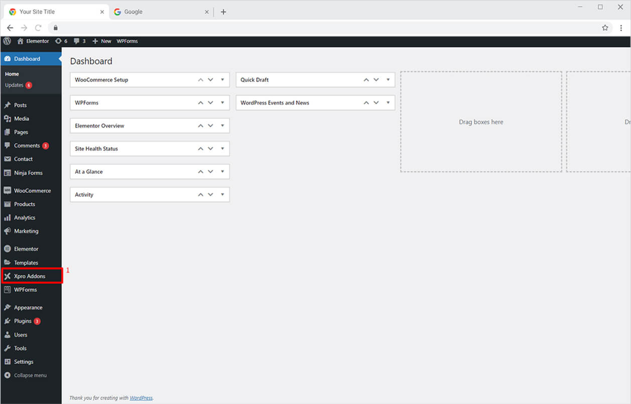
Step 1
Click on the Xpro Addons option available on the WordPress Dashboard Menu.
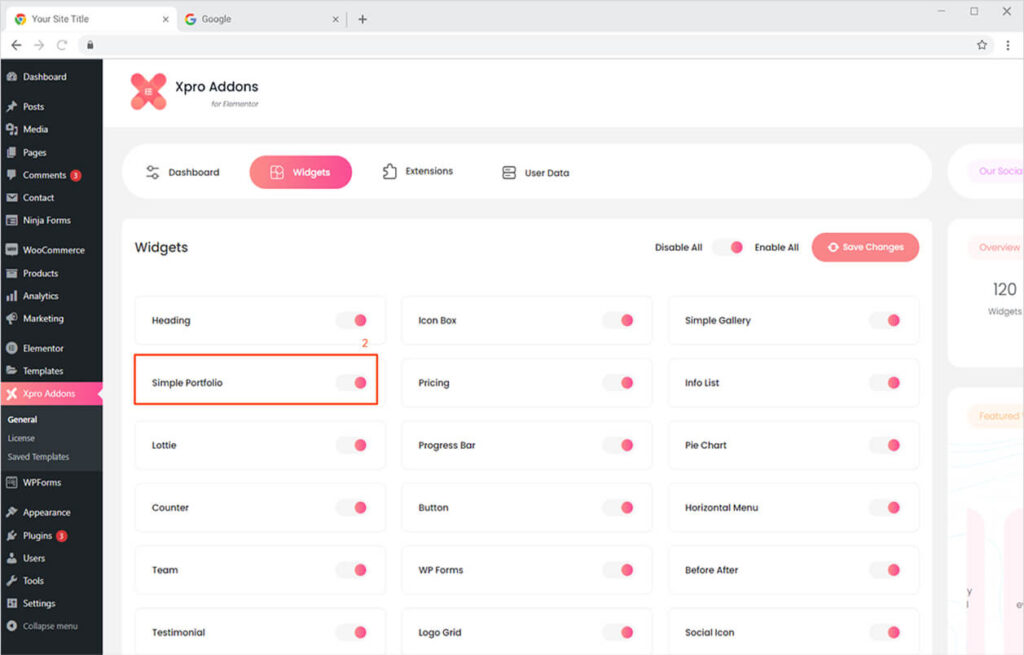
Step 2
From the Xpro Addons Dashboard, click on the Widgets Tab, find the Simple Portfolio Widget, and then toggle the button ‘ON’ to enable it.
How to Use Xpro Simple Portfolio Widget for Elementor
With Xpro Simple Portfolio, you can easily highlight your portfolio items on your website. It’s the most effective way to let your audience notice your work and take action. Grab your site visitor’s attention and make them instantly engage with your content. You can present your work in multiple eye-popping portfolio items and categorize them for easy navigation. It’s simple, FREE, fun, and time-saving! Here’s how to use this amazing Elementor Simple Portfolio widget.
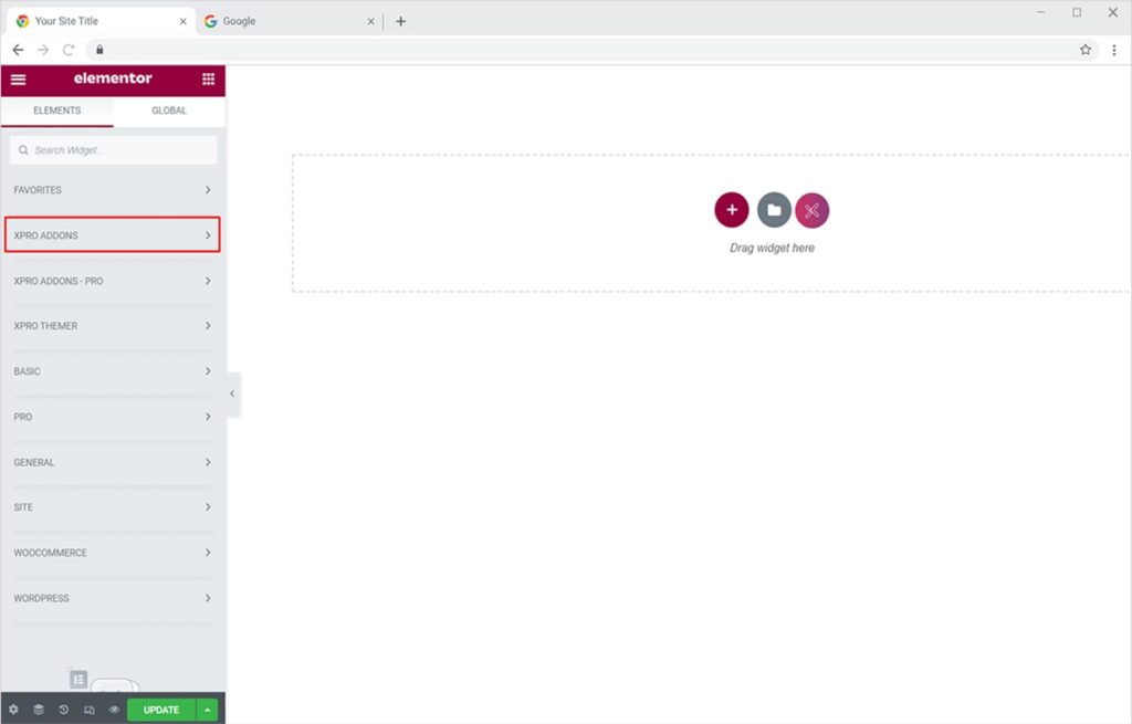
Step 1
Click on the Xpro Addons section available in the Elementor Editor.
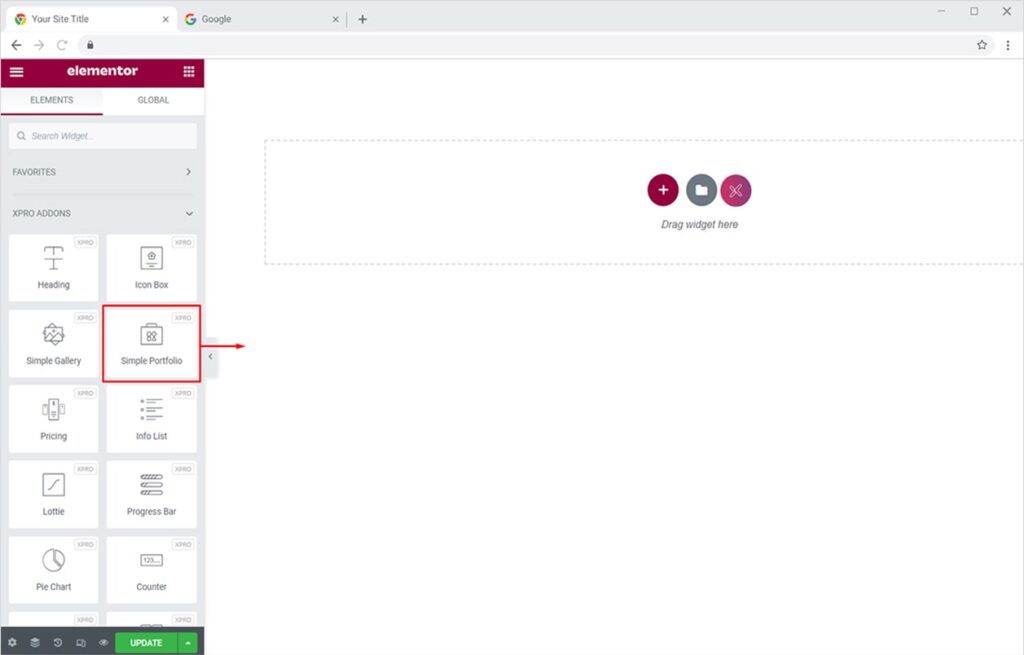
Step 2
From the Xpro Addons section, find and simply drag’n’drop the Simple Portfolio widget on your desired page location.
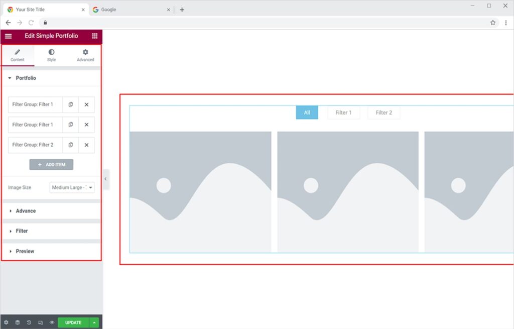
This is the default view of the widget:
How to Add Portfolio Items using Xpro Simple Portfolio Widget
Adding portfolio items instantly attracts and engages your audience with your portfolio. You can add one or multiple portfolio items in 1 filter and set any portfolio filter as a default active filter. Let’s see how to do that!
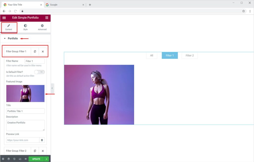
From the Content Tab, click on the Portfolio Section. You will see multiple filter groups by name (default). Click on any filter and name it as you like. To set the featured image, click on the Featured Image option and choose any image of your choice from the media library or upload it from your PC.
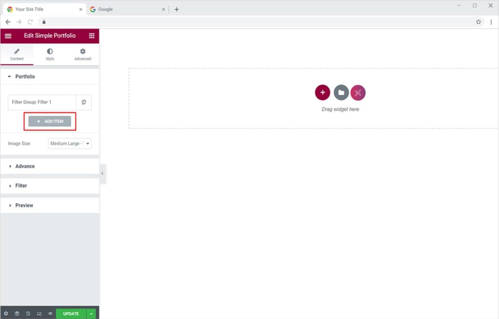
Now you can assign multiple portfolio items to one filter by keeping the same filter name for those items. Click on the Add Item button and add the name of the desired filter group. Similarly, add the featured image.
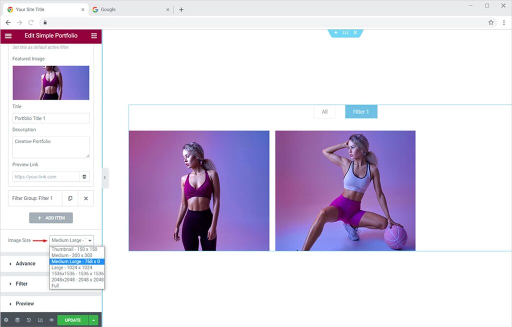
You can resize your image from the Image Size option.
How to Add & Style Filters using Xpro Simple Portfolio Widget
Once you’ve added portfolio items to one filter, you can create multiple filters, set any as your default filter, and style them as you want.
Go to the Content Tab and click on the Add Item button. Name your new filter and add a featured image
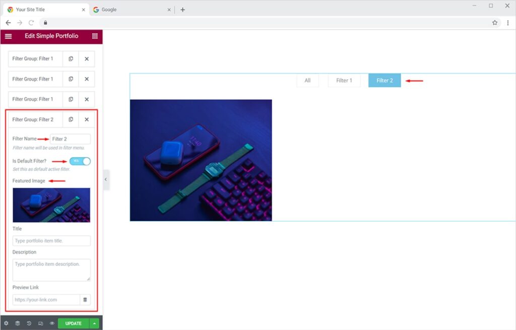
to it. You can set any filter as the default active one by toggling the Default Filter button to ‘Yes’.
Now you have two filters for your portfolio. It’s time to add creative styling, animations, and more to your filters.
Under the Content Tab, go to the Filter section to explore more features for filters. Here you can toggle the filter menu on or off, enable/disable the ‘All’ filter, and apply amazing animation to your filters. The ‘All’ filter simply combines all of your portfolio items and shows them under one filter.
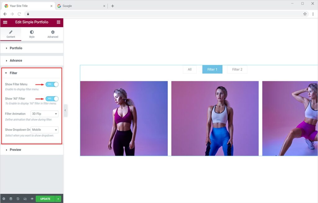
By turning off the Filter Menu, the ‘All’ filter will also be disabled or you can only disable the ‘All’ filter. The portfolio view will be like this if Filter Menu is turned off:

Now let’s add animation to your portfolio filters in Elementor. From the Filter section, select any of the 3 animations you like (3D Flip, Quick Sand, Fade Out). Here we will try ‘Quick Sand’ animation.
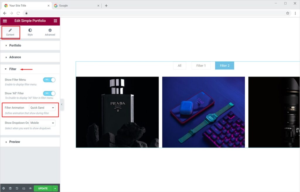
Now whenever someone switches between your portfolio filters, a unique animated transition will happen just like the following:

Let’s get more creative and style your portfolio filters using our Simple Portfolio Widget for Elementor.
Click on the Style Tab and open the Filter section available in the dropdown menu. From here you can change the typography of the filters and set alignment as left, center, or right. Moreover, you can add a border to your filters, add color to the border, and adjust the space between them to create a pleasant-looking filter section for your portfolio. You can also customize the border-radius, item padding, and margin for filters.
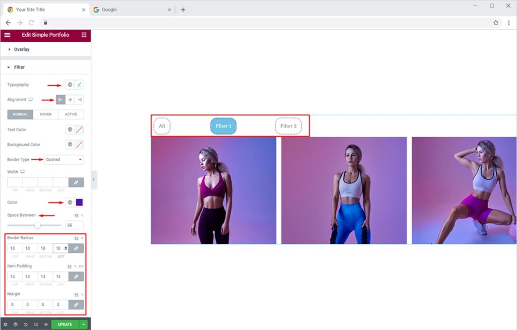
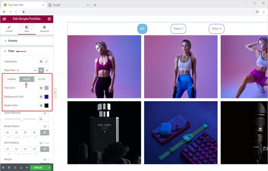
Now let’s customize the filters for ‘Hover’ mode. From the Filter section, click on the Hover option. Here you can customize the color scheme for filter text, background, and border.
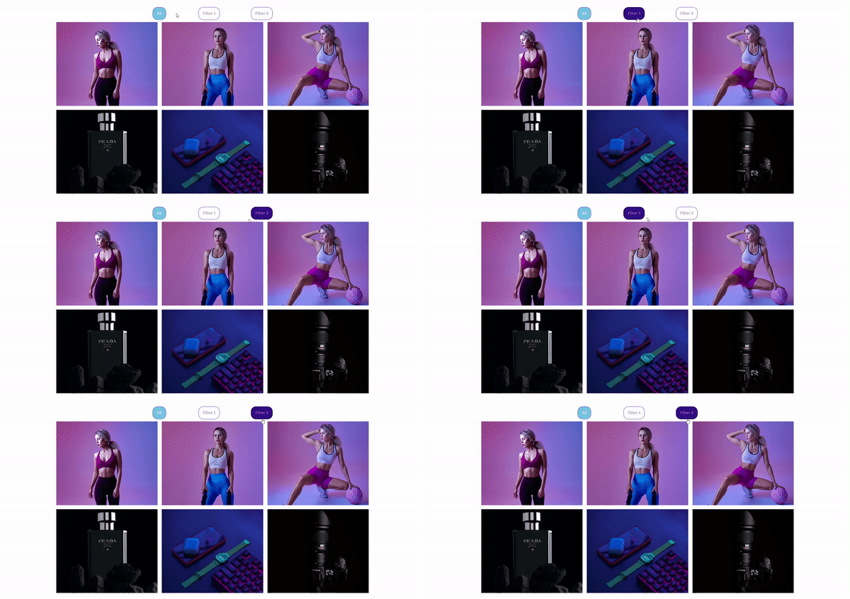
Now the hover effect on your filters will look like this:
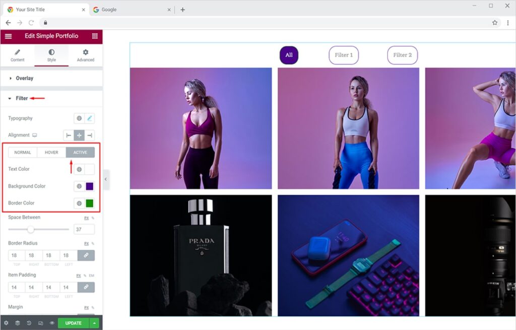
Similarly, you can customize the portfolio filters for ‘Active’ mode. From the Filter section, click on the Active option. Here you can customize the color scheme for filter text, background, and border.
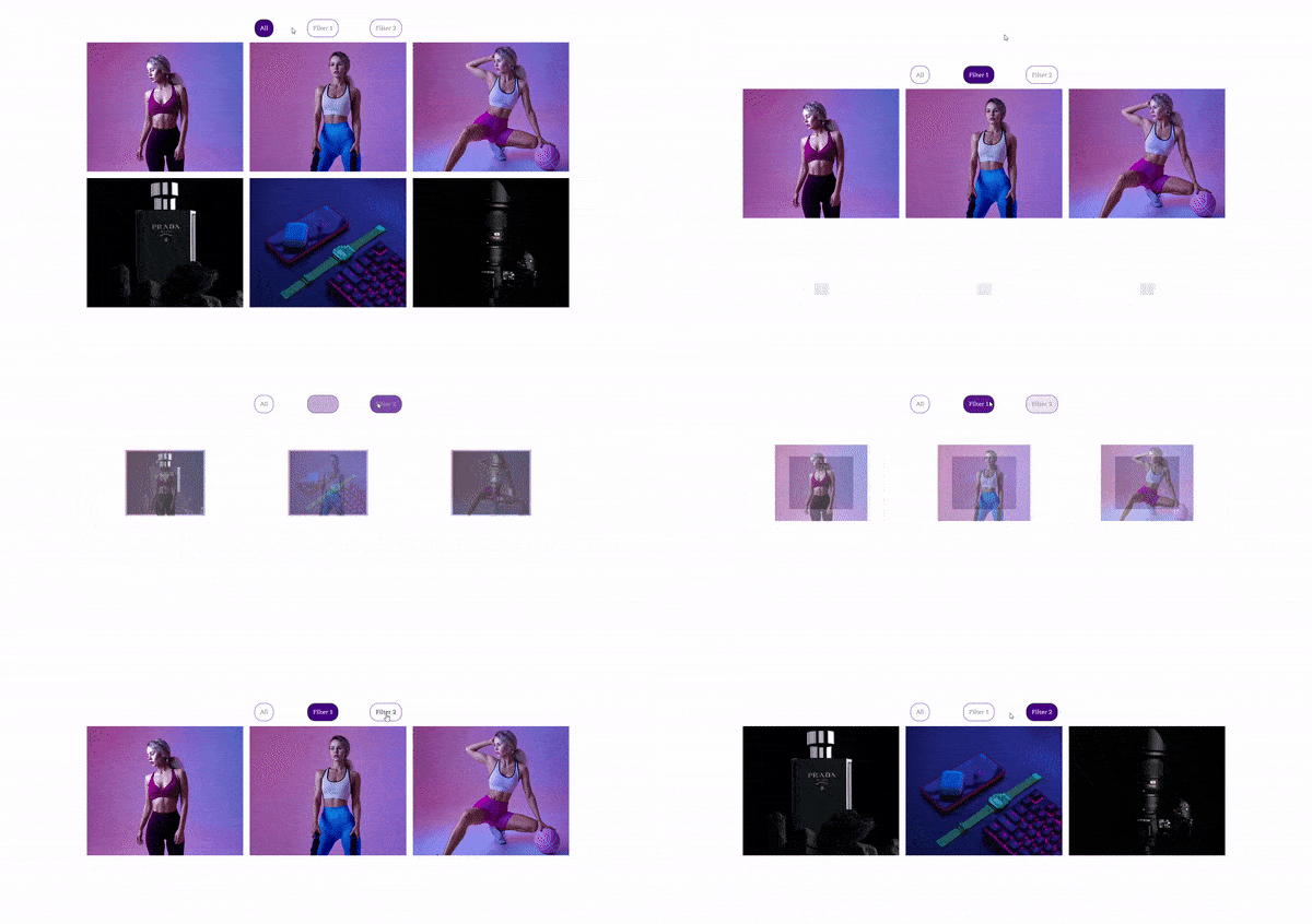
Now the Active filters will look like this:
Customize Single page and single post layout of your Elementor websites using our free theme builder for Elementor.
By Xpro Elementor Addons
How to Add & Style Item Hover Effects for your Portfolio in Elementor
You can add appealing hover effects to your portfolio items within minutes. Let’s design them to instantly captivate your site visitors. Go to the Style Tab and click on the Overlay section. From the options available, you can add any of the 3 Hover effects (Fade In, Zoom, Rotate). Set a gradient background with linear or radial type and select the position as you please.
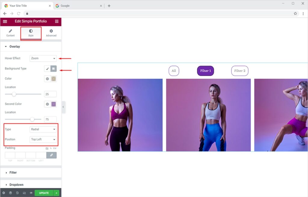
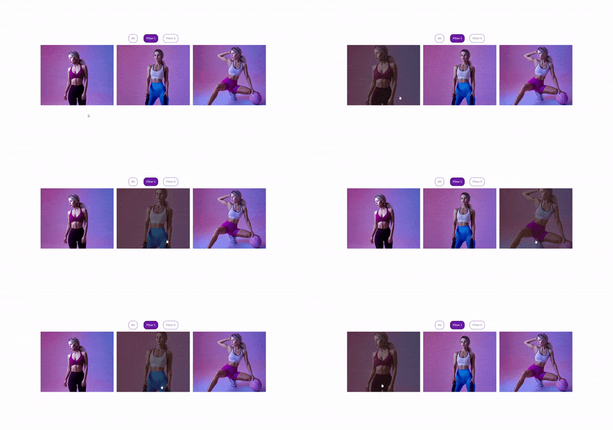
Your portfolio items will look like this on hover with the ‘Zoom’ effect.
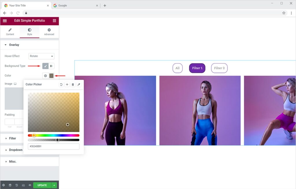
You can also set a solid color as a background type. To do this, select the Classic option from the Background Type section, set the color of your choice, and give it the opacity you want.
The final output will look like this with the ‘Rotate’ hover effect.

How to Add & Style Icon, Title, Description & Button of Your Portfolio Items
Add incredible Icons, captivating Titles, Descriptions, and Buttons to your portfolio items and entice your users once they hover over your portfolio items. This is another amazing feature you can add to your portfolio using our Free Xpro Simple Portfolio Widget. Adding Buttons to your portfolio items makes them more appealing and engaging for visitors. Titles & descriptions also help you to give a brief statement about your portfolio items, making it easier to get the attention of the users.
First, you need to activate the icon, title, description, and button from the Content Tab. Under the Advanced section, toggle the buttons to ‘Yes’ against all options.
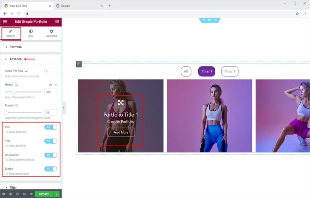
Once you have activated all options, now you can style each one for your portfolio items.
Style Your Icon for Elementor Portfolio Items
You can design the icon for your portfolio items from the Style Tab. Click on the icon section, you’ll see multiple options for styling your icon. You can add any icon of your choice by uploading a custom SVG or choosing from our massive Xpro Icon library or Font Awesome library. Adjust the size of the icon and icon background.
You can also change the color accent of the icon and add a border for ‘Normal’ mode. Choose a border you like, add a pleasing color to it too.
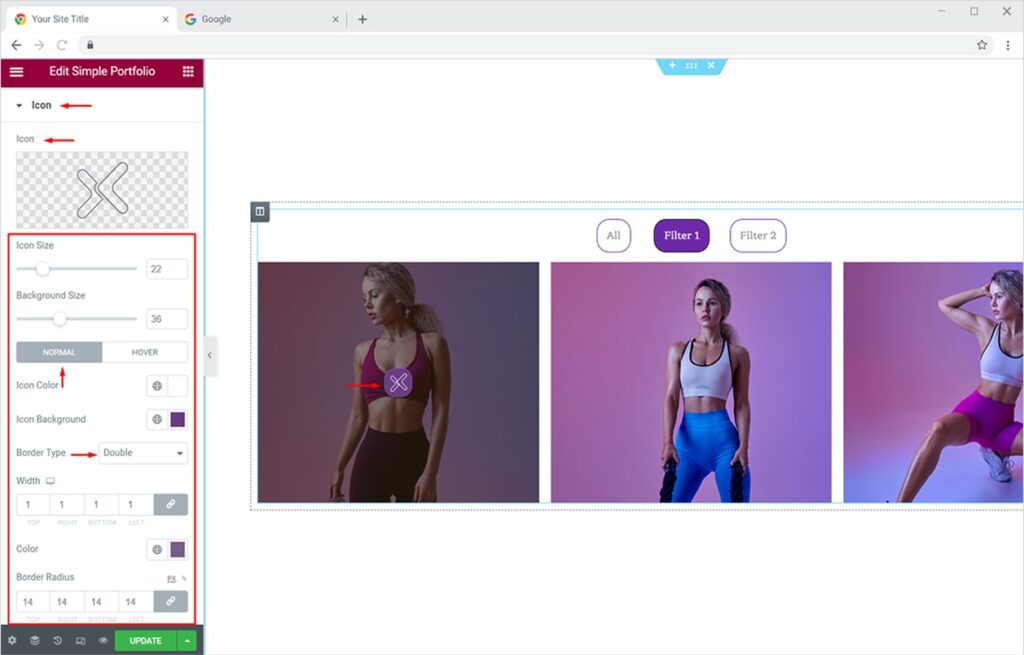
You can also change the color of your icon for the hover effect. Just switch to the ‘Hover tab’ and add the colors of your choice for the icon, background, and border.
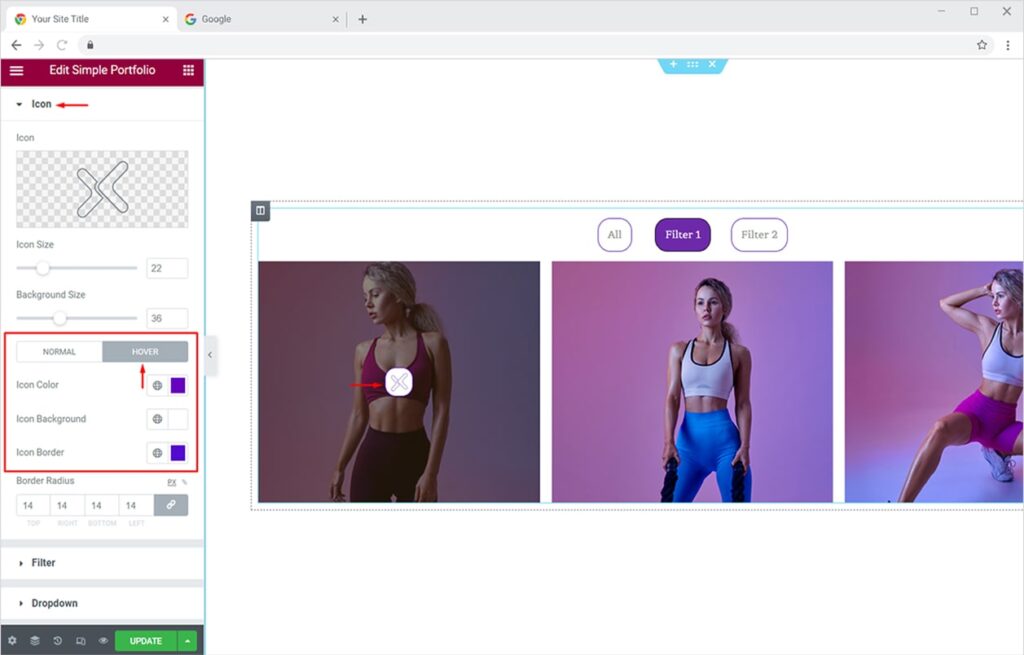
The final output will be like this.

Style Your Title & Description for Elementor Portfolio Items
Once you’ve activated the Title and Description from the Advanced section, you can now add an attractive title and description for each portfolio item. Click on any portfolio item visible in the Portfolio section. Now add your desired text in the Title and Description field.
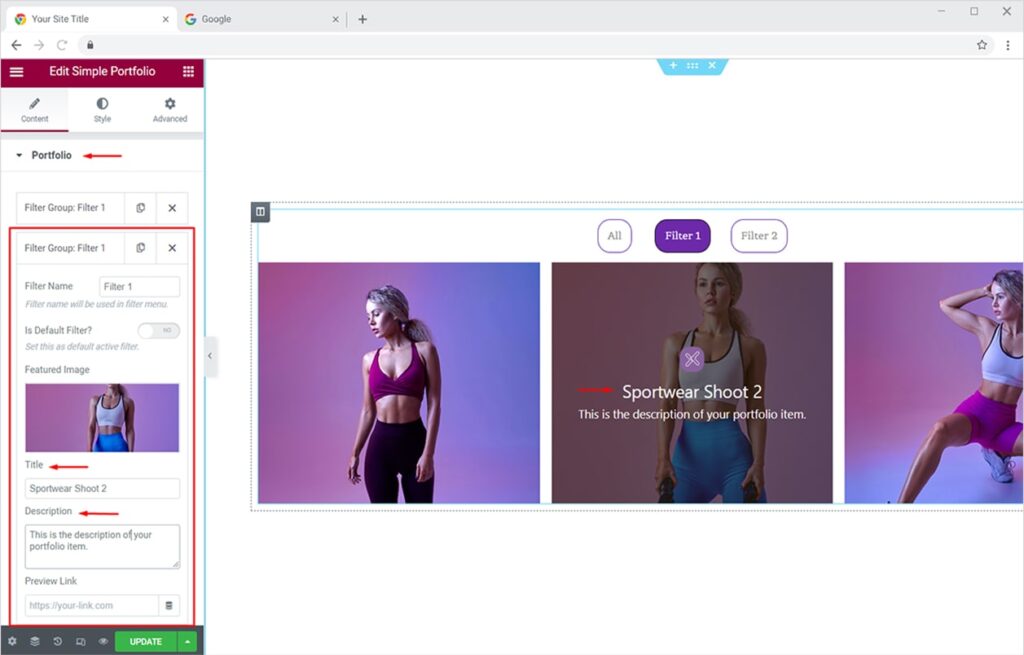
From the Style tab, you can change the color, typography and adjust the margin for your title and description.
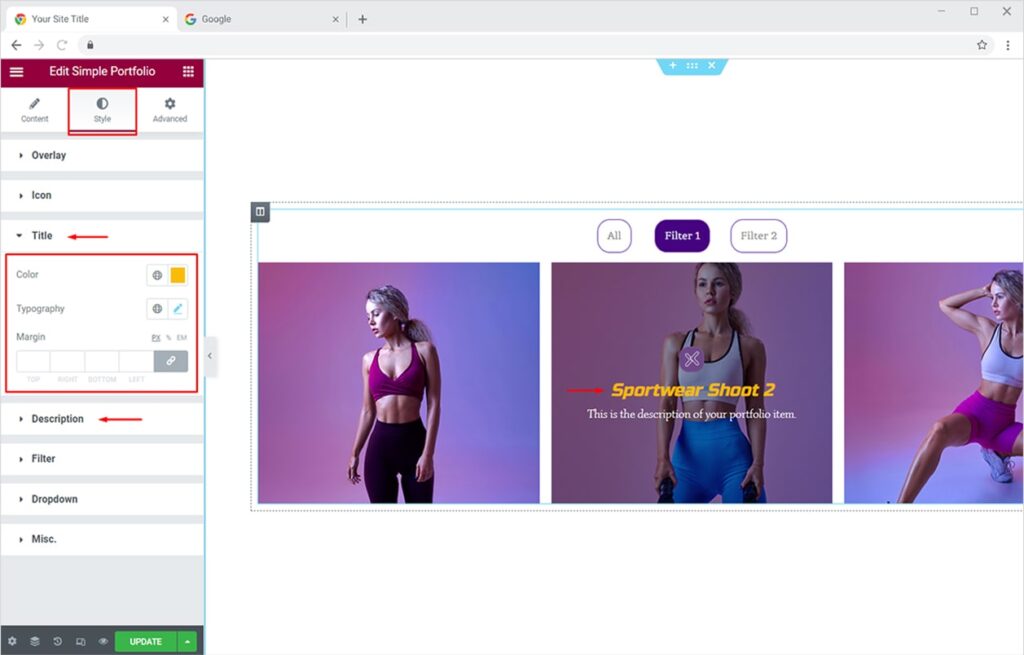
Style Your Button for Elementor Portfolio Items
Now let’s style interactive buttons for your portfolio items. Adding Buttons to your portfolio items instantly drives clicks to your detail popups. Click on the Style Tab and find amazing options under the Button section. You can change the typography for text, add background text color for ‘Normal’ mode, add up a nice border & style it, adjust the border radius, padding, and margin.
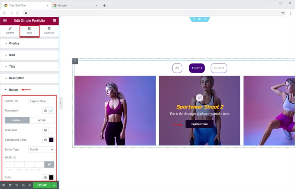
Now you can change the color accents for button ‘Hover’ mode too. Just switch to the Hover tab and add up your personalized colors. The final button output will look something like this:
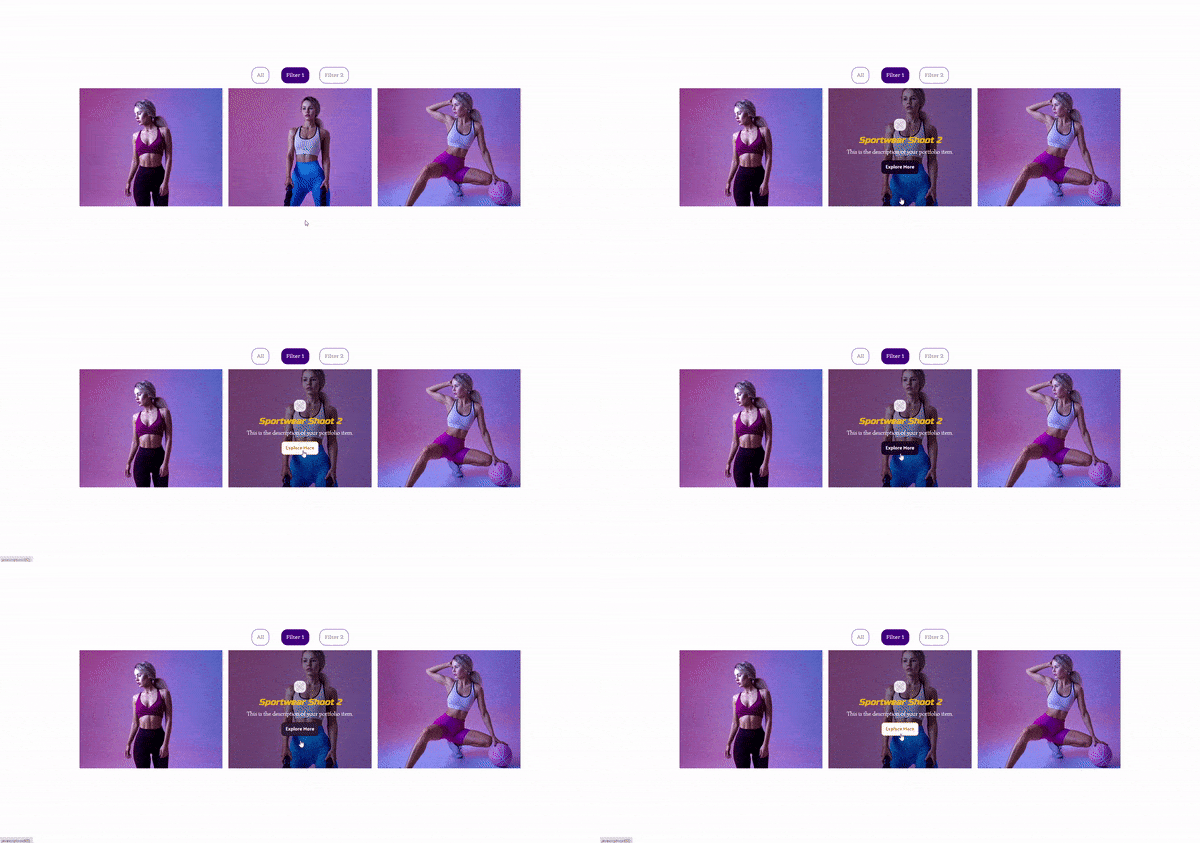
How to Add & Style Preview Popup of Portfolio Items in Elementor
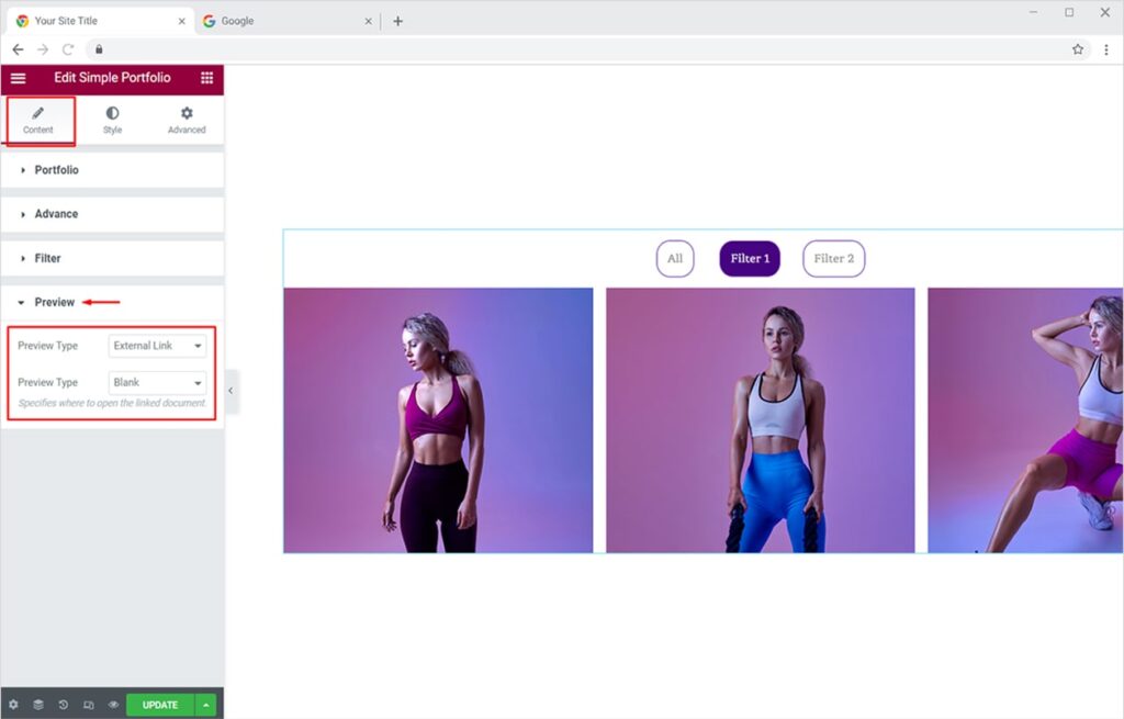
Now that everything is set up nice and stylish for your portfolio items. You surely want to redirect your site visitors towards a detailed page once they click on any of your portfolio items. You have 2 options to preview your portfolio (Popup and External Link). Firstly, open the portfolio item whose preview you want to show. Go to the Content Tab and open the Portfolio section. Click on the desired portfolio item and add your link in the Preview Link option.

Now click on the Preview section and choose the preview type you like. Here we will try the Popup preview first. You can choose any of the 2 layouts and add a nice popup animation to it (slice left or slice right).
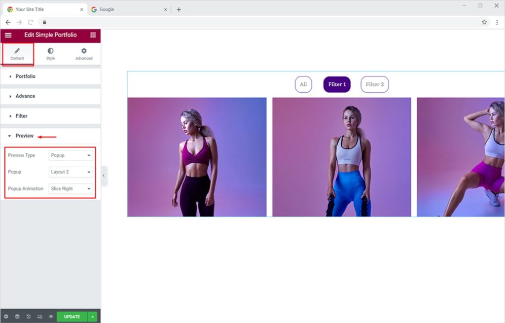
Now let’s style your preview popup from the Style Tab. Click on the Popup section to find design options for each element of your preview popup. From here, you can set custom colors for popup overlay, background, and separator. Similarly, you can set colors of your choice for Close and next/Prev buttons for both modes, Normal and Hover.
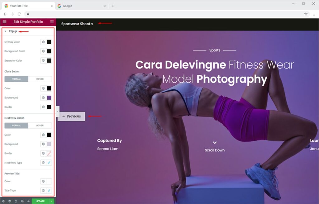
The popup will look like this whenever your visitors will preview any of your portfolio items.
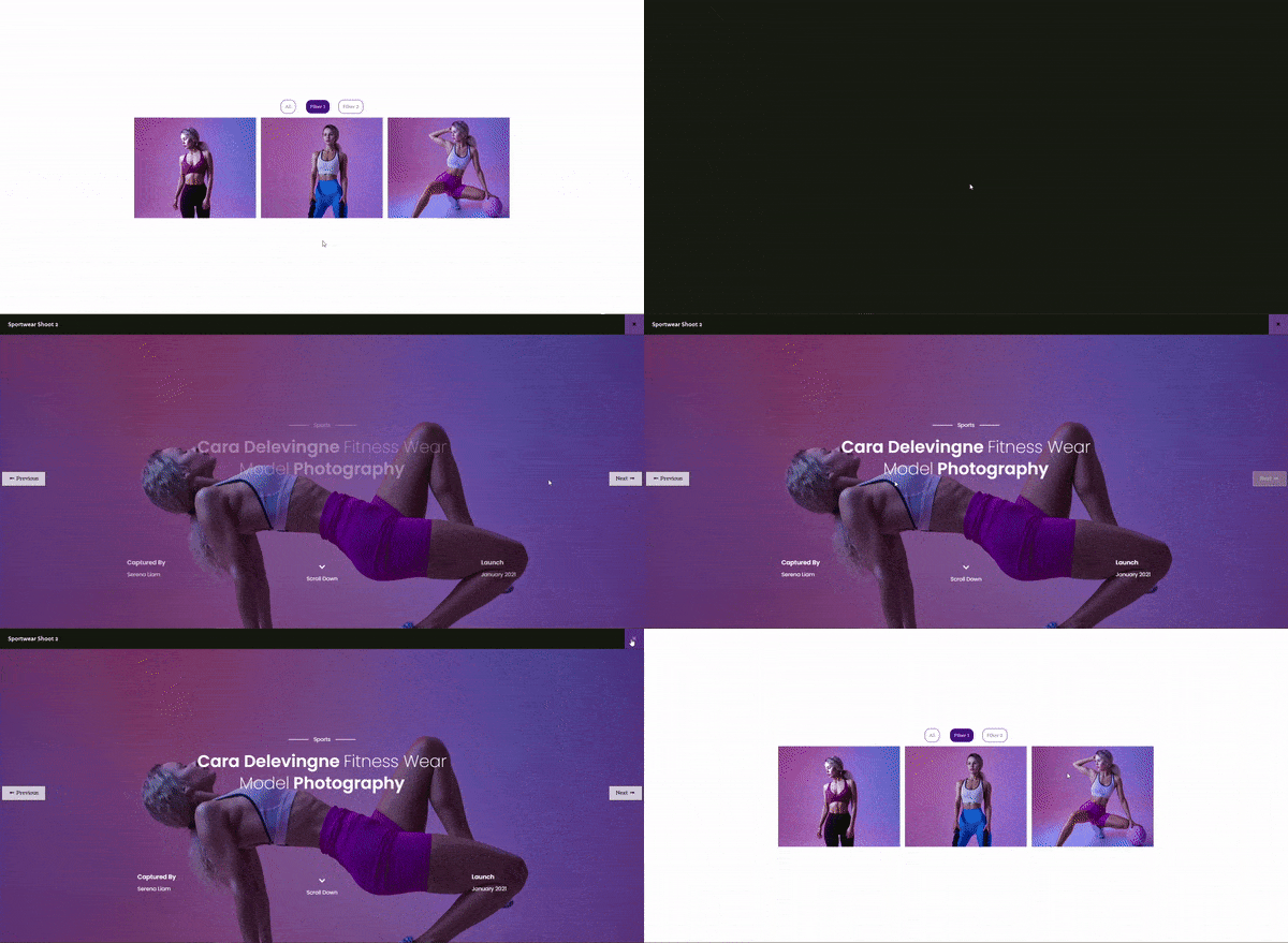
Similarly, you can let your site visitor open preview popups in the external tab. To do this, simply change the preview type to External Link from the Preview Type section under Content Tab. Set the Target to either Blank (new tab )or Self (same page).
How To Style Your Portfolio for Mobile Devices in Elementor
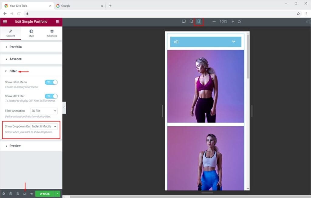
make them look pretty in a responsive view too. As most of the design is done on Desktop, somehow most of the internet users are on mobile. This quick feature allows you to make your portfolios instantly attractive on all display devices. Firstly, turn on the responsive mode from the options available in the footer of the Elementor editor.
Now from the Filter section under Content Tab, choose the devices you want the filter dropdown to appear on (Tablet & Mobile or only Mobile).
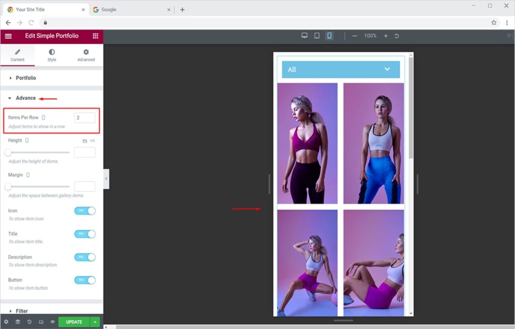
You can also adjust the layout of portfolio items from the Advanced section. Here I have set it to 2 items per row. This will make your portfolio items more pleasant for mobile users.
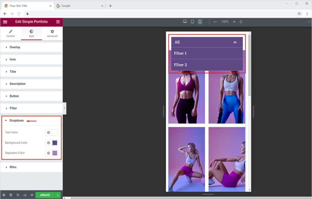
Now let’s style your portfolio’s dropdown menu. Click on the Style Tab and open the dropdown sections from the available ones. You can change the color accent for text, background, and separator of the dropdown menu.
This is all from our Simple Portfolio Widget for Elementor. I hope now you have a better understanding of how to fully utilize our amazing portfolio widget and create amazing portfolios for your websites. If you want to explore and add more attractive features then head over to our Xpro Elementor Advanced Portfolio Widget and Elementor Carousel Portfolio widget documentation right away.