Table of Contents
Introduction:
Pop-ups can be frustrating, especially when they appear unexpectedly during our online browsing or while reading an article. Just as we’re engaged in content, a pop-up demanding a newsletter subscription or contact details interrupts our flow. While they’ve earned a bad reputation for blocking website content, they can still be quite useful if used effectively with the Xpro Elementor Modal Popup Widget.
Perfectly designed popups can help you gain conversions, increase email lists, and encourage users to take action without interfering with their browsing experience.
In this blog post, we’ll talk about 12+ best practices to understand how popups can be useful to drive more conversions. Additionally, we will discuss the importance of effective pop-ups while providing strategies to improve conversion rates.
So, without further ado, let’s get started.
Benefits of Using Effective Popups on Websites:
Using effective pop-ups on a website offers several benefits that can enhance user engagement, drive conversions, and optimize your overall digital marketing strategy. Here are some key benefits:
1. Increased Conversion Rates:
Well-designed pop-ups can capture user attention and encourage them to take specific actions, such as signing up for newsletters, making purchases, or downloading resources, to effectively boost conversion rates.
“According to the research, Medstar Media, a digital marketing agency, experienced a 500% increase in client conversions by implementing popups. Before this, only 2% of website visitors requested appointments.”
(ref: Optinmonster)
2. Enhanced User Engagement:
Interactive and relevant popups can engage visitors by offering specific content, promotions, or information related to their interests, resulting in more time spent on a page and more visits.
3. Growth of the Email Subscriber List:
Popups can serve as effective tools for building your email subscriber list by prompting visitors to sign up for newsletters, updates, or exclusive offers. It also enables you to follow up with clients and build long-term relationships.
4. Promotion of Special Offers or Events:
Pop-ups can be utilized to highlight special promotions, discounts, sales, or upcoming events. It creates a sense of urgency as well as encouraging users to take immediate action.
5. Data Collection and User Insights:
Through pop-ups, you can collect valuable user data, preferences, and feedback, enabling you to refine your marketing strategies, improve user experiences, and make informed business decisions.
6. Cost-Effective Marketing Technique:
Compared to other forms of digital advertising or marketing efforts, popups can be a cost-effective solution for reaching target audiences, generating leads, and driving conversions without making a significant investment.
7. Increased Sales:
Strategically designed popups can help you increase sales by offering discounts or reminding users about items in their carts.
Let’s say a visitor browses your product page, adds an item to their cart, then takes a moment and decides to move their cursor towards the close tab. At that moment, an exit-intent popup appears, offering: “Thanks for considering this beautiful dress! Get 10% off with code PINKPARTYWEAR10.”
This personal touch shows that you value their interest. You can also add a free shipping offer in the popup! “Spend $12 more and get free shipping.” This encourages them to make a purchase and possibly discover an additional item to get free shipping.
Additional Benefits of Using the Elementor Modal Popup:
Elementor offers an intuitive drag-and-drop interface that makes popup customization extremely simple. You can easily modify layouts, colors, fonts, and more to align with your brand’s overall look and feel.
Using the Xpro Elementor Modal Popup Widget, you can quickly create compelling call-to-actions (CTAs), forms, social icons, and download buttons on popups within minutes. Whether you are promoting sales, upcoming events, or new products, this widget gives you the design features to make your message stand out.
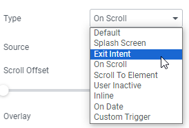
With the elementor modal popup, you can support the following trigger types, which include:
- Splash screen: Display popup after a specified amount of time.
- Exit-intent: Appears when a user tries to leave the page.
- On scroll: Appears as the user scrolls through the page.
- Scroll to elements: Shows when the user reaches a specific section of the page.
- User inactive: Shows when a user stops activity for a set time.
- Inline: Displays within a designated area or section.
- On date: Display on a specified date or time.
- Custom Trigger: Activates an individual trigger based on user-defined conditions (e.g., button click).
You can easily select these trigger types from the dropdown menu of the Xpro Elementor Modal Popup with just a single click. With these display types, you can engage users at the right time and make your popups more effective.
Moreover, this Elementor Modal Popup plugin can integrate with a variety of email marketing tools, such as Mailchimp, as well as forms (specifically contact forms). This makes it an excellent choice if you want more people to sign up for your newsletters.
Furthermore, you can also add dynamic content using the Elementor Modal Popup Widget. For example:
- Add files that users can download to the popup windows.
- Add forms to capture leads (emails or other information) and allow visitors to log in directly from the popup to the website.
- Display videos in the popup
- Show Google Maps in a popup.
- Create unique coupons to encourage people to make a purchase and many more.
Now, let’s talk about the best practices for using Elementor Modal Popups to drive more conversions.
Strategic Tips to Boost Conversion Using Elementor Modal Popup
Popups, once the most annoying part of the internet, have evolved into effective conversion techniques for capturing leads, boosting sales, and promoting brands.
Using popups strategically with the best practices helps to generate more conversions.
Here are some proven ideas for using popups to boost conversion:
1. Start with Your Purpose/ Clarify Your Intent:
Before diving into creating a pop-up campaign, clarify your objectives.
Understanding your ‘why’ sets the stage for defining visitor actions( what you want visitors to do when they see your pop-up). Do you want them to sign up for emails, quickly fill out a form, or give them a special offer?
Once you’ve determined your core objective, consider the finer aspects of your campaign:
- Which conversion metrics will best measure the effectiveness of your pop-up?
- What incentive will resonate with users, encouraging them to act?
For example, you’re running an online home decor store and launching a spring clearance sale. Implementing a pop-up that features discounted home essentials or seasonal decor collections can engage visitors immediately, encouraging them to browse and refresh their living spaces.
Moreover, by utilizing popups created with the Xpro Elementor Modal popup widget, you can enhance the user experience by incorporating dynamic functionalities. For example, you can showcase videos to give users an idea of how specific home essentials will improve or transform their living areas, giving visitors a real-time visual and further encouraging them to make purchases. In this way, you can easily convert your visitors into loyal customers.
2. Target the Right Audience:
When it comes to pop-up strategies, understanding not just the ‘why‘ but also the ‘who‘ is key.
Don’t blast everyone with the same popup. If you want to target new visitors, you should place the newsletter subscription popups strategically on high-traffic pages or those pages where new users may land, like the homepage. For existing buyers, you can design popups to encourage them to share referral links once they’ve completed their purchase.
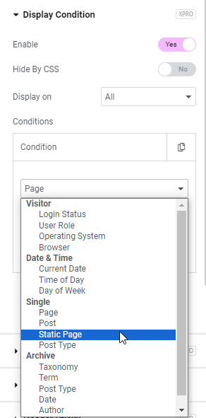
For applying display conditions, you can use the Xpro Elementor Modal Popup in combination with the Xpro Display Condition extension for elementor to set specific display conditions based on the audience you are targeting. This extension allows you to target visitors based on criteria such as date & time, specific pages, and more, as you can see in the screenshot below:
3. Time is Everything: Display Popup at the right time
Time is everything when it comes to popups for optimal engagement. Displaying them too quickly may disrupt your visitors and cause them to leave. However, if you present them too late, you may miss out on opportunities to engage them and keep them. Therefore, strategically showcasing popups at the appropriate time is essential for maximizing effectiveness and user engagement.
To optimize the timing and relevance of your popups, consider adjusting the following parameters:
- Set the delay before a popup is displayed.
- Shows when the user reaches a specific section of the page.
- Specify the percentage of page scroll required to trigger the popup.
- Display popups strategically as visitors move their cursor towards the “X” in the browser tab and offer a last-minute incentive to stay.
- Furthermore, activate popups after a certain time of user inactivity.
Setting up these trigger types is hassle-free. Simply choose your preferred trigger options from the drop-down menu within the Xpro Elementor Modal popup widget, as you can see in the screenshot below:
4. Create Compelling Offers:
What will make visitors click that “Subscribe” or “Buy Now” button? Consider the following strategies to encourage visitors:
- Offer limited-time discounts, early access to sales, or free resources not available elsewhere.
- Customize offers based on visitor needs or preferences.
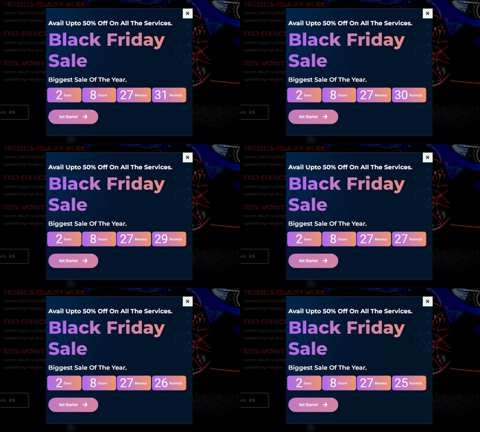
- Use limited quantities or countdown timers to create a sense of urgency and prompt action. A sense of urgency and limited resources are the two most effective approaches that you can use to win consumers, particularly for huge sales like the Black Friday Sale, New Year Sale, and more.
???? If you are thinking about adding a countdown timer to a modal popup, try using the Xpro popup builder because it comes with dynamic functionality. So, you can easily add the elementor countdown timer widget to your popup.
5. User-Centric Approach
Avoid frustrating users with excessive popups by strategically placing them and limiting their number to a single page.
Here’s how to find the perfect spot:
Use sidebar popups: Simple yet informative, sidebars, as seen on the HubSpot blog, provide important notifications that don’t obstruct the main content.
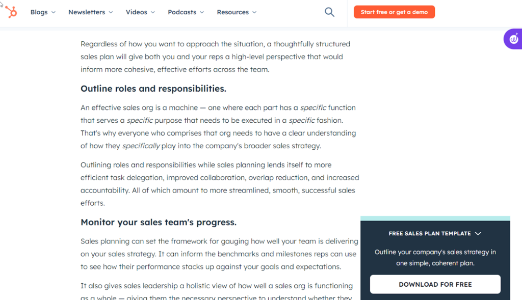
???? With the Xpro Elementor modal popup widget, you can display the sidebar popup with just a single click by adjusting your popup position to the bottom right.
Less is More: If managing multiple campaigns, ensure you don’t overload users with too many pop-ups in one session. Three popups per session or website, Max! One for newsletter signup, one for exit-intent promotions, and maybe the last one for feedback or help.
Remember: Popups are sources of information, not roadblocks. So, use them strategically with the elementor modal popup widget and keep your visitors happy.
6. Get Creative with the Copy and Design
Your popup should also be visually appealing and easy to understand.
Headline: Keep it clear, concise, and benefit-oriented. Highlight the value proposition.
Visuals: Use high-quality images or videos that complement your message and brand.
Call to action (CTA): Make it prominent, actionable, and easy to find. Use strong verbs like “Download Now” or “Get Started.”
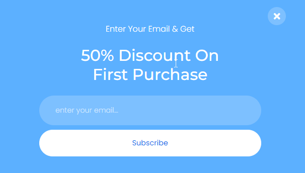
7. Ensure Effortless Popup Exit Options:
To maintain a seamless and positive user experience, implementing an easily accessible exit option for popups is extremely important. Having popups that are difficult to close affects users’ browsing experience and can discourage them from engaging with your content further.
Here are some best practices to ensure an effortless exit option:
Clear and Visible Close Button: Always include a visible “X” or “Close” button on the popup. Position it strategically (like in the top right corner) so that users can spot and click it without difficulty.
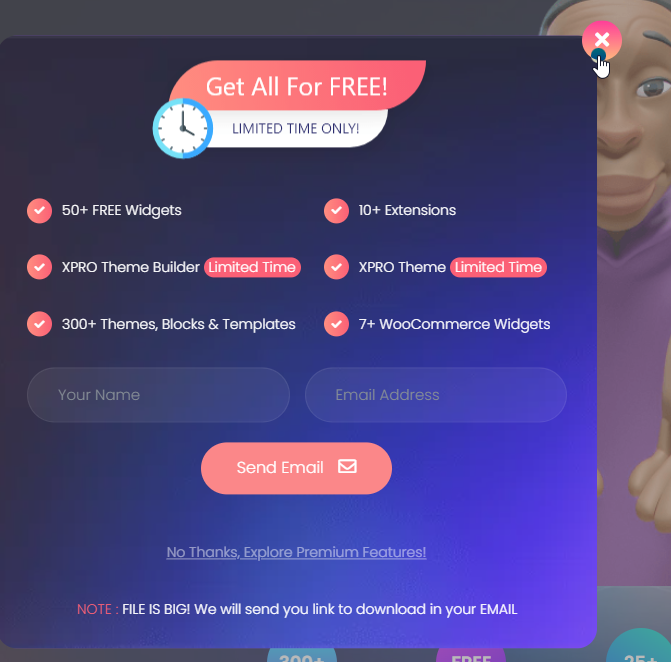
Responsive Design: Ensure that the close button is easily accessible on all devices, including desktops, tablets, and mobile phones. Also, adjust the size and placement for optimal usability.
User-Friendly Interface: Furthermore, do not place multiple exit options or make users jump through steps to close the popup. A single, straightforward close option is sufficient and appreciated.
Tip: In the Xpro elementor modal popup widget, you can easily find this close button option under General Settings. You can also change your close button icon from the icon library and style it (under the style setting) according to your website branding.

????Xpro Elementor Modal Popup comes with the Xpro Elementor Addons pro version, which includes 70+ premium elementor widgets, premium elementor extensions, pre-built elementor templates, and much more. The price of pro version starts at $29 with a 14-day money-back guarantee.
8. Prioritize Mobile-Friendly Design
Over half of all web traffic now comes from mobile devices. If your popups aren’t optimized for smaller screens and touch interactions, you’re losing a significant portion of your audience. Additionally, unused popups on mobile lead to higher bounce rates and lower conversion rates.
“According to the research, Email popups generate 74.27% more conversions on mobile than on desktop.”
(Ref: getsitecontrol)
You should consider the following guidelines when designing mobile-friendly popups to maximize engagement and conversions:
Responsive Design: Use a responsive design framework that automatically adjusts the popup layout and size based on the device screen.
Simplified Content: Reduce text quantity and avoid complex visuals to focus on the core message and offer. Also, maintain a clear hierarchy, clear fonts, and appropriate spacing to enhance readability and comprehension.
Large Buttons: Make your call to action button large and easy to tap on touch.
Minimal Elements: Avoid unnecessary animations and excessive visual clutter.
Clear Closing: Ensure the close button is prominent and easily accessible on mobile screens.
Timing and Targeting: Avoid showing popups right away on mobile. Consider delaying them or using exit-intent triggers to improve the user experience.
Remember, happy mobile users are more likely to convert!
Let me explain with a quick example:
As we all know, the majority of users prefer to buy products online through mobile phones due to convenience, accessibility, and flexibility. Smartphones and tablets have become more user-friendly for browsing products, making purchases, and more.
Imagine you are browsing an online furniture store through your mobile phone, and you are in love with a cozy armchair that is perfect for your reading spot. But something holds you back—the price tag.
Just as you consider leaving the page, a sleek, mobile-friendly popup appears. It adjusts beautifully to your phone screen, with no annoying zooming required. It is showing a targeted offer: “Upgrade your comfort! Get 15% off this armchair with code ARMCHAIR1256. At that time, it speaks directly to your interest and offers a tempting discount. Lastly, two large buttons are present—”Shop Now” and “Close.”.
So, at that time, the convenience, targeted offer, and appropriate CTA (Shop Now) entice you to add the armchair to your cart and complete the purchase with ease, all on your phone.
9. Testing and Refinement:
Don’t settle for the first popup you create. A/B tests different designs, headlines, CTAs, and triggers to see what resonates the most with your audience.
Elementor Page Builder makes it easy to test your popup with a live preview before finalizing and publishing it. It enables you to make informed decisions based on real-time feedback, ensuring optimal engagement and conversion rates for your website visitors.
10. Choose the appropriate format:
The term “popup” includes a variety of techniques designed to capture visitors’ attention.
These formats include:
- Central, off-canvas, screen-overlay, and lightbox popups
- Side-scrolling popups
- Full-screen takeovers
- Header and footer bars
Each format comes with advantages, drawbacks, and levels of disruption, making them suitable for specific scenarios. For example, small popups are ideal for mobile devices, whereas larger overlays are best for showcasing promotional offers.
To find out which works most effectively under which circumstances, you should test different popup formats. But it’s important to keep in mind that you have more than one option.
Tip: Instead of designing different popups in different formats, you can use pre-built Elementor templates to test your popup format effortlessly. With this approach, you will be able to make data-driven decisions and implement ongoing optimization techniques.
11. A clear and enticing call to action (CTA)
The primary goal of any popup is to prompt users to take action promptly. It’s not designed for starting discussions, self-introductions, or wasting time. The key is to be direct and concise.
Therefore, your call to action (CTA) must be clear and unique in its purpose from the starting point. Users should be guided to complete a single task without encountering multiple choices or confusion. A straightforward approach is important because a confused visitor is less likely to take action.
Best Practices for Creating a CTA on a Popup:
Use strong verbs: Use targeted language like “Get Started,” “Subscribe Now,” or “Claim Your Discount.”
Design for visibility: Make CTA buttons visually prominent with contrasting colors and clear text.
Create a sense of urgency: Use phrases like “Limited Time Offer” or “Don’t Miss Out.”
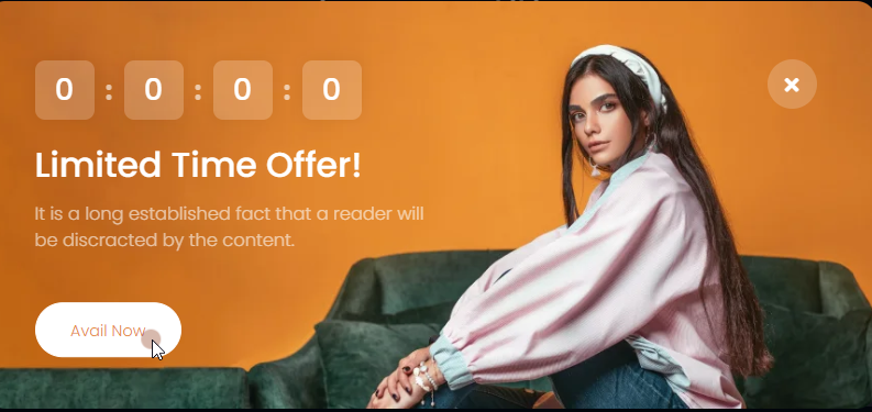
12. Align the Popup design with the rest of your Website
Aligning your popup design with the rest of your website is crucial for creating a cohesive user experience and maximizing its effectiveness.
Consider these best practices for aligning popups:
Color palette: Use the same color palette as your website to create a sense of familiarity and brand recognition.
Fonts: Use the same fonts or font families you use on your website for text consistency.
Imagery: Match the style and tone of your website’s visuals in the popup images or backgrounds.
Design elements: Use similar buttons, icons, and other design elements to maintain a cohesive look.
Grid system: Align the popup’s layout to the grid system used on your website for a balanced appearance.
Spacing and padding: Maintain consistent spacing and padding between elements within the popup and with the website layout.
13. Clear yet Concise Descriptions:
Visitors have limited attention time, so clarity is key. Clear and concise descriptions ensure that users quickly understand the message or offer without getting confused. It also helps in communicating information effectively and encouraging users to take the desired action.
Before creating popups, follow these practices:
- Get to the point quickly: Use short, attention-grabbing headlines and bullet points to convey your message.
- Focus on benefits: Highlight the value users will gain from taking action in the popup.
- Use clear language: Keep your language simple and free of unnecessary words.
- Proofread carefully: Ensure there are no typos or grammatical errors.
14. Use Visuals on Popups:
Using visuals on popups can significantly enhance user engagement and comprehension, allowing the visuals to convey information more effectively. Visual elements such as images, icons, or videos can capture attention quickly and provide instant context or emotional appeal, making the call-to-action (CTA) more compelling.
???? Expert Tip: According to research, pop-ups without images have an average conversion rate of 2.7%, which nearly doubles to 3.8% when images are included. Therefore, incorporating graphical elements in your pop-up design is recommended to enhance conversion rates.
(Ref: LucaTagliaferro)
Let’s say you’re running an e-commerce website and want visitors to sign up for a newsletter for exclusive offers. Instead of just having a text-based popup that says, “Sign up for our newsletter,” you could incorporate visuals to make it more appealing and clear.
Here are some practices you should do while adding visuals:
Image: Include an enticing image of a product or a happy customer enjoying the benefits of exclusive offers to grab attention.
Icon: Use a visually appealing icon, such as an envelope or a gift box, next to the CTA button to provide a visual representation of the action you want users to take.
Color Contrast: Ensure that the colors used for the CTA button and visuals contrast well with the background or image to make them stand out. For example, a bold color for the “Sign Up Now” button can draw attention.
Brief Text: Pair the visuals with concise and clear text like “Get Exclusive Offers” or “Join Our Community” to reinforce the message visually and verbally.
Remember, adding visuals to the elementor modal popups is the best practice for high-converting popups.
Winding Up!
Fortunately, using popups on your website is now more accessible than ever, thanks to user-friendly features like Elementor and the Xpro Elementor Modal popup.
By implementing these strategies thoughtfully, you can maximize the benefits of popups while preserving a positive user experience, driving meaningful interactions, and achieving your conversion objectives effectively.
????Apart from that, Xpro is also providing free elementor addons, which include 50+ free elementor widgets, free elementor extensions, and free pre-designed templates for elementor. Moreover, Xpro is also providing a FREE Theme Builder For Elementor.
Thank you for reading this blog till the end. I hope this blog is useful for creating high-converting popups.
Do you have any questions, or would you like to share anything that I did not cover in this article? Let me know in the comment section! I will be more than happy to find answers for you and add them to my blog.
What is a Popup on a website?
A popup on a website is a graphical element that appears over the main content of a web page and is intended to capture user attention for a specific purpose, such as promoting offers, gathering email subscriptions, or delivering important messages.
How to Trigger a Popup on Page Load in Elementor?
To trigger a popup on page load using Elementor, you can follow these steps:
1. Open your WordPress dashboard and navigate to the Elementor editor for the specific page.
2. Select the popup widget you wish to use or create a new one.
3. In the settings or conditions section, choose the option to trigger the popup on “Page Load.”
4. Customize the content, design, and behavior of the popup as desired.
5. Save and update your changes to see the popup trigger upon page load.
What is the best time delay for popups?
The best time delay for popups largely depends on your target audience, website content, and specific goals. However, a commonly recommended approach is to implement a 10 to 20-second delay after a user has landed on a webpage. This timeframe allows visitors enough time to engage with the content and get a sense of your website’s value. It’s advisable to avoid displaying them immediately, as it can be extremely annoying and rude to users.
What is the purpose of a pop-up?
The purpose of a pop-up is to capture attention and prompt specific actions from website visitors, such as subscribing, purchasing, or engaging with content. They are mainly used for lead generation, advertising, and conveying information effectively.
What is the importance of popups for Google?
Popups effectively collect email addresses and user data, which Google values for better ad targeting and personalized experiences.
Well-designed popups can grab attention and increase interactivity with content, improving website metrics like time spent on site, bounce rate, and the positive impact of SEO.
Why Do Popups Convert So Well?
Popups often do well with conversion because they capture immediate attention, presenting targeted messages or offers that resonate with users’ needs or interests. Moreover, their effectiveness lies in focused, customized content, optimized design elements, and emotional triggers like limited supply or urgency.
