Table of Contents
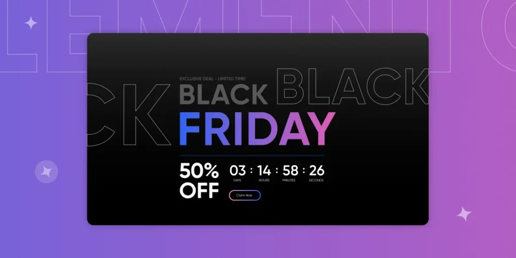
Black Friday is just around the corner, and brands across the globe are getting ready to cater to a large number of shoppers. Getting your website ready for the holiday season is important in order to give your customers a better holiday shopping experience. With that said, you need to create a Black Friday landing page for your website to list your offers for the Cyber Week sale.
This blog will walk you through a step-by-step process to create your landing page for Black Friday with Elementor like a pro. We will also discuss why you need a dedicated landing page for Black Friday, how Elementor can help design a high-converting landing page, and some tips on creating an impressive landing page.
Also, this blog will feature some examples of well-designed Black Friday landing pages from different brands for your inspiration.
So without further ado, let’s dive into creating your landing page.
The Importance of Black Friday for Brands:
Black Friday is observed the day after Thanksgiving. It is considered to mark the start of the shopping season. Customers are ready with their wallets to get products they have waited the whole year to purchase.
We see a lot of people waiting for Cyber Week to shop for their favorite items. The primary reason is that almost all brands run special sales for Cyber Week. These discounts attract customers and allow brands to make more sales.
Like every year, Black Friday 2023 will also be a blast. A survey by Drive Research shows that 82% of consumers (out of 1000 people surveyed) plan to shop during Cyber Week in 2023.
A huge number of shoppers makes Black Friday an important event for brands. This is the time to get more leads, clear out inventory, and get more loyal customers. So if you, as a brand, are planning for Black Friday, you are on the right track, and we will help you do it right.
What is a Black Friday Landing Page?
It is a web page specifically designed to promote your offers and discounts for Black Friday. For your customers, your Black Friday landing page is the gateway to making a purchase. It can be an excellent way to capture new customers and retain existing ones.
Why Should You Create a Dedicated Black Friday Landing Page?
There are many reasons why creating a dedicated landing page for Black Friday can be a great idea. Here are some of these amazing reasons to help you understand why you should go for it.
Track Black Friday Conversions:
A dedicated landing page for Black Friday can help you measure conversion rates specific to the sale. Tracking how many people engaged with your Black Friday deals can help you gain valuable insights for future business decisions. You can measure audience engagement and optimize your future Black Friday campaigns.Improve Brand Image:
Having a dedicated landing page for Black Friday can help you build a professional image for your brand. By creating a Black Friday page, you tell your customers that you are participating in the sale event by having all deals dedicated to the sale events. This tells your customers that your brand is recognizable among other brands that are participating in the Black Friday sales event. If you have a good sales strategy, then this may give your brand a huge boost. Which helps to improve your brand image.Increased Conversion Rate:
A dedicated Black Friday landing page can help increase your conversion rate. By creating a dedicated page, you provide your customers with a more focused and optimized experience that guides them towards making a purchase. You can remove distractions and let the customer focus on your curated list of products for Black Friday, which in turn helps increase the conversion rate.Create a Sense of Urgency:
With a Black Friday landing page, you can create a sense of urgency to encourage your customers to make a buying decision. This can be done by displaying a countdown timer for the end of the sale or by displaying stock levels. Doing so can help provoke customers to make an impulsive buying decision.Improve User Experience:
Creating a dedicated landing page can also help improve the user experience on your website. When your customers search for your Black Friday deals, they are not expecting your shop page, where products are listed at regular prices. Instead, they expect a page where your Black Friday discounted products are listed. With a dedicated page, search engines are able to serve the right page to your customers, and they don’t have to navigate through your entire product catalog. This approach can significantly improve the user experience.
How Can Elementor Help in Creating a High-Converting Landing Page?
Elementor is one of the most popular page builders for WordPress. It helps you create professional web pages in no time. To create a landing page for Black Friday, Elementor can be an effective tool. Here’s how;
Pre-built Black Friday Landing Page Templates:
Elementor has pre-built templates that you can use. If you don’t know where to start, you can use a pre-built Elementor Black Friday landing page template as inspiration and create something impressive. Elementor has many templates for blocks and entire landing pages that can help you create a high-converting landing page for Black Friday.
????Also Check Out: 7 High-Converting Banners to Use for Black Friday Sale 2023
Mobile-Friendly Design:
Most users access your website through mobile phones or tablets. It is important to make sure your website appears the same on every device the user may use to access it. Elementor helps you create a mobile-responsive design easily. You don’t have to create a separate mobile design for your website. You can just create a single webpage design and use Elementor’s responsive mode to switch between screens and fix display issues for different devices. This ensures your website is perfectly viewable on every screen.Powerful Widgets:
Elementor makes creating sections easier with its collection of powerful widgets. You can utilize different pre-designed Elementor widgets, such as headings, paragraphs, popup modals, forms, tables, and much more, and customize them according to your design preferences. You also have the flexibility to use third-party Elementor addons to increase the number of widgets and functionality of Elementor.
Creating a Black Friday Landing Page With Elementor:
Requirements:
To create a landing page for Black Friday design with Elementor, you need the following:
Elementor helps you create stunning web pages on your WordPress website. Matched with the 130+ additional Elementor widgets from XPro Elementor Addons, you are all set to rule the Black Friday sale.
You can install and activate these plugins through the WordPress repository.
Once you have installed and activated these plugins on your website, you are ready to get started with creating your landing page.
Step 1: Create a New Page and Edit with Elementor:
Hover over the Pages nav item on the left sidebar in your WordPress dashboard and click Add New. You will be redirected to a new page where you can create your page. Just add the Page Title and hit Publish.
Once published, click on Edit with Elementor to get started with creating your landing page.
????Pro tip: Your page name will be used as the URL for your page. Use short, clear, and specific page names that avoid generic or descriptive terms. This will make your page URLs more memorable and informative for visitors. For example, instead of “Black Friday Landing Page,” name your page “Black Friday Deals” or “Black Friday Sale.”
Step 2: Use a Template or Start From Scratch:
The next step is to get started with creating your Elementor landing page for Black Friday. You can either use a pre-built Black Friday landing page template or start from scratch.
If you are planning to use a template, XPro Elementor Addons has a lot of amazing pre-built Elementor landing page templates for Black Friday. You can access the template library and choose the one you like. To do that, click on the XPro icon on your page. This will open the templates library, where you can choose your template and insert it on your page. It is that simple.
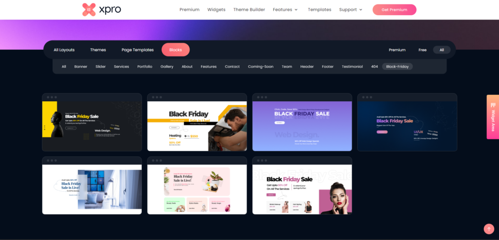
If you don’t wish to use a template and start from scratch instead, XPro has 130+ premium and free Elementor widgets you can use. Just drag and drop the widget you need onto the page and create your desired layout. You don’t have to write any code to create a functional page with Elementor and XPro.
????To learn more, check out our documentation on how to use XPro Elementor templates.
Step 3: Review and Publish Your Black Friday Landing Page:
Once you are done with designing your landing page, it is time to publish it. But before that, you need to review the page to ensure everything is perfect. One important aspect to check is the responsiveness of your page. Your page should be responsive, so it is perfectly visible on all devices.
To check responsiveness, turn on the responsive mode in Elementor and scroll through the page to check if everything is perfect. If an element isn’t properly viewable, you can modify its styling to make it better. Once you have reviewed everything, hit Update, and your Black Friday landing page will be live.
Tips for Creating an Impressive Black Friday Landing Page Design:
When creating a Black Friday landing page, you need everything to be perfect. You wish to make sales, and that is only possible with an impressive page design. To ensure you do everything right, here are some Black Friday landing page best practices:
Do Right by Your Copy:
When designing your landing page, you need to ensure your marketing copy is excellent. It should be able to grab the customer’s attention while walking them through their journey to make a purchase. When writing your copy, make sure it is catchy, clear, and short. This will help you get more conversions.FOMO Is A Friend:
Fear Of Missing Out is what provokes customers to make impulse buying decisions. This makes FOMO a friend to all the brands out there. But how can you benefit from it? Simply by presenting a deal in a way so good the customer can’t resist. This can be done by creating a sense of urgency using a countdown timer. You can also display the number of items left in the inventory to create a sense of competition. When customers see the limited quantities, they are likely to act fast before someone else does. Use FOMO in your favor and improve your conversion rate.Avoid a Cluttered Black Friday Landing Page:
Nothing destroys the user experience more than a cluttered page. When designing your landing page, you need to ensure it doesn’t appear cluttered. Everything should be placed in a well-organized way. Whitespaces play a great role in doing that. Make sure there is plenty of white space on the page so customers can easily navigate through your page without feeling overwhelmed.Social Proof Makes the Mood:
Social proof is important to win the trust of potential customers. Social proof includes reviews from your past customers. Seeing other happy customers makes your potential customers comfortable enough to make a buying decision. So when designing your Black Friday landing page, use social proof to win over potential customers and increase your sales.Use Images Wisely:
Visual content, such as images, can play an effective role in conveying messages and increasing conversions. Ensure to use high-quality images that are relevant to your page to grab customers’ attention. Pixelated or irrelevant images would not have a good impact on customers. So ensure to use images wisely on your page.
Black Friday Landing Page Examples for Inspiration:
To help inspire your creativity, here are some examples of landing pages from top brands. Analyze them to get some insights on how they are utilizing different elements for their landing pages and create yours accordingly.
1. Target:
Target has an impressive Black Friday page. The page starts with a simple yet attractive hero section. The color combination catches attention. Target makes a price match guarantee with a promise to match prices if they go low during the holiday sale season. This is an impressive way to engage customers.
Below the hero section, Target lists their “deal of the day” section with attractive discounts on different products.
Scrolling down a bit, you see an attractive banner that features their “Buy 2, Get 1 Free” deal for multiple categories. They also feature deals for their Tech category products under this banner section.
Scrolling down, you can see some other attractive deals they are promoting.
Target takes advantage of the space on their Black Friday landing page to promote all of their amazing discounts on multiple categories. This is an impressive approach, as customers can stay longer on the page. Also, the large collection offers customers multiple options to check out, which increases their chances of making a purchase decision.
At the end of the page, they list their products to offer more options to customers.
Overall, the page is impressively designed, with attractive section designs and well-placed deals.
2. Hostinger:
The web hosting company, Hostinger, takes part in the Black Friday sale event with an amazing discount on their hosting plan.
The hero section on their Black Friday landing page features an animated image of the discount they are promoting along with a well-written and clear copy. They feature some features of their deal along with the discounted price. To create a sense of urgency, the hero section features a countdown timer. The section ends with a CTA button with their 30-day money-back guarantee featured under it.
Scrolling down a bit, Hostinger features their Black Friday specific pricing plans with all features.
Scrolling down, they list the features of their web hosting in well-designed sections, but what really catches the eye is the section where they reinforce the time-sensitive nature of their deal.
This section features a simple yet attractive graphic with very well-written copy that provokes the customer to make a buying decision soon, or they will miss out.
Hostinger’s landing page is attractive and well-designed. It is a good starting point to get inspired by and design your own page.
3. Macy’s:
Macy’s uses attractive colors for its Black Friday landing page design. The hero section is simple yet elegantly designed. It features the starting date for their Black Friday sale with a countdown timer to add to the excitement of the customers.
Scrolling down, Macy’s lists the products that will be on sale to let their customers know what to expect.
Macy’s lists some details about their Black Friday sale in the last section, along with featuring some popular searches on the page. The popular searches link to their specific product pages on Macy’s, which allows customers to explore more products.
This page is excellent because it features all the essential elements of a landing page while avoiding clutter.
4. XPro Elementor Addons:
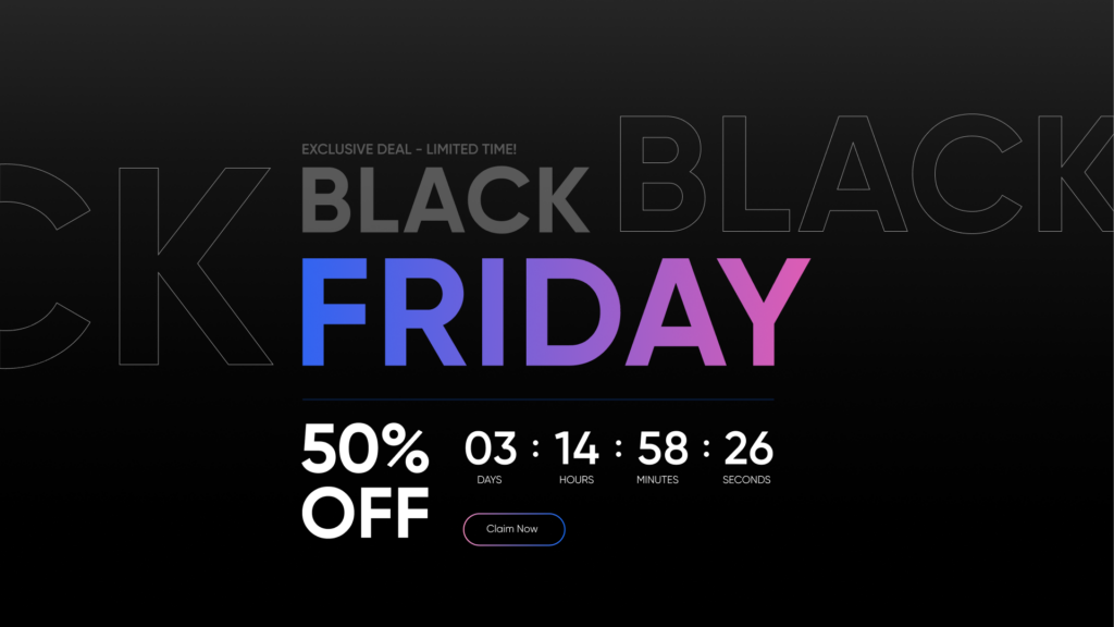
We are not going to miss a chance to show off our own Black Friday sale landing page (since our designer put a lot of effort into creating it).
Our Black Friday landing page features a cool graphic (patting ourselves on the back) to announce our Black Friday sale. The hero section also features a countdown timer to mark the end of the sale. We also feature a CTA button below to allow our potential customers to make a purchase.
Did you know? Our Black Friday sale is live, and we are offering a 50% flat discount on our Elementor Addons. With this plan, you will get access to our 130+ FREE and Premium Elementor Widgets, 30+ Elementor Features, 300+ Pre-built Elementor Templates and Themes, and our FREE Theme Builder for Elementor. So if you haven’t already, check out our Black Friday sale page and claim this spectacular offer.
Below the hero section, we list our pricing specific to the Black Friday sale.
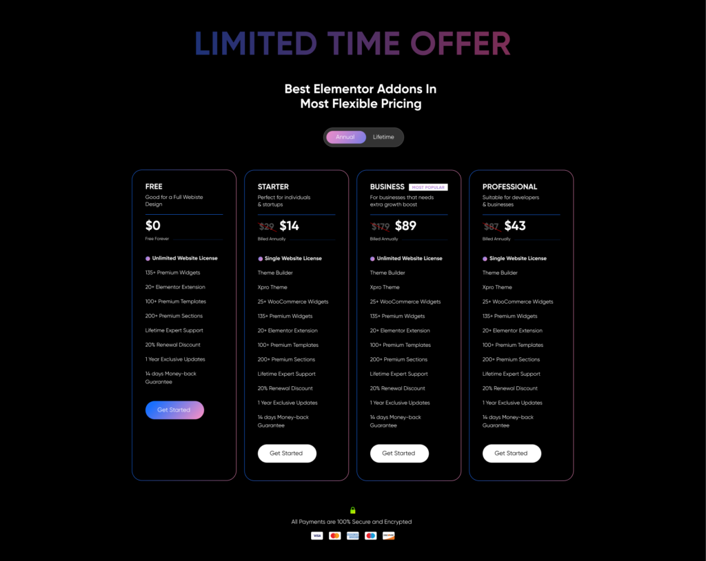
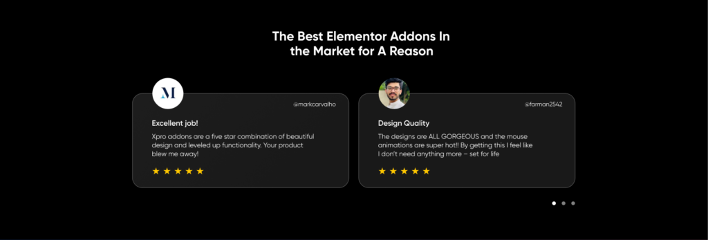
Scrolling down, we present (very cleverly) customer testimonials along with our 14-day money-back guarantee to win the customer’s trust.

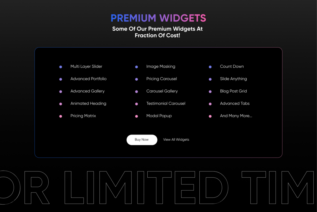
Below this section, we list our premium widgets.
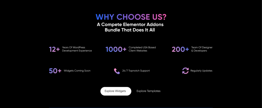
Below this section, you can find the features of our plugin.
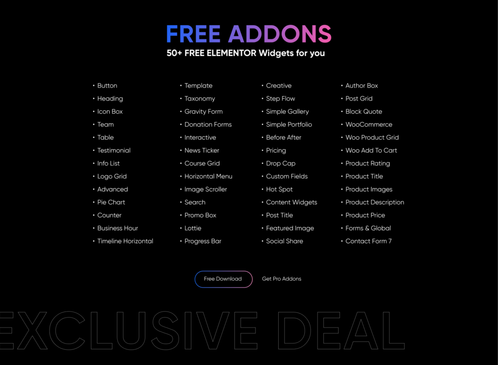
Moving on, we feature our free addons, so if a potential customer is not ready to buy premium yet, they can try out the free version and decide on buying premium later.
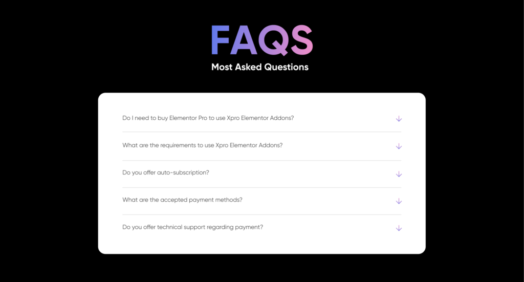
Below this section, we have our FAQs section to answer common pre-sales questions.
So this is our approach to creating a Black Friday landing page. Let us know what you think about this in the comments.
Wrapping Up:
Building a high-converting landing page for Black Friday can be tough. We have covered everything you need to know about creating a landing page in this blog. By following the tips and tricks in this guide, you can design an impressive landing page in no time.
So go ahead and let the horses of your creativity run wild and design your perfect Black Friday landing page. Don’t forget to use XPro Elementor Addons because they can make your job of creating a page much easier. Also, be sure to check out our blog on 7 High-Converting Banners to Use for Black Friday Sale 2023 and let us know what you think about them. Happy Designing!
